
The most effective contrast upgrade for helping low-vision guests navigate confidently is adding high-contrast signage with bold, clear colors like black on white or yellow on dark backgrounds. Pair this with well-lit, tactile, and color-contrasted pathways to guide visitors seamlessly. Consistency is key—apply the same contrast principles throughout your venue to reduce confusion and enhance safety. Keep exploring for practical tips to create a truly accessible environment.
Key Takeaways
- Implement high-contrast tactile paving with textured surfaces at key navigation points.
- Use bold, contrasting colors like yellow or white against dark backgrounds for signage.
- Ensure signage incorporates tactile elements with high-contrast Braille for easy reading.
- Enhance lighting to create even, glare-free illumination that increases contrast visibility.
- Regularly assess and adjust contrast levels using tools to maintain clear visual differentiation.
Why Contrast Is Critical for Low-Vision Navigation
Because contrast is vital for distinguishing objects and pathways, low-vision guests rely heavily on high-contrast environments to navigate safely. Your color perception and contrast sensitivity are key factors in how well you can detect differences in your surroundings. When there’s strong contrast, it becomes easier to identify doorways, stairs, and furniture, reducing the risk of accidents. Subtle differences in color or shading can be challenging for low-vision individuals, making high-contrast designs essential. By enhancing contrast, you improve your ability to differentiate surfaces and objects, allowing for smoother, more confident movement through spaces. Incorporating visual cues such as contrasting colors or textures can further aid navigation. Understanding contrast sensitivity can help you appreciate why these adjustments make such a difference. The use of contrast ratios in environment design can significantly impact safety and ease of movement. Additionally, lighting conditions play a crucial role in how contrast is perceived, and optimizing these can further improve navigation. Adjusting lighting to improve visual contrast can make a noticeable difference in visibility. This simple adjustment can considerably enhance safety and independence, helping you navigate unfamiliar environments with less difficulty and greater peace of mind.
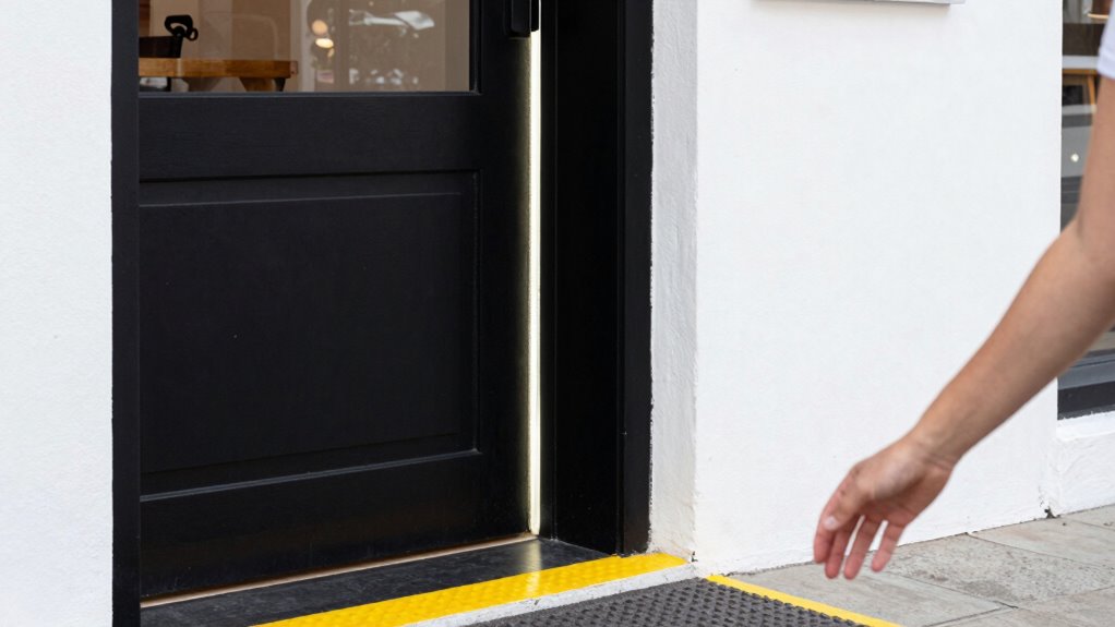
How Bright Door Frames Enhance Visibility
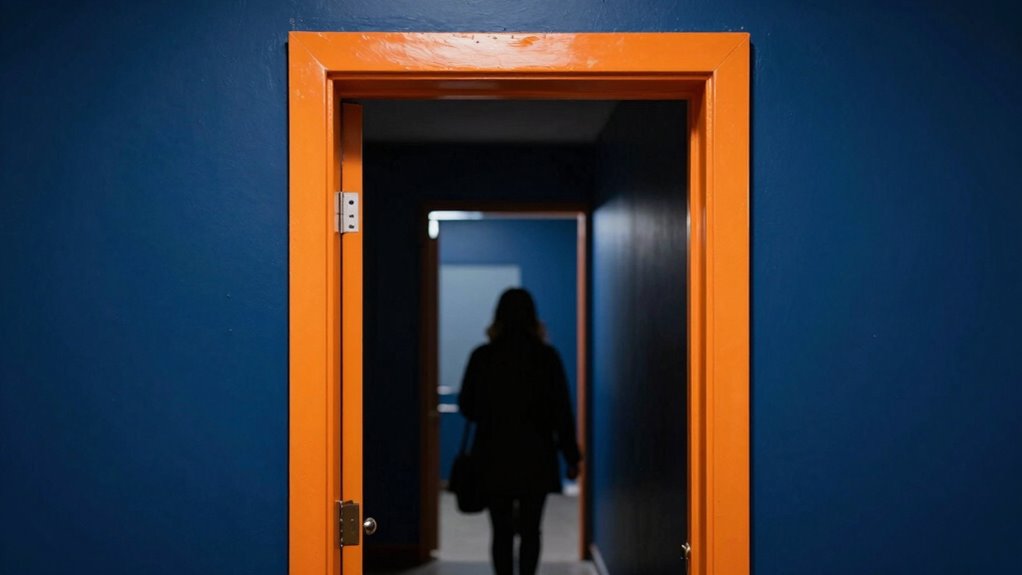
Bright door frames stand out prominently against their surroundings, making entrances easier to locate for low-vision guests. Using effective lighting techniques, you can highlight these frames further, such as installing focused spotlights or backlighting to increase contrast. Material choices also matter; opt for durable, matte finishes that minimize glare and reflect light evenly. Brightly painted frames in high-contrast colors, like white or yellow, create a clear visual boundary, guiding guests effortlessly. Avoid glossy or reflective materials that can cause confusion or visual clutter. By combining strategic lighting with thoughtful material choices, you enhance visibility and ensure that your entrances are immediately recognizable. Incorporating visual contrast into your design not only improves navigation but also enhances safety and independence for low-vision visitors. Paying attention to environmental factors like ambient lighting and color contrast can further optimize the overall visibility of these features. Additionally, understanding the effects of glare reduction techniques can help minimize discomfort caused by reflections, making entrances even easier to identify. This simple upgrade considerably improves navigation, promoting independence and safety for low-vision visitors.
Choosing Colors That Make Signs Pop
To make signs stand out, choose high-contrast color combinations that catch the eye easily. Avoid clashing hues that can confuse or distract viewers, ensuring the message remains clear. Be sure to test your colors in different lighting conditions to confirm they stay visible and effective throughout the day. Incorporating visual impact can enhance the effectiveness of your signage in various settings. Additionally, understanding color contrast principles can help you select combinations that maximize readability and accessibility for all viewers. Paying attention to scientific research on color perception can further improve your signage’s clarity and inclusivity. Considering the visual perception principles behind color choices can also help you create signs that are both attractive and functional. Considering the Gold IRA markets can also guide you in making investment decisions that are both secure and profitable over time.
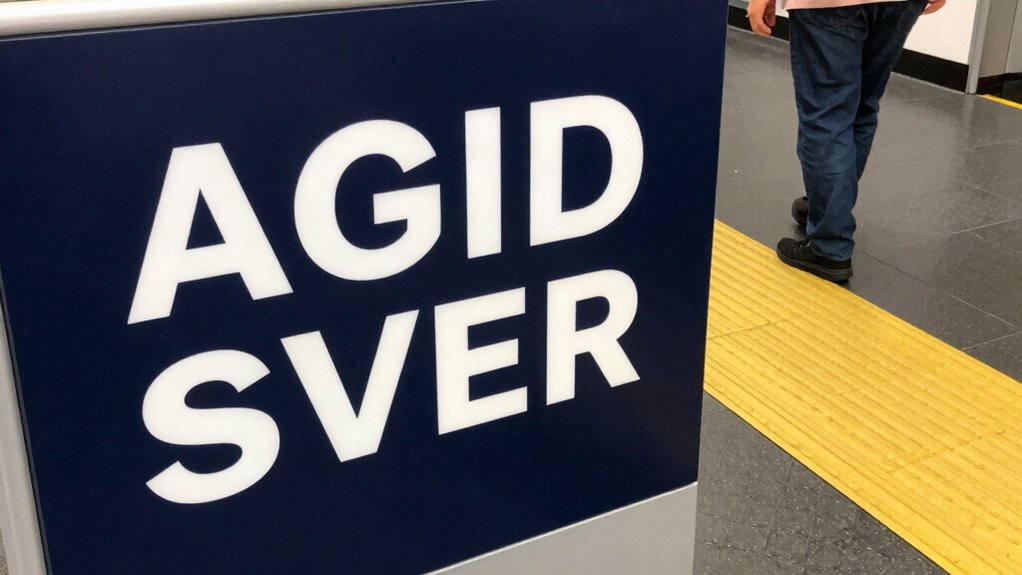
Use High-Contrast Colors
Choosing high-contrast colors is vital for making signs easily visible to low-vision guests. When selecting color pairing, opt for combinations like black on white or yellow on dark blue, which stand out clearly. These contrasts help signs catch the eye quickly, reducing confusion and frustration. Proper signage placement also plays a key role; position signs at eye level and in well-lit areas to maximize visibility. Avoid placing signs in shadows or behind objects that can obscure their contrast. Consistent use of high-contrast colors across all signage ensures guests can navigate confidently and independently. Additionally, selecting appropriate lighting can enhance sign visibility and further improve accessibility. Incorporating visual contrast principles into signage design guarantees that visual cues are unmistakable, supporting a seamless experience for everyone, especially those with low vision. Incorporating contrast assessment methods can help ensure that color choices meet accessibility standards and effectively serve all users. Using contrast testing tools can further verify that your signage remains highly visible in various lighting conditions. Regularly reviewing and adjusting contrast levels based on user feedback can also improve overall effectiveness.
Avoid Clashing Hues
Avoiding clashing hues is essential for making signs stand out without causing visual confusion. When selecting colors, focus on achieving good color harmony; complementary or analogous color schemes often work best. Clashing hues can distract or overwhelm low-vision guests, making signs harder to interpret. Instead, choose colors that enhance contrast while maintaining visual aesthetics—this helps signs be both noticeable and easy to read. Keep in mind that sharp, well-coordinated hues prevent the eye from bouncing between conflicting shades, improving overall clarity. Consistent, thoughtfully paired colors foster a cohesive look that guides visitors effortlessly. By avoiding clashing hues, you create more accessible signage that balances visibility with pleasing visual aesthetics, ensuring everyone can navigate comfortably. Understanding color contrast principles is also crucial for optimizing sign readability and accessibility.
Test Under Different Light
Testing your signage under different lighting conditions is crucial to guarantee it remains visible and eye-catching. Lighting conditions can dramatically affect how colors appear, impacting color perception for low-vision guests. Bright, dim, or uneven lighting can wash out or obscure signs if you haven’t tested them thoroughly. To ensure your signs stand out, evaluate them in various settings—natural daylight, artificial light, and at different times of day. Observe how the colors look and adjust accordingly. High-contrast color combinations that work well in one light may not perform the same in another. By testing under different lighting conditions, you can select colors that maintain their visibility and clarity, helping all guests navigate your space with confidence. Considering color contrast during adjustments can further enhance overall visibility and accessibility. Additionally, understanding the impact of lighting conditions on color perception can guide better signage choices for diverse environments. Being aware of visual acuity limitations can also assist in designing signs that are more universally accessible. Regularly reassessing your signage under changing lighting conditions ensures ongoing accessibility and effectiveness.
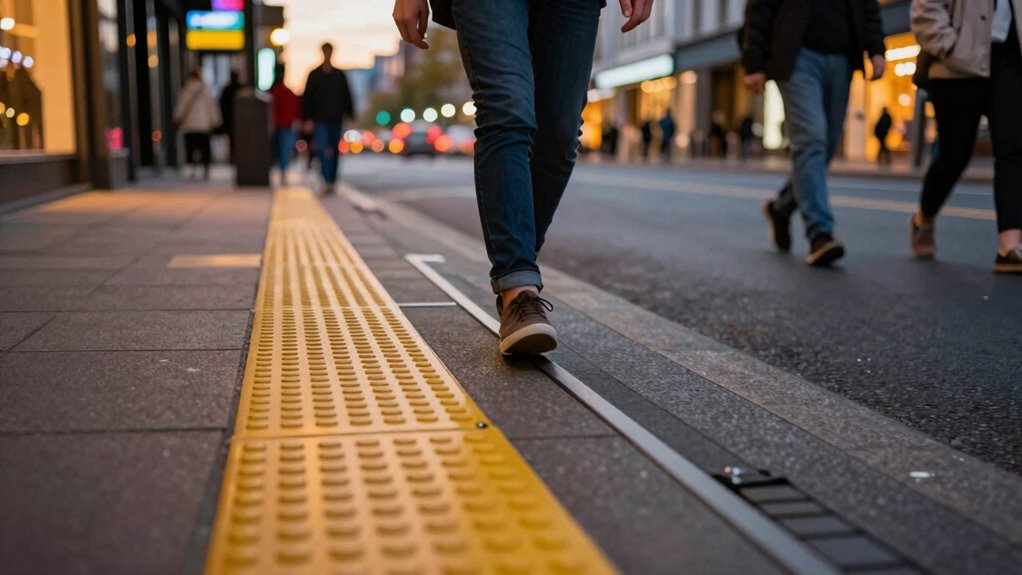
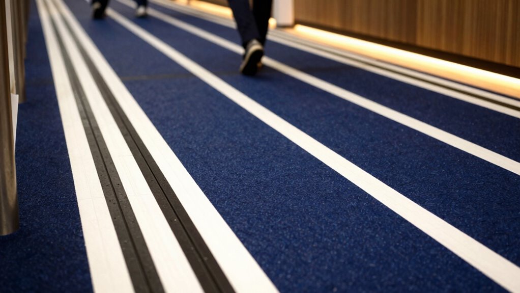
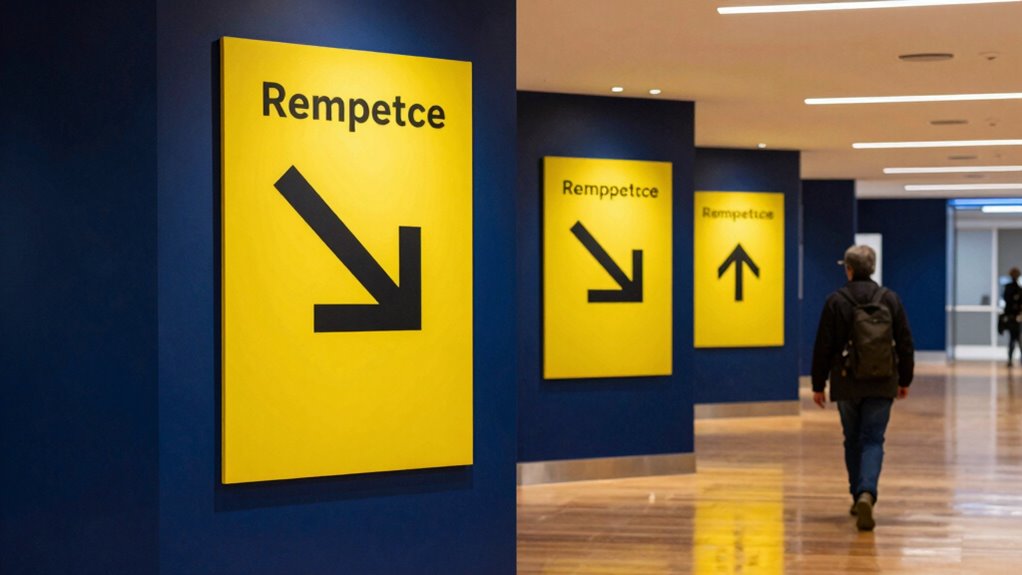
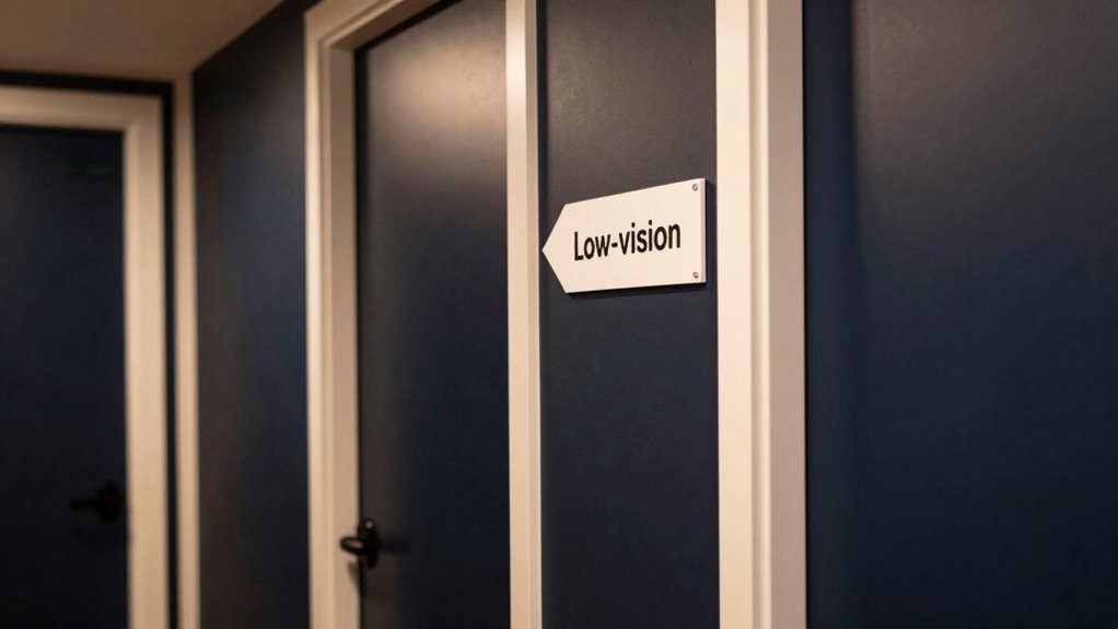
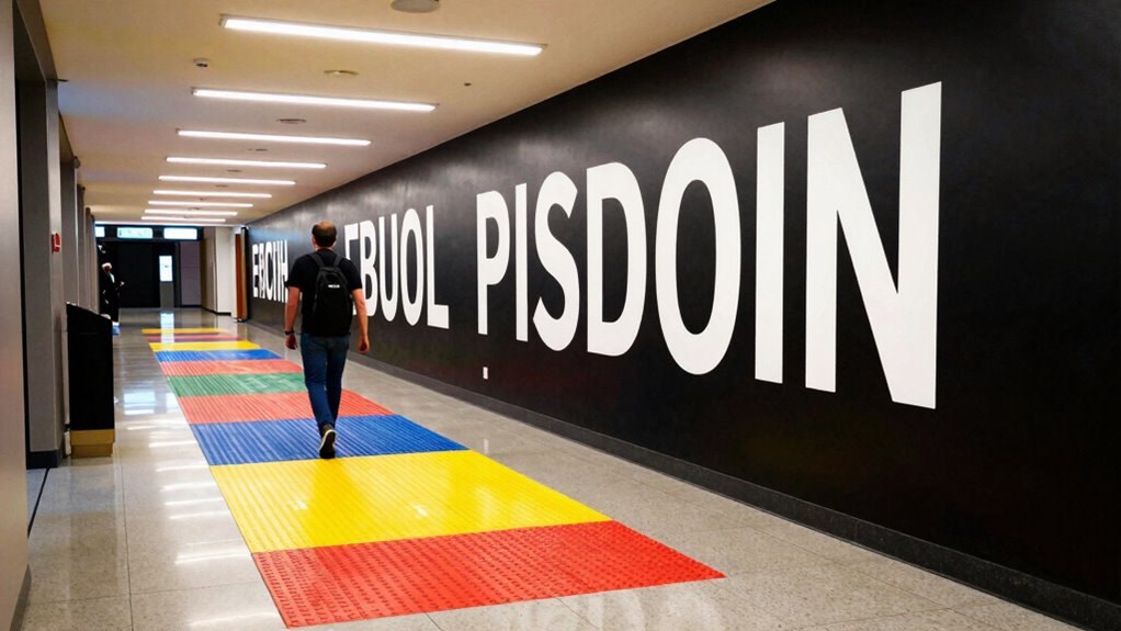
Applying Contrast to Signs and Wayfinding Elements
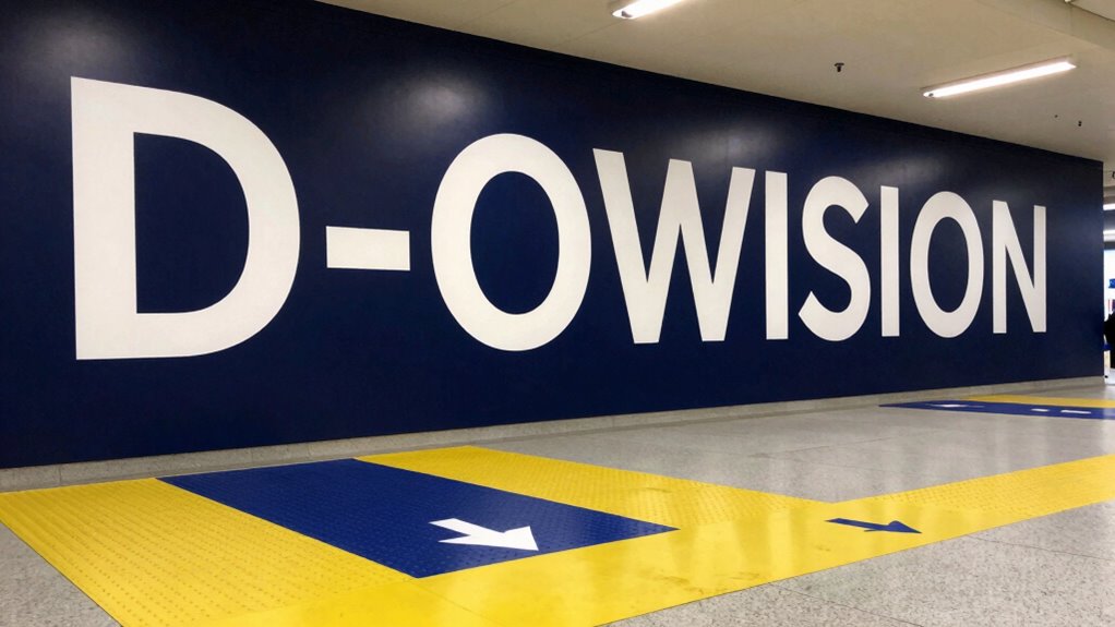
To guarantee low-vision guests can easily locate and read signs, applying high-contrast color combinations is essential. Use bold, contrasting colors like black on white or yellow on dark backgrounds to make signs stand out. Make certain Braille signage is also high-contrast and tactile for better readability. Incorporate tactile paving at key points, such as crossings and entrances, with color and texture that contrast sharply with the surrounding surface. This helps guests identify pathways and important areas through touch and sight. Consistent contrast between signs and their backgrounds reduces visual confusion and enhances navigation. Remember, the goal is to make signs and wayfinding elements as noticeable and accessible as possible, so guests can easily find their way without frustration.
Keeping Contrast Consistent Throughout Your Venue

Maintaining consistent contrast throughout your venue is essential for creating an accessible environment for low-vision guests. Use effective lighting techniques to reduce glare and shadows, ensuring all areas are well-lit and evenly illuminated. Consistent lighting helps highlight contrast differences, making it easier for visitors to distinguish surfaces and objects. Additionally, pay attention to material textures; choose finishes with contrasting textures or patterns to reinforce visual cues. For example, smooth flooring next to textured mats or different wall finishes can guide guests naturally. Avoid abrupt changes in contrast that can confuse or disorient low-vision guests. By balancing lighting techniques and material textures, you create a cohesive environment where contrast remains steady, enhancing navigation and safety for everyone.
Testing Your Contrast Choices: Tools and Tips
Once you’ve established consistent contrast in your venue, it’s important to verify that your choices work effectively for low-vision guests. Use tools like contrast analyzers or color matching apps to test the visibility of key areas and signage under various lighting conditions. These tools help you confirm your color schemes provide sufficient contrast, especially when considering material durability—some finishes might wear or fade over time, reducing effectiveness. When testing, focus on real-world scenarios, checking that labels, pathways, and controls remain distinguishable. Regularly reassess your contrast choices, especially after renovations or updates, to maintain accessibility. Clear, durable materials combined with thoughtful color matching will keep your venue welcoming and navigable for all guests.
Common Challenges When Improving Contrast and How to Fix Them
Improving contrast in your venue often presents several common challenges that can hinder accessibility efforts. One major issue is maintaining lighting consistency, which is essential for low-vision guests to perceive contrast effectively. Fluctuating or uneven lighting can make high-contrast signage or markings difficult to see. Additionally, signage durability often poses a problem; low-quality materials may fade or peel over time, reducing contrast and clarity. To guarantee these issues, ensure your lighting is evenly distributed and adjustable to prevent shadows or glare. Use durable, fade-resistant materials for signage, and regularly inspect and replace worn-out signs. Consistent lighting and resilient signage are key to creating an environment where low-vision guests can navigate confidently and safely.
Benefits of High-Contrast Design for All Guests
High-contrast design improves visibility for everyone, making it easier to see signs, steps, and important details. It also simplifies wayfinding, helping all guests navigate confidently without confusion. Plus, it fosters an inclusive environment where everyone feels comfortable and accommodated.
Enhances Overall Visibility
When you incorporate high-contrast design elements, visibility becomes clearer and more immediate for everyone. Thoughtful color pairing creates distinct visual cues, making key features stand out. Adjusting lighting enhances clarity, reducing glare and shadows that can obscure details. This benefits all guests by providing a more comfortable environment. Visual clarity improves navigation and reduces confusion, especially in busy or dim settings. Consider this table as a mental map:
| Feature | Contrast Technique | Impact |
|---|---|---|
| Door Handles | Bright color on dark background | Easy to find |
| Signage | White text on dark surface | Readable from afar |
| Pathways | Light-colored borders | Clearly defined routes |
| Seating Areas | Dark furniture against light floors | Spot easily from a distance |
| Stair Edges | Contrasting tape or paint | Prevents trips and falls |
High contrast guarantees that everyone benefits from enhanced overall visibility.
Simplifies Wayfinding Processes
Clear and straightforward signage helps guests find their way quickly, reducing confusion and frustration. High-contrast color pairing makes signs stand out against their backgrounds, even under various lighting conditions. This guarantees visibility in bright daylight or dimly lit areas, simplifying wayfinding for everyone. When the color contrast is thoughtfully designed, guests can distinguish directions and important information effortlessly. It eliminates the guesswork, saving time and preventing stress. Good contrast also guides guests seamlessly from one space to another, whether they’re maneuvering hallways, entrances, or exits. By choosing effective color pairing and considering lighting conditions, you create a more intuitive environment. This approach benefits all guests, making navigation straightforward and accessible at every turn.
Promotes Inclusive Environment
Implementing high-contrast design creates a more inclusive environment by ensuring all guests can navigate easily, regardless of visual impairment. When you use strong contrast between text and backgrounds, it benefits guests with limited color perception, making details stand out clearly. This approach helps those with low vision distinguish important features, but it also improves overall visibility for everyone. By prioritizing high contrast, you foster an atmosphere where everyone feels considered and comfortable. It reduces confusion, minimizes frustration, and encourages independence. When visual cues are obvious and accessible, you create a welcoming space that accommodates diverse needs. Promoting inclusive design demonstrates your commitment to all guests, making their experience safer, more comfortable, and more enjoyable.
Real-Life Examples of Successful Contrast Upgrades
Many facilities have seen remarkable improvements in accessibility after upgrading their contrast settings, making it easier for low-vision guests to navigate safely. For example, some hospitals enhanced lighting adjustments and added tactile markers along hallways and stair edges. These simple changes markedly reduced confusion and accidents, helping guests distinguish doorways, steps, and important signs easily. In museums, contrast upgrades involved repainting exhibits with high-contrast colors and installing tactile guides on floors, allowing visitors to explore independently. Restaurants improved lighting and added textured strips on floors to lead guests through key areas. These real-life examples demonstrate that small but strategic contrast upgrades can transform environments into safer, more inclusive spaces, empowering low-vision guests to move confidently and independently.
Easy Steps to Start Improving Contrast Today

Start by identifying the key contrasts in your environment that matter most, like text against backgrounds. Next, choose high-contrast colors that make these differences clearer and easier to see. Finally, test your choices and adjust settings as needed to guarantee ideal visibility for your guests.
Identify Key Contrasts
Have you ever struggled to distinguish objects or text because of low contrast? The first step is to identify key contrasts in your environment. Look for areas where color combinations blend too closely, making items hard to see. Focus on lighting and illumination techniques that can improve visibility—brightening dull surfaces or reducing glare can make a big difference. Notice the contrast between walls, floors, and furniture, as well as between text and backgrounds. By pinpointing these areas, you’ll know where to focus your efforts. Remember, strong contrasts don’t always mean bold colors; sometimes, adjusting lighting or using subtle differences in shades can enhance clarity. Start by observing your space carefully to find the contrasts that, once improved, will make navigation easier.
Choose High-Contrast Colors
Choosing high-contrast colors is one of the simplest ways to improve visibility for low-vision guests. You can enhance their experience by selecting color combinations that maximize contrast and support better visual acuity. Bright, bold pairings like black and white or navy and yellow stand out clearly. Avoid subtle shades that blend together, making it harder to distinguish objects or text. Use this table to inspire your choices:
| Color Combinations | Impact on Visual Acuity |
|---|---|
| Black & White | Highest contrast, easiest to see |
| Navy & Yellow | Bright, attention-grabbing, clear distinction |
| Dark Green & Light Pink | Soft yet distinguishable |
| Red & Light Gray | Sharp contrast, easy to recognize |
Test and Adjust Settings
To begin improving contrast for low-vision guests, you should test your current display settings and make simple adjustments. Start by reviewing your screen’s color matching to ensure foreground and background colors provide sufficient contrast. Adjust lighting to reduce glare and shadows that can obscure details. Experiment with brightness and contrast controls on monitors or devices to find a balance that enhances visibility without causing eye strain. Proper lighting adjustment can make a significant difference, so consider adding adjustable light sources or anti-glare screens if needed. Keep testing different settings until text and visuals stand out clearly. Small tweaks can dramatically improve navigation and readability, making your space more welcoming and accessible for low-vision guests.
Frequently Asked Questions
How Can I Determine the Best Contrast Levels for Different Visual Impairments?
You can determine the best contrast levels by conducting contrast calibration tailored to each guest’s needs. Start with visual acuity testing to assess their specific impairments, then adjust contrast settings accordingly. This hands-on approach guarantees maximum visibility and comfort. Regularly update these settings based on feedback, and consider consulting specialists when necessary to fine-tune the contrast calibration for diverse visual impairments.
What Materials Are Most Effective for High-Contrast Signage?
Did you know that 70% of people with visual impairments rely on tactile cues? To create effective high-contrast signage, use materials like tactile signage with textured surfaces. These elements help low-vision guests distinguish signs easily. Choose durable, contrasting colors such as black on yellow or white on blue, and incorporate textured surfaces for tactile recognition. This approach guarantees accessibility and improved navigation for everyone.
How Often Should Contrast Elements Be Re-Evaluated or Updated?
You should re-evaluate your contrast elements, like decorative accents and digital displays, at least annually or whenever environmental changes occur. Regular checks ensure they remain highly visible and effective for low-vision guests. Updating contrast ensures clarity and safety while enhancing accessibility. Keep in mind that lighting conditions and aging materials can affect visibility, so consistent assessments help maintain ideal contrast for all visitors.
Are There Specific Lighting Conditions That Improve Contrast Visibility?
Imagine guiding a lighthouse through fog; good lighting conditions act as your beacon. Bright, even lighting enhances contrast visibility, making features stand out clearly. Opt for lighting enhancement that minimizes glare, preventing harsh reflections that obscure details. Soft, diffused light creates a welcoming environment for low-vision guests, helping them navigate confidently. Adjust lighting levels throughout your space to make certain of consistent contrast, turning every corner into a safe, well-lit path.
How Can I Train Staff to Assist Guests With Low Vision Effectively?
You can train staff effectively by emphasizing guest empathy and providing thorough staff training on low-vision assistance. Teach them to speak clearly, offer guidance, and be patient. Use role-playing scenarios to build confidence, and educate staff on specific contrast upgrades that aid navigation. Encouraging staff to listen actively and tailor assistance to each guest’s needs ensures a welcoming environment where low-vision guests feel comfortable and supported.
Conclusion
By paying attention to contrast, you might just discover a simple upgrade that transforms your guests’ experience—sometimes, all it takes is a bold door frame or vibrant sign. As you enhance visibility, you could find visitors orienting more confidently, making your venue feel welcoming for everyone. It’s funny how small changes often lead to big differences, and in this case, the right contrast might be the key to turning confusion into clarity for all your guests.