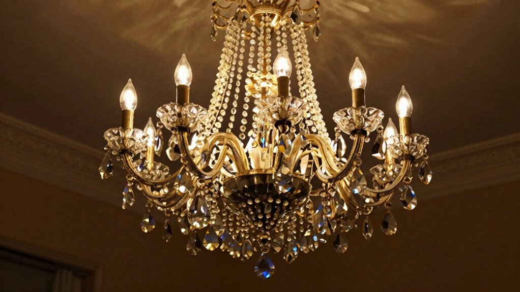
Here’s how the 60-30-10 rule simplifies color balance in your space, with easy tips to avoid common pitfalls—keep reading to learn more.
Browsing Category
Color Schemes
40 posts
Stop Choosing the Wrong White: The Undertone Test That Never Fails
No more guessing—discover the foolproof undertone test that ensures you pick the perfect white every time; keep reading to find out how.
High Contrast Without Harshness: Color Pairing for Aging Eyes
Brighten your space with gentle, high-contrast color pairings that soothe aging eyes—discover how to create vibrant yet comfortable visuals.
This Is Why Your Room Feels Smaller: The Color Placement Fix
Aiming to make your room feel larger? Discover how strategic color placement can transform your space and avoid common design pitfalls.
The Two-Neutral Formula That Makes Any Room Look Designer-Level
The two-neutral formula transforms any space into a designer-level room, balancing contrast and cohesion—discover how to elevate your interiors effortlessly.
Color Zoning: Defining Spaces in Open Plans With Paint
Beware of how strategic color zoning with paint can transform open plans; discover the key to defining spaces creatively and effectively.
Top to Bottom: Ceilings & Floors as Part of Your Color Scheme
Meta Description: “Mastering the art of choosing ceiling and floor colors creates harmony and visual interest—discover how to elevate your space from top to bottom.
Coordinated Look: Matching Wall Colors With Furniture
The key to a stunning space lies in matching wall colors with furniture—discover how to create harmony and contrast that will elevate your decor.
Seasonal Shift: Transition Your Decor From Fall to Winter Colors
Jump into easy tips to seamlessly transition your decor from warm fall hues to cool winter shades and elevate your seasonal ambiance.
Pop of Color: Using Accent Hues Without Overdoing It
Smartly incorporate accent hues to elevate your space without overwhelming it—discover how to achieve balanced, stylish pops of color that truly enhance your decor.