
When choosing colors to set a room’s mood, consider warm hues like reds, oranges, and yellows for energy, excitement, and a cozy feel, making spaces feel smaller and more inviting. Cool tones like blues, greens, and purples promote relaxation, calmness, and spaciousness, ideal for areas meant to soothe or focus. Balancing color temperature with lighting and personal style helps craft the perfect atmosphere—keep exploring to master the art of mood-changing color choices.
Key Takeaways
- Warm colors evoke energy and comfort, making spaces feel cozy and inviting, ideal for social areas.
- Cool colors promote calmness and relaxation, suitable for bedrooms or meditation zones.
- Warm hues tend to advance, making rooms appear smaller and more intimate, while cool shades recede, creating a sense of spaciousness.
- Balance warm and cool tones to prevent overwhelming or overly subdued atmospheres in a room.
- Consider lighting conditions, as natural and artificial light influence how warm and cool colors impact mood and space perception.
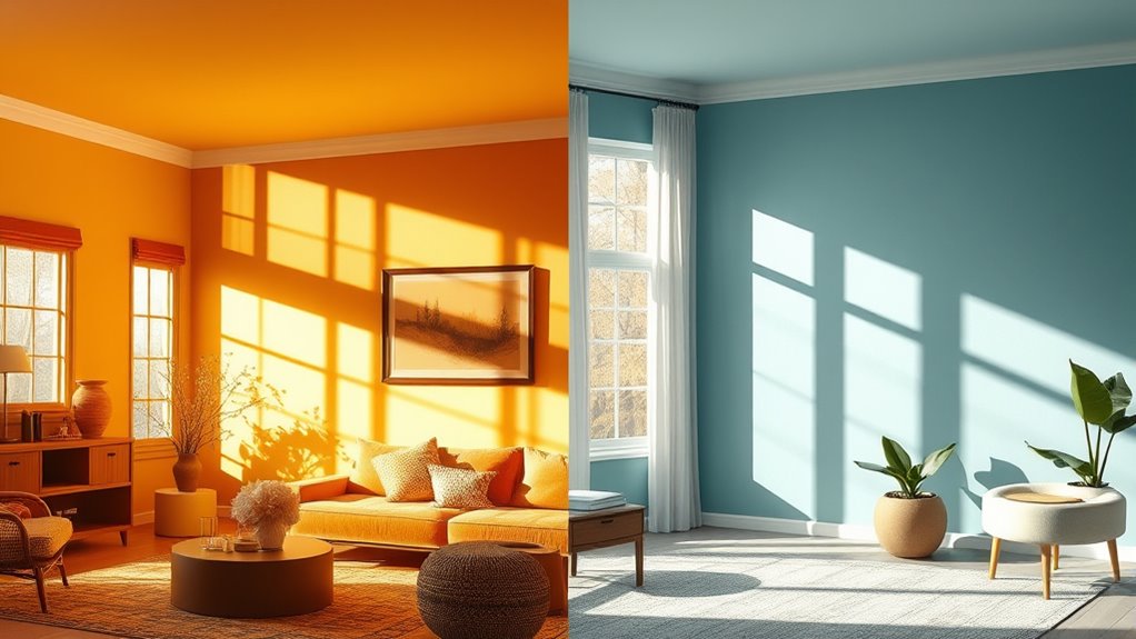
The colors you choose for a room can instantly influence its mood and how you feel inside it. This is where color psychology comes into play—understanding how different hues evoke specific emotional impacts helps you create spaces that align with your desired vibe. When you pick warm or cool colors, you’re not just selecting shades; you’re intentionally shaping the atmosphere and your emotional experience within a room. Warm colors, like reds, oranges, and yellows, tend to energize and stimulate. They evoke feelings of comfort, passion, and excitement. If you want a space that feels inviting and lively, warm tones are your go-to. They can make a room seem cozy and welcoming, encouraging social interactions and giving a sense of warmth—both physical and emotional. Think about a sunny kitchen or a fiery living room; these settings often use warm colors to boost positivity and activity. But be mindful of overdoing it; too much warmth can sometimes feel overwhelming or aggressive, so balance is key.
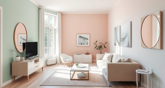
On the other hand, cool colors—blues, greens, and purples—bring a calming, soothing influence. These shades promote relaxation and focus, making them ideal for bedrooms, offices, or meditation spaces. The emotional impact of cool colors is often associated with serenity, clarity, and even melancholy, depending on the tone. Light blues and greens can make a space feel open and revitalizing, helping to reduce stress and anxiety. Darker hues, such as navy or deep purple, can add a sense of sophistication or introspection but might also feel isolating if used excessively. When choosing colors based on emotional impact, consider how you want to feel in that room. Do you seek energy and warmth or calm and tranquility? Your choice should reflect your personal needs and how you want to experience the space. Additionally, understanding color perception can assist in optimizing how the hues influence spatial awareness and emotional response.
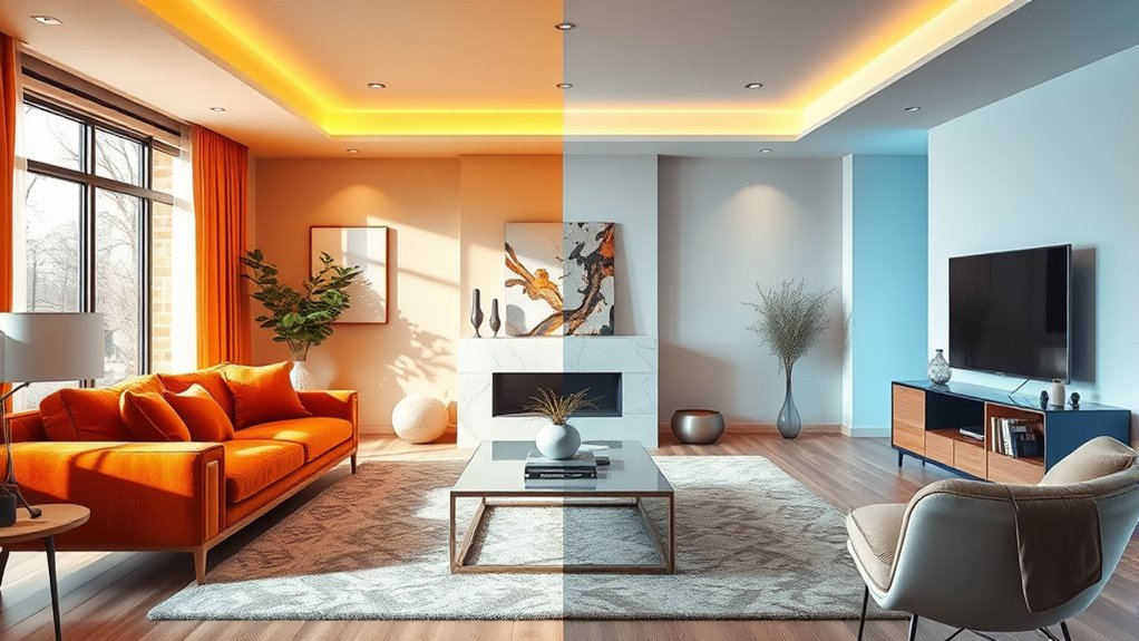
Temperature of colors influences not only mood but also perception of space. Warm colors tend to advance, making a room feel smaller and more intimate, while cool colors recede, giving a sense of expansiveness. This effect is essential if you want to alter how large or small a room feels. Also, consider lighting—natural light can enhance warm hues, making them glow, whereas cool colors might become more vibrant under certain lighting conditions.
Ultimately, your goal is to harness the emotional impact of color psychology by choosing warm or cool tones that align with the mood you desire. Whether you aim for lively energy or peaceful calm, understanding how different colors influence emotions will help you craft a space that truly feels just right.
Frequently Asked Questions
How Do Lighting Conditions Affect Warm and Cool Color Choices?
Lighting conditions notably influence your warm and cool color choices by affecting lighting effects and color perception. In natural light, warm colors appear more inviting, while cool colors can seem invigorating. Under dim or artificial lighting, warm tones may feel cozy, but cool hues might look dull or washed out. You should consider how different lighting conditions will impact how colors look and feel in your space.
Can Color Psychology Vary Across Different Cultures?
You might think color psychology is universal, but it’s not. Cultural color meanings and regional color preferences shape how people interpret colors differently around the world. What’s calming in one culture could be energizing in another. So, when choosing colors, consider your audience’s background. Don’t paint with a broad brush—what works in one country might not hit the same note elsewhere. It’s always best to tailor your choices accordingly.
Are There Any Health Considerations When Selecting Warm or Cool Colors?
When choosing warm or cool colors, consider health effects like their impact on sleep and skin tones. Warm colors, such as reds and oranges, can energize you but may disrupt sleep if used in bedrooms. Cool colors like blues and greens promote relaxation and better sleep. Also, these colors can subtly influence how your skin appears, so pick shades that complement your natural tone for a healthier, more comfortable environment.
How Do Neutral Colors Influence the Overall Mood of a Room?
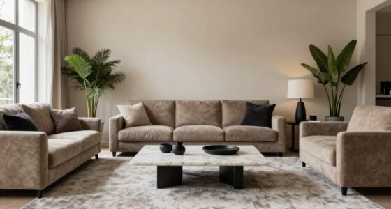
Studies show that neutral colors can boost relaxation, making up about 60% of popular interior palettes. You’ll find a neutral palette creates calming effects, helping a room feel more inviting and serene. When you choose neutral shades, you promote a balanced atmosphere that’s easy to personalize with accents. Neutral colors don’t overwhelm; instead, they support a peaceful environment, perfect for unwinding or focusing.
What Are the Best Color Combinations for Balancing Warm and Cool Tones?
You should use complementary color schemes or monochromatic palettes to balance warm and cool tones effectively. Complementary schemes pair opposite colors on the color wheel, creating vibrant contrast without clashing. Monochromatic palettes focus on variations of a single hue, blending warm and cool shades smoothly. By combining these approaches, you achieve visual harmony, making your space feel balanced and inviting without overwhelming the senses.
Conclusion
By selecting warm or cool colors thoughtfully, you can transform your space’s mood effortlessly. For example, imagine repainting your living room with calming blues to promote relaxation after a stressful day. Or, if you want energy, vibrant reds could invigorate the atmosphere. Remember, your color choices influence emotions and ambiance—so choose wisely. When you understand how warm and cool hues affect feelings, you can create a room that truly reflects your desired vibe.