Poor color placement can make your room feel smaller by creating harsh contrasts or overwhelming dark shades that absorb light. Using light, neutral tones on walls, ceilings, and floors helps reflect more light and make the space seem larger. Strategically placing accent walls with contrasting colors can add depth without shrinking the room. For tips on choosing the right colors and avoiding common mistakes, keep going to discover how to open up your space effectively.
Key Takeaways
- Using dark, saturated colors on all walls absorbs light and makes the space feel smaller and more enclosed.
- High contrast between wall, ceiling, and floor surfaces visually segments the room, reducing perceived size.
- Placing darker accent walls or bold colors opposite entrances creates a shrinking effect and diminishes openness.
- Not optimizing lighting can distort color perception, making rooms appear smaller than they actually are.
- Overusing bold or heavy colors on all walls decreases light reflection, making the space feel confined.
Why Color Placement Can Make Your Room Feel Smaller or Larger

Color placement can dramatically influence how spacious or confined your room feels. By understanding color psychology, you can manipulate visual perception to your advantage. Light colors tend to reflect more light, making a room seem larger and more open. Conversely, darker shades absorb light, creating a cozy but smaller appearance. Strategic placement of color on walls, ceilings, and accents can enhance this effect. For example, painting a single wall a darker hue can create depth, while lighter hues on all walls make the space feel expansive. The key is how your eyes perceive the colors in relation to one another. Properly placed colors can trick your brain into seeing a room as larger or smaller, depending on your desired effect. Additionally, incorporating European cloud innovation into your design choices can inspire sustainable and energy-efficient solutions that subtly influence the ambiance. Understanding color psychology allows you to select and position hues intentionally, maximizing the perceived size of your space.
How Wall, Ceiling, and Floor Colors Affect Room Perception
Your choice of wall, ceiling, and floor colors can dramatically influence how spacious or cozy a room feels. High contrast between these surfaces can make a space seem smaller or more segmented, while subtle shades create a seamless look. Lighting also plays a key role, as it amplifies or softens the impact of your color choices. Color psychology can help you understand how different shades affect mood and perception, guiding you to select hues that improve room openness. Incorporating visual continuity through harmonious color transitions can further enhance the feeling of openness. Smart design principles can help you optimize color placement to enhance comfort and openness in your living space. Additionally, understanding color contrast techniques can further refine how your chosen palette influences spatial perception. Applying color theory effectively can make a significant difference in creating an inviting and airy environment.
Color Contrast Effects
Have you ever wondered how the colors on your walls, ceiling, and floor influence the way a room feels? Color contrast plays an essential role in perception. High contrast between wall, ceiling, and floor colors can make a space seem smaller or more enclosed, while low contrast creates a seamless flow that enlarges the room. Your choice of paint finish also impacts this effect; matte finishes soften contrasts, making a room feel more open, whereas gloss adds sharpness and definition. By understanding color psychology, you can select contrasts that enhance your space. Use the table below to see how different contrasts affect perception:
| Contrast Type | Effect on Room Size |
|---|---|
| High contrast | Makes the room feel smaller or more enclosed |
| Low contrast | Creates a spacious, open feeling |
| Matte vs. gloss finish | Matte softens, gloss sharpens contrasts |
Additionally, choosing electric bikes with appropriate color schemes can influence the perceived spaciousness of a room, especially when displayed or stored in a way that highlights their sleek design. Color placement strategies can further enhance this effect by directing attention and creating visual harmony within the space. Moreover, understanding visual perception principles can help you select color schemes that optimize your room’s size and ambiance. Exploring interior design basics can provide further insights into how color choices impact a room’s perception. Awareness of color psychology can also guide you in creating a mood that complements the perceived size of your space.
Lighting and Color Impact
Lighting and color work together to shape how a room feels; the way wall, ceiling, and floor colors interact with light can dramatically influence perception. Different lighting styles, such as warm or cool tones, enhance or soften colors, affecting room size perception. Warm lighting creates a cozy, inviting atmosphere, while cool lighting can make a space feel more open and expansive. Color psychology plays a vital role—light, neutral shades reflect more light, making a room appear larger, whereas darker hues absorb light, making it feel smaller. Properly balancing lighting and color choices can trick the eye into perceiving a space as bigger or smaller, depending on your goals. Additionally, understanding lighting and color interaction is crucial for designing a room that feels spacious or intimate. Color placement can further influence perception by emphasizing certain areas or creating visual flow. By understanding these interactions, you can strategically design your room to feel more spacious or intimate, especially when considering the effect of lighting on color perception.
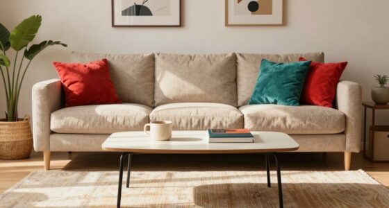
Creating the Illusion of Space With Accent Walls and Color Contrast

Using an accent wall in a strategic spot can instantly make a room feel larger. By choosing a contrasting color, you draw the eye and create a sense of depth. Learning how to place and contrast colors effectively helps you maximize space visually. Incorporating interior design principles can further enhance the perception of openness in your room. Additionally, selecting appropriate lighting can amplify these effects and make the space feel even more expansive. Paying attention to balanced designs ensures that visual weight is distributed evenly, contributing to a more open feel. Understanding color placement techniques can optimize the illusion of space and make your room appear bigger than it actually is. Utilizing garage door openers with smart features can also improve home functionality and perception of space, creating a more open living environment.
Strategic Accent Wall Placement
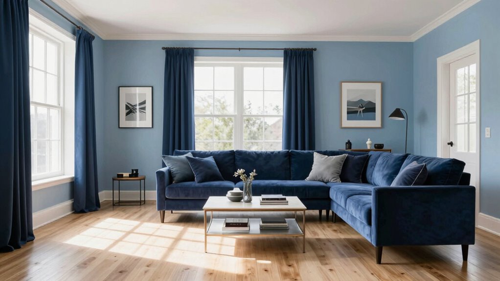
Strategic placement of accent walls can dramatically alter the perception of space in a room. To maximize this effect, consider pattern mixing and color psychology. Placing an accent wall opposite the entrance draws attention and creates depth, making the room seem larger. Use lighter shades on this wall to reflect more light and enhance openness. Incorporate subtle patterns or textures to add visual interest without overwhelming the space. Pattern mixing, when done thoughtfully, guides the eye smoothly across the room, emphasizing its length or width. Color psychology also plays a role; calming hues like soft blues or greens can make a room feel more expansive. Avoid overdoing accent walls, and focus on strategic placement to create the illusion of a bigger, more inviting space.
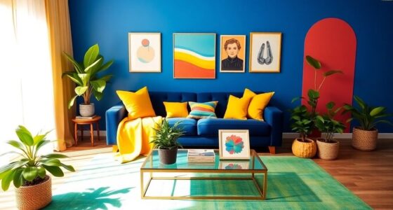
Color Contrast Techniques
By leveraging color contrast techniques, you can make a room feel more spacious and inviting. Using the color wheel, select complementary colors—colors opposite each other—that create vibrant contrasts. For example, pairing blue with orange or red with green enhances visual interest and depth, tricking the eye into perceiving more space. An accent wall painted in a bold, contrasting hue draws attention and adds dimension without overwhelming the room. To maximize this effect, consider the intensity and placement of your colors. Here’s a quick guide:
| Color Pair | Effect | Best Use |
|---|---|---|
| Blue & Orange | Adds depth, expands space | Accent walls, focal points |
| Red & Green | Creates energy, visual contrast | Smaller areas, details |
| Yellow & Purple | Brightens, enlarges perception | Walls, decorative panels |
| Teal & Coral | Modern, vibrant contrast | Feature sections |
| Black & White | Classic, sharp contrast | Trim, furniture accents |
Using these techniques, your room gains both dimension and style.
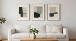
Colors That Make Your Room Look Bigger
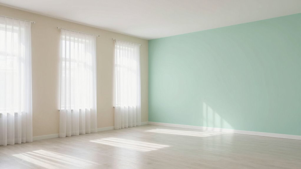
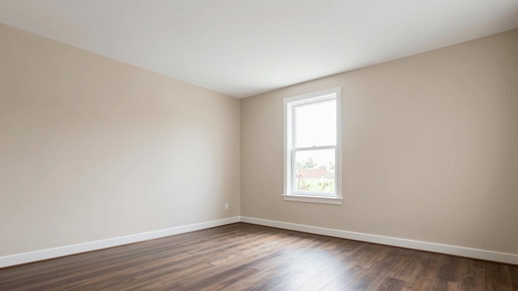
Light, neutral colors can instantly make your room feel more spacious. According to color psychology, soft shades like whites, beiges, and light grays create an open, airy atmosphere. These hues reflect more light, enhancing the sense of space. When choosing paint finishes, opt for matte or eggshell rather than glossy, as they diffuse light evenly and prevent reflections that can make a room seem smaller. Such finishes also give a smooth, seamless appearance, contributing to a larger feel. Avoid dark or overly saturated colors, which tend to absorb light and shrink the space visually. Instead, stick with these light, neutral tones for walls and ceilings to maximize the perception of openness, making your room feel more expansive and inviting. Incorporating light-reflective finishes can further amplify this effect by increasing the overall brightness. Additionally, selecting appropriate color placement can help optimize the perception of space and balance in your room. Proper color contrast can also be used strategically to highlight or de-emphasize certain areas, enhancing the open feel.
How Furniture and Decor Colors Influence Room Size Feelings
The colors you choose for furniture and decor can considerably influence how large or cozy your room feels. Using color psychology, bright or neutral tones on furniture can create a sense of openness and airiness, making the space appear bigger. Conversely, darker hues tend to make a room feel smaller and more intimate. Additionally, color choice impacts mood enhancement; cheerful, lively colors can energize the room, while subdued shades promote calmness. Coordinating furniture and decor colors with wall tones helps maintain visual harmony, preventing cluttered or cramped feelings. By strategically selecting colors that align with your desired atmosphere, you can manipulate the perception of space, making your room feel more expansive or snug without physical changes. Understanding color psychology can help you harness the emotional effects of different hues to optimize your space’s ambiance.
Practical Tips for Choosing Colors to Make Your Room Look Bigger

Are you wondering how to make your room appear larger through color choices? Focus on color psychology to select shades that expand space visually. Light, neutral tones like whites, soft grays, or pastel hues reflect more light, creating an airy feel. When choosing paint, consider textures—smooth finishes enhance brightness, while matte textures can make walls seem closer. Here are some practical tips:
- Opt for light colors on walls to maximize light reflection.
- Use darker shades sparingly for accents, avoiding overpowering the space.
- Incorporate a monochromatic palette for a seamless, expansive look.
- Choose paint textures that reflect light evenly for a more open atmosphere.
These strategies help your color choices work together to make your room feel bigger and more inviting.
Common Mistakes to Avoid When Planning Your Color Scheme

When planning your color scheme, it’s easy to make mistakes that can undermine your room’s visual appeal. One common error is ignoring color psychology; choosing colors based solely on personal preference might not create the desired mood or perceived space. Another mistake is selecting inconsistent paint finishes, which can result in uneven textures and a cluttered look. You should also avoid overusing bold or dark colors on all walls, as this can make a room feel smaller or cramped. Instead, consider balancing accent walls with lighter shades. Additionally, neglecting how lighting interacts with your chosen colors can distort their impact. Always test paint samples in different lighting before committing, ensuring your color scheme enhances your space’s size and atmosphere.
Frequently Asked Questions
How Does Natural Light Influence Color Perception in Small Rooms?
Natural light greatly influences how you perceive colors in small rooms. It increases light reflection, making colors appear brighter and more vibrant, which can make the space feel larger. The color temperature of natural light also affects perception; warm light enhances cozy tones, while cool light emphasizes cooler hues. By understanding these effects, you can choose colors that work with your natural light, creating a more open and inviting atmosphere.
Can Color Placement Tricks Work in Rooms With High Ceilings?
Imagine you’re in a spaceship steering a galaxy of high ceilings. Yes, color placement tricks work well here too. Using strategic color contrast on walls and ceiling can visually lower the height, making the space feel more cozy. Lighter shades on the ceiling and darker tones on walls trick the eye, balancing the tall ceiling height and creating a more inviting atmosphere. So, don’t hesitate to experiment with your color placement.
Do Different Color Schemes Work Better in Specific Room Types?
Yes, different color schemes suit specific room types best. Using color psychology, you can choose calming blues for bedrooms to promote relaxation, or vibrant yellows for kitchens to energize the space. Pair this with smart furniture arrangement to maximize space and flow. For example, light colors in small rooms make them seem larger, while darker shades add coziness in larger areas. Tailoring colors and furniture placement enhances each room’s purpose and feel.
How Often Should I Repaint to Maintain the Illusion of Space?
Think of repainting as giving your room a fresh pair of shoes; it keeps everything looking sharp. You should consider seasonal repainting and paint touch-ups every 1-2 years to maintain the illusion of space. Regular updates refresh your walls and prevent dullness, helping your room feel larger. Don’t wait too long—touch-ups and seasonal repainting keep your space feeling vibrant and open year-round.
Are There Color Combinations That Universally Make Rooms Appear Larger?
Yes, certain color combinations can make your room look larger. Opt for high color contrast with cool and neutral tones to create depth, making the space feel more open. Avoid warm tones that tend to recede, but if you prefer warmth, use them sparingly with contrast to prevent shrinking the room. Light shades on walls paired with darker accents or contrasting trim work wonders for an expansive feel.
Conclusion
By thoughtfully selecting and placing colors, you can subtly enhance your room’s perceived size and elegance. Remember, the right hues and contrasts gently guide the eye, creating a sense of spaciousness without overwhelming the senses. A well-considered palette acts as a refined whisper, transforming your space into a more open and inviting retreat. With a little patience and finesse, your room can effortlessly feel larger, more harmonious, and truly yours.