To create an age-friendly home, choose calming colors like pastel shades and natural tones that promote relaxation. Use high contrast between walls and doorways, furniture, or stairs to improve visibility and safety. Incorporate ample lighting to highlight these contrasts and reduce shadows. Select furniture with simple shapes and striking colors to help locate items easily. Paying attention to balancing calm palettes with clear visual cues guarantees a safe and soothing environment—discover how to optimize your space further.
Key Takeaways
- Use high-contrast colors, such as white doors against darker walls, to improve visibility and object recognition.
- Opt for calming, muted color palettes to create a relaxing environment that reduces stress.
- Incorporate contrasting furniture and décor to serve as visual anchors and aid navigation.
- Ensure proper lighting enhances contrasts and highlights key features, supporting safety and clarity.
- Select simple, sturdy furniture with distinct colors to prevent confusion and promote stability.
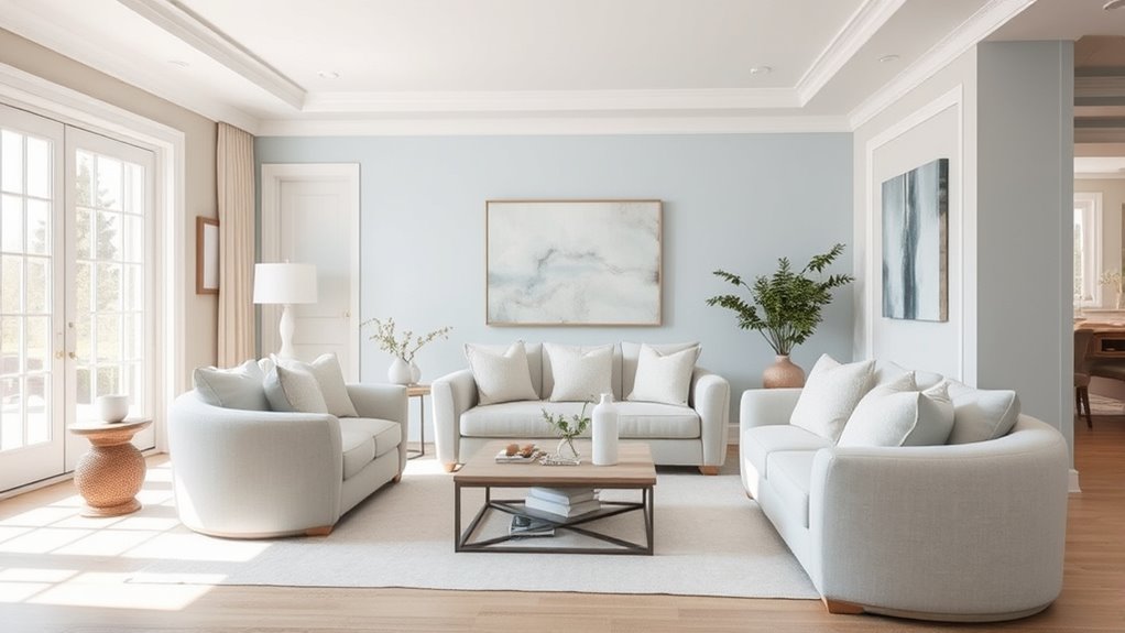
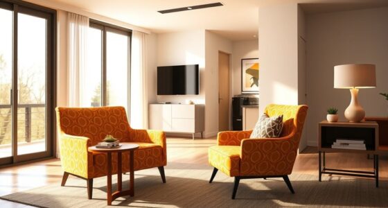
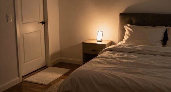
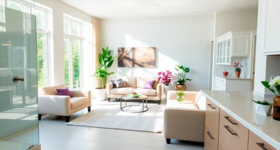
Choosing the right colors for an age-friendly home can make a significant difference in safety and comfort. When you’re designing or updating your space, it’s essential to consider how color impacts visibility and mood. A well-thought-out color palette can help you navigate your home more easily, reducing the risk of accidents and creating a calming environment. One key aspect is contrast. By selecting colors that stand out against each other, you improve visual cues, making it easier to distinguish doorways, stairs, and furniture. For example, a white door against a darker wall provides a clear boundary, so you don’t accidentally bump into it. This principle extends to lighting design as well—placing lights to highlight contrasts or features can prevent missteps in dimly lit areas. Bright, well-placed lighting not only enhances contrast but also minimizes shadows, which can cause confusion or disorientation. Engaging in a consistent color scheme throughout your home also supports visual perception and helps create a cohesive, easily navigable environment. Furniture selection plays a vital role in reinforcing contrast and enhancing safety. Choose pieces with distinct colors or finishes that contrast with the floor and walls. For instance, a dark-colored armchair on a light carpet creates a visual anchor, helping you locate seating easily. Avoid furniture with overly similar shades to the surrounding surfaces, as this can make objects blend into the background, increasing the risk of trips or falls. The goal is to create a harmonious yet clearly defined environment where everything is easy to see and reach. Additionally, opting for furniture with simple shapes and sturdy construction minimizes confusion and provides stability when you sit or stand. When selecting furniture, consider how color and design can work together to guide your movement smoothly through each room, reducing cognitive load and enhancing safety. Keep in mind that color choices influence perception, so a calm, muted palette can foster relaxation, while strategic contrasts keep the space visually engaging and safe. Incorporate lighting design techniques that emphasize these contrasts, such as layered lighting or task lights, to ensure every corner is well-lit and visually accessible. When choosing colors and furniture, think about how they interact with your lighting setup—both natural and artificial—to create a balanced, age-friendly environment. Ultimately, your goal should be to craft a home that feels both secure and soothing, where contrasting colors and thoughtful furniture selection work together to support independence and ease of movement.
Frequently Asked Questions
How Do Color Choices Impact Cognitive Function in Seniors?
You can enhance cognitive function in seniors by choosing colors with good contrast, which helps them distinguish objects and navigate spaces more easily. Using color contrast in key areas promotes cognitive stimulation by encouraging engagement and awareness of their environment. Calm, muted tones reduce confusion and anxiety, supporting mental clarity. Thoughtful color choices create a supportive, accessible home that actively benefits seniors’ cognitive health and overall well-being.
Can Color Schemes Reduce Anxiety and Improve Mood?
Yes, color schemes can reduce anxiety and improve mood. Bright, calming colors like soft blues and greens promote relaxation, supporting mental health benefits and emotional well-being. You’ll notice that using these soothing tones in your home creates a peaceful environment, helping you feel more comfortable and less stressed. By choosing the right colors, you actively foster a positive mood and enhance your overall mental health.
Are There Specific Colors Recommended for Visual Impairments?
You need high contrast palettes and muted tones for visual impairments; they’re like a lighthouse guiding you through fog. Bright, bold colors with stark differences help distinguish objects and pathways clearly, reducing confusion and accidents. Muted tones prevent overwhelming glare while maintaining contrast. Choosing these colors makes your environment safer and more accessible, ensuring you can navigate comfortably and confidently without the chaos of clashing or overly bright hues.
How Do Lighting Conditions Affect Color Perception in Elderly Homes?
Lighting conditions profoundly impact how colors are perceived in elderly homes. Natural light enhances true color perception, making spaces feel brighter and more inviting, while insufficient or artificial lighting can distort colors, causing confusion or difficulty in distinguishing objects. To create a comfortable environment, you should maximize natural light during the day and use well-placed, adjustable artificial lighting that mimics natural light, ensuring consistent and accurate color perception for residents.
What Are the Best Color Combinations for Small, Cluttered Spaces?
Imagine your small space as a canvas waiting for clarity. Opt for high color contrast—pair light walls with darker furniture, or vice versa—to create visual boundaries. This technique enhances spatial perception, making the room feel larger and more organized. Stick to calm, neutral tones with pops of color for accents, avoiding cluttered patterns. These combinations help your space breathe, feel inviting, and prevent it from becoming overwhelming.
Conclusion
Choosing the right colors can transform your home into a safe, calming space. But have you considered how subtle contrasts might reveal hidden dangers or create unforeseen challenges? The perfect palette isn’t just about soothing tones—it’s about balancing calm with clarity. Stay tuned, because the next step in creating an age-friendly home could change everything you thought you knew about color. Are you ready to uncover the secret to truly welcoming, safe living spaces?