
To add a pop of color without overwhelming your space, focus on balance and thoughtful pairing. Use neutral backgrounds or muted tones to let your accent hues stand out. Incorporate small pieces like cushions, vases, or artwork to create focal points without cluttering. Mix textures and materials to add depth, and choose colors that support the mood you want to create. Continue exploring these ideas to master subtle, stylish use of accent hues.
Key Takeaways
- Use neutral or muted backgrounds to let accent hues stand out without overwhelming the space.
- Incorporate small, intentional accent pieces like pillows or artwork rather than covering all surfaces.
- Pair bold accent colors with complementary or soft neutrals to maintain visual harmony.
- Mix textures and materials to add depth and prevent accents from feeling flat or overpowering.
- Choose accent hues that support the desired mood, such as warm tones for coziness or cool shades for calmness.

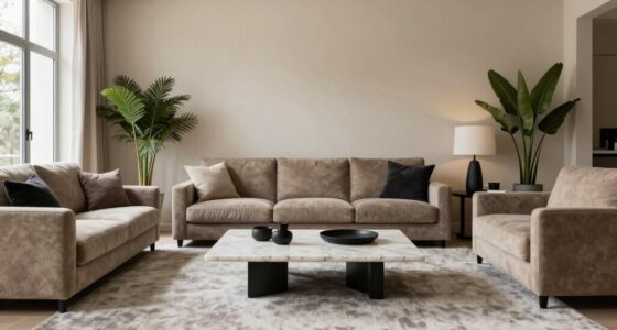
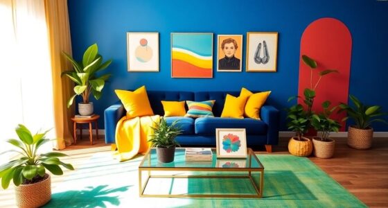
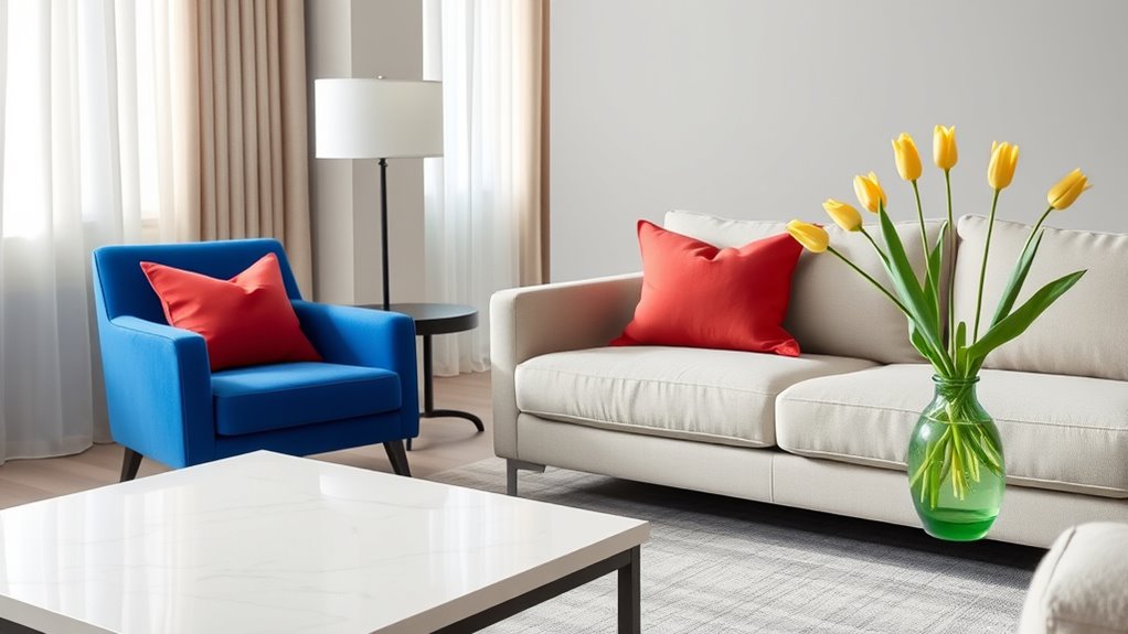
Adding accent hues to your space can elevate its style, but if overdone, it risks overwhelming the room. The key is finding the right balance between boldness and restraint. When it comes to incorporating a pop of color, thoughtful color pairing plays a vital role. Instead of choosing hues that clash or compete, select shades that complement each other and blend seamlessly into your existing decor. Soft neutrals, pastels, or muted tones can serve as perfect backgrounds, allowing your accent hues to stand out without dominating the entire space. The goal is to create a visual anchor that draws attention without overwhelming the senses.
Subtle integration is essential when introducing these accent hues. You don’t need to paint every wall or cover every surface with vibrant color. Instead, focus on small, intentional touches—such as throw pillows, vases, artwork, or rugs—that add just enough contrast to catch the eye. These accents should enhance the room’s overall aesthetic rather than overpower it. For example, a single bold cushion on a neutral sofa or a colorful piece of artwork on a plain wall can serve as a focal point, adding personality without cluttering the space. The idea is to keep the dominant palette calm and let the accent hues act as delightful surprises.
Layering different textures and materials can further amplify the effect of your accent hues while maintaining subtlety. Consider pairing a bright throw with a textured throw blanket or a vibrant vase with a sleek, matte surface. This mix of textures prevents your accents from feeling flat and adds depth to your design. When you select your hues, keep in mind the mood you want to evoke. Warm tones like terracotta or mustard can create a cozy atmosphere, whereas cooler shades like teal or lavender evoke calmness. By carefully choosing your color pairing, you guarantee the hues enhance your space rather than clash or create visual chaos.

MIULEE Pack of 4 Couch Throw Pillow Covers 18×18 Inch Neutral Soft Decorative Chenille Pillow Covers Farmhouse Boho Cushion Covers for Mid Century Modern Spring Home Decor Sofa Bedroom Living Room
Premium Chenille: Crafted from substantial, high-grade chenille, these decorative pillow covers offer a luxuriously soft, velvety touch and…
As an affiliate, we earn on qualifying purchases.
As an affiliate, we earn on qualifying purchases.
Frequently Asked Questions
How Do I Choose the Right Accent Color for My Space?
To choose the right accent color, start by consulting the color wheel to find complementary or analogous hues that enhance your space. Consider the mood you want to create—calm, energetic, cozy—and pick a color that matches that vibe. Test different shades in small areas first, and verify they harmonize with your main colors, creating a balanced yet lively look without overwhelming the room.
Can Small Rooms Handle Bold Accent Hues Effectively?
Sure, small rooms can totally handle bold accent hues—if you don’t go overboard with wall art and decorative pillows. Think of the space as a stage; a striking wall art piece or a few vibrant pillows can add personality without overwhelming. Keep the rest of the decor simple, and let those accent hues shine. Remember, less is more—unless you’re aiming for a chaotic art gallery.
What Are Common Mistakes When Incorporating Pop of Color?
You often make the mistake of clashing hues, which can create a chaotic look instead of a cohesive one. Overusing bright colors is another common error, overwhelming your space rather than highlighting it. To avoid these pitfalls, balance bold accents with neutral tones and stick to a limited palette. This way, your pop of color remains striking without overpowering your room’s overall aesthetic.
How Can I Update Accents Seasonally Without Redecoration?
Think of your space as a garden; you can change its colors without planting new flowers. You can update accents seasonally with simple seasonal pillow swaps and decorative accessory updates. These small changes refresh your look, much like changing blooms in a garden, keeping your style lively without a full overhaul. It’s easy to keep your space feeling fresh, vibrant, and seasonally appropriate with just a few thoughtful updates.
Are There Any Color Combinations to Avoid When Adding Accents?
You should avoid clashing hues and unbalanced palettes when adding accents. Steer clear of pairing very bright colors with muted tones that don’t complement each other, as this can create visual tension. Also, avoid mixing too many bold shades at once, which can overwhelm the space. Instead, choose colors that harmonize well, like analogous or complementary schemes, to keep your accents lively yet balanced.

Modern Ceramic Vase Set, Earth Tone Natural Color Ribbed Matte Design, 3-Piece Decorative Vases for Home, Living Room, Office (Coffee Mix)
MODERN DESIGN: Set of three coffee color mix ceramic vases featuring elegant ribbed texture and clean lines for…
As an affiliate, we earn on qualifying purchases.
As an affiliate, we earn on qualifying purchases.
Conclusion
By balancing your accent hues thoughtfully, you turn your space into a symphony of color rather than a chaotic splash. Think of these pops of color as the punctuation in your design story—adding just the right emphasis without overwhelming. When you sprinkle in these hues with intention, you create harmony that’s both vibrant and inviting. Remember, a little color goes a long way—like a whisper that leaves a lasting impression.
Gooyule Metal Flower Wall Art – Colorful Floral Decor for Indoor Outdoor Hanging – Home Office Garden Yard Wall Decoration Set (Metal Flower Decor A)
【Colorful Metal Wall Decor Set】You will get 4 pcs blooming metal flowers in different colors. Vivid and vibrant…
As an affiliate, we earn on qualifying purchases.
As an affiliate, we earn on qualifying purchases.

MIULEE Textured Throw Pillow Covers Thick Chenille Decorative Pillows Cream White 18×18 Inch Set of 2 Modern Boho Farmhouse Home Decor Neutral Cushion Covers for Couch Sofa Living Room Bedroom
Enhanced Slubby Texture: MIULEE decorative pillowcases feature a pronounced coarse-woven texture, highlighted by a distinct grid-like pattern that…
As an affiliate, we earn on qualifying purchases.
As an affiliate, we earn on qualifying purchases.