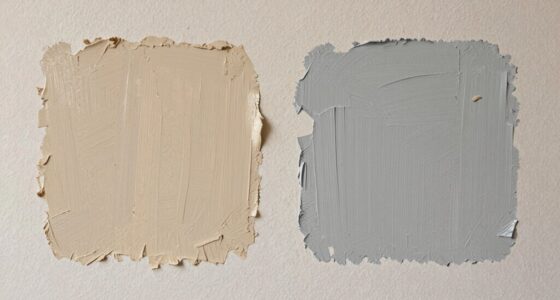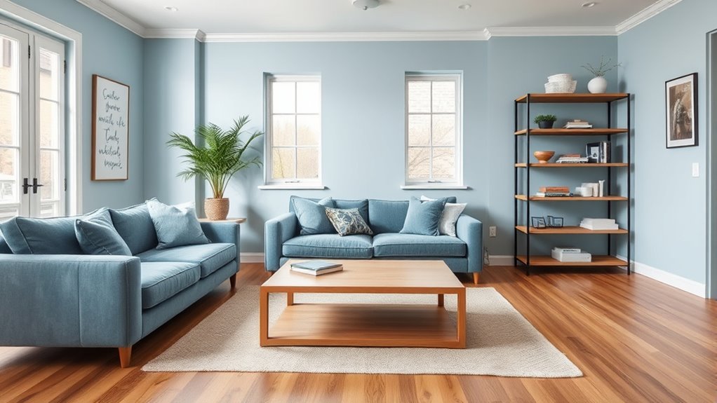

To create a cohesive look, match your wall colors with your furniture by considering style and mood. For modern pieces, opt for neutral or cool tones like gray or navy, which enhance a sleek feel. Traditional or rustic furniture pairs well with warm shades like beige or terracotta, adding warmth. Play with contrast or harmony to balance your space, and test colors in different lighting to see how they complement your furniture. Keep exploring to discover more tips for achieving perfect coordination.

Get furniture and decor delivered free — and shop member deals
- Fast, free delivery on millions of items
- Access to Prime Big Deal Days deals on October 6–7
- Prime Video, Amazon Music and more included
Key Takeaways
- Match wall colors with furniture style and mood to create a cohesive and harmonious room aesthetic.
- Use neutral or cool tones for modern furniture, and warm shades for traditional or rustic pieces.
- Consider contrasting or complementary colors to highlight furniture or unify the space effectively.
- Test paint samples under natural and artificial lighting to ensure colors enhance both furniture and room ambiance.
- Align wall color choices with room function and desired atmosphere, guided by color psychology principles.
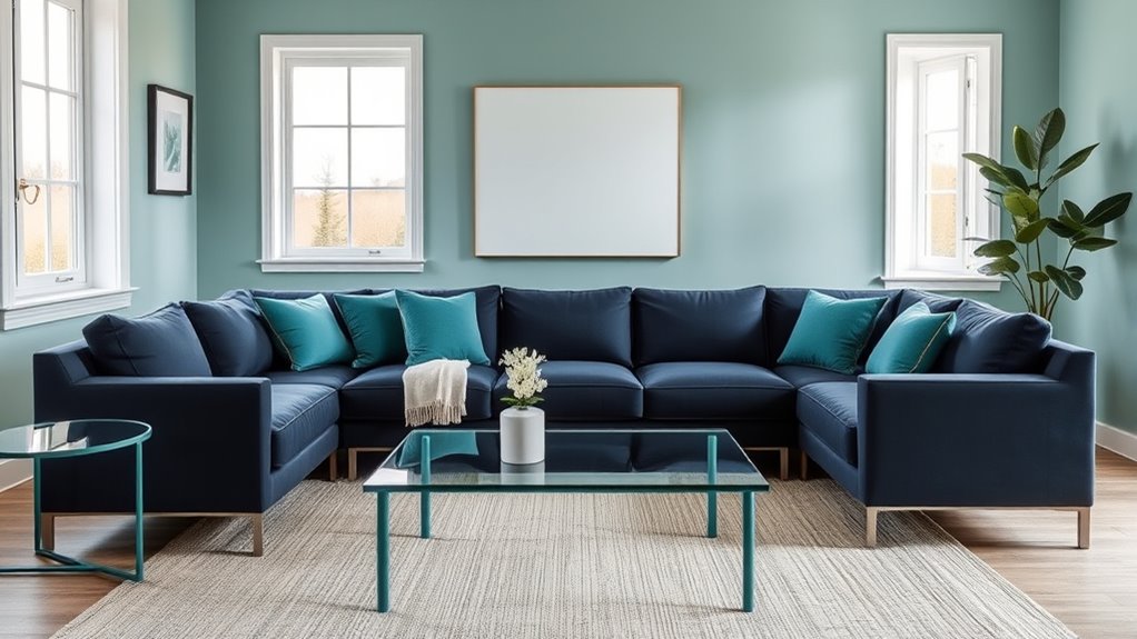
Choosing the right wall color can dramatically enhance your furniture and create a cohesive look in any room. When you pick a color, it’s essential to contemplate how it aligns with your furniture style and the emotions you want the space to evoke. Color psychology plays a significant role here—certain hues can make a room feel calm, energetic, or sophisticated, depending on what you’re aiming for. For example, if your furniture features sleek, modern lines, a neutral or cool-toned wall color like soft gray or navy can highlight that contemporary aesthetic. Conversely, if your furniture has a more traditional or rustic style, warm shades like beige, terracotta, or muted gold can complement those textures and details. Incorporating rustic decor elements can further unify the look by emphasizing the farmhouse charm. Your furniture style should guide your color choices because different styles evoke different moods and atmospheres. For minimalist furniture, clean and understated wall colors tend to work best, ensuring a quiet background that emphasizes the simplicity of the pieces. Think about using shades of white, light taupe, or soft pastels—these create a sense of openness and serenity. For more ornate or vintage furniture, richer tones like deep reds, forest greens, or jewel tones can enhance the intricate details and bring a sense of warmth and richness to the space. When matching wall colors with furniture, it’s not just about aesthetics; it’s about creating a balanced environment where each element supports the other. Another key aspect is understanding how color psychology influences perception. Bright colors like yellows and oranges energize a space and make furniture pop, which is great for activity areas like kitchens or playrooms. Meanwhile, cool shades such as blues and greens tend to soothe and relax, making them ideal for bedrooms or living rooms where comfort is a priority. If you want your furniture to stand out, choose a wall color that provides contrast but still harmonizes with the overall palette. If you prefer a more unified look, opt for shades that are complementary or monochromatic. Finally, don’t forget to test your choices before committing. Paint small sections of the wall and observe how they look at different times of day, considering natural and artificial lighting. This will help you see how the color interacts with your furniture and adjust accordingly. When you deliberate color psychology and furniture style together, you’ll be able to select wall colors that not only match aesthetically but also create the ambiance you desire. The right combination transforms your space into a harmonious retreat where furniture and walls work seamlessly to reflect your personality and style.
neutral wall paint for modern furniture
As an affiliate, we earn on qualifying purchases.
As an affiliate, we earn on qualifying purchases.
Frequently Asked Questions
How Do I Choose Wall Colors for a Small Room?
To choose wall colors for a small room, consider color psychology—light, neutral shades can make the space feel larger and more open. Opt for matte or eggshell paint finishes to reduce glare and add softness. You should also test paint samples on your walls before committing, ensuring the shades complement your furniture and lighting. This way, your small room feels inviting, balanced, and visually expanded.
What Colors Make a Room Appear Larger?
Colors like soft blues, light grays, and creamy whites are your best bet—they make a room feel like it’s stretching endlessly, like a clear sky. Using light shades enhances color psychology, creating a calming, open vibe. Opt for minimal color contrast to avoid breaking up the space visually. You’ll want to keep walls and furniture in harmonious tones, making your small room appear larger and more inviting.
How Can I Match Wall Colors With Patterned Furniture?
To match wall colors with patterned furniture, you should focus on pattern mixing and color contrast. Pick a wall color that complements one of the dominant shades in your furniture without overwhelming the pattern. Use neutral or solid wall colors to create balance, and consider contrasting hues to make patterns pop. This approach helps your space feel cohesive while highlighting your furniture’s unique design.
What Are Trending Wall Color Palettes for 2024?
In 2024, trending wall color palettes include soothing neutrals like warm beige and soft greys, which align with color psychology to promote calmness. Bold jewel tones, such as emerald and sapphire, are also popular for their richness. You should consider paint texture trends like matte finishes for a modern look. These palettes help you create a balanced, inviting space that complements your furniture while staying on trend.
How Do Lighting Conditions Affect Wall and Furniture Color Coordination?
Ever wonder how lighting conditions influence your room’s vibe? Natural light enhances true colors, making your furniture and walls look vibrant and lively. Artificial lighting can cast warm or cool tones, changing how colors appear. You should consider both when choosing your palette. For example, a room with ample natural light may suit bold hues, while dimmer spaces might benefit from softer, warmer shades to create a cozy atmosphere.
Conclusion
Imagine stepping into a room where everything feels just right, like a perfectly choreographed dance. When your wall colors match your furniture, it’s as if the space whispers harmony. Think of it like a painter blending shades seamlessly—each element complements the next, creating a cozy yet stylish haven. When you coordinate your colors thoughtfully, you turn your home into a masterpiece that reflects your personality and style effortlessly.
Fall Picks
fall essentials
As an affiliate, we earn on qualifying purchases.