
To make your home safer and more accessible, focus on creating strong color contrasts that highlight key features like stair edges, doorways, and handles. Use bold tones paired with neutral backgrounds, and enhance contrast with appropriate lighting to improve visibility. Combining vibrant colors with good lighting guides movement naturally and prevents accidents. Keep in mind that balancing safety with aesthetic appeal is key—exploring these strategies further will help you design a space that’s both beautiful and secure.
Key Takeaways
- Use high-contrast color combinations, like dark borders with light backgrounds, to enhance visibility and safety.
- Pair bold, vivid colors with neutral tones to create clear distinctions and reduce visual confusion.
- Incorporate strategic lighting to accentuate contrast and improve the perception of key safety features.
- Ensure color contrasts meet accessibility standards, such as sufficient luminance differences for those with visual impairments.
- Balance aesthetic appeal with safety by emphasizing important features through intentional color contrast and proper lighting.
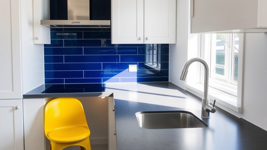
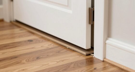
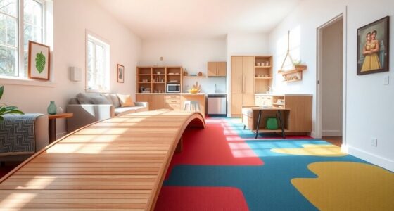
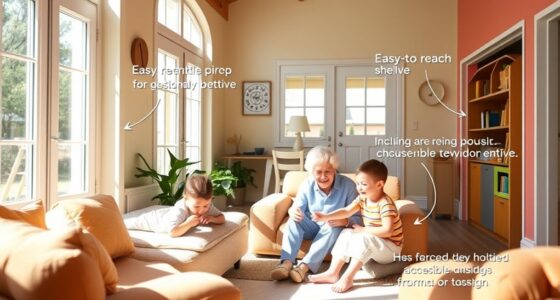
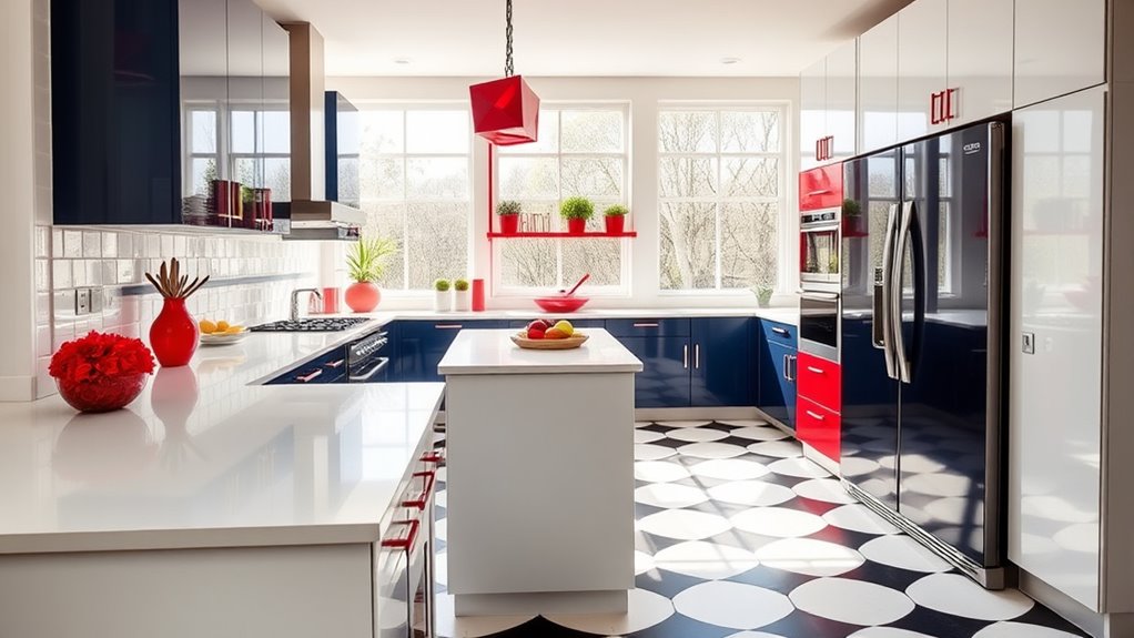
Have you ever wondered how some designs instantly grab your attention? The secret often lies in the effective use of contrast, which not only creates visual interest but also enhances safety and accessibility in your home. When you incorporate contrast thoughtfully, you guide the eye naturally, making important features stand out and ensuring that every space feels both inviting and functional. One essential element to consider is visual harmony. You don’t want your contrast to feel jarring; instead, it should complement the overall style and color palette of your home. Achieving this balance involves selecting colors that work well together while emphasizing key areas or features. For example, pairing deep, dark shades with lighter hues creates a striking difference that’s easy to perceive, especially for those with visual impairments. Consistency in color relationships helps maintain visual harmony while still providing enough contrast to serve your safety needs. Additionally, understanding safe sleep environments can inform how you choose colors and contrast for areas like bedrooms to promote better safety and comfort. Lighting techniques play an indispensable role in enhancing contrast effectively. Proper lighting can make the difference between a space that feels dull or chaotic and one that feels vibrant and safe. Use a mix of ambient, task, and accent lighting to highlight contrast points within your home. For instance, installing brighter lighting around staircases or uneven flooring ensures these areas are clearly visible, reducing trip hazards. Similarly, using focused lighting on doorways or handles can help differentiate them from the background, making navigation easier for everyone, especially those with limited vision. Adjustable lighting fixtures also give you control, allowing you to adapt the environment to different needs or times of day. When you combine strategic lighting with contrasting colors, you create a dynamic visual hierarchy that naturally guides movement and attention, leading to a safer, more accessible living space. In designing with contrast, remember that visual harmony and lighting techniques go hand in hand. The goal is to craft spaces where contrast is enough to be functional without overwhelming the senses. Think about the color choices you make—pairing bold tones with neutral backgrounds can achieve this balance beautifully. Use lighting to enhance these choices, ensuring that contrast is visible in various lighting conditions. This thoughtful approach not only boosts aesthetic appeal but also improves safety, making your home more welcoming and accessible for everyone. By paying attention to how contrast interacts with lighting and overall design, you’re creating an environment that’s both eye-catching and practical. Ultimately, the right combination of visual harmony and lighting techniques makes your home safer, more functional, and visually compelling.
Frequently Asked Questions
How Do I Choose the Best Color Combinations for Visual Contrast?
When choosing color combinations for visual contrast, focus on creating strong visual hierarchy by pairing colors that differ markedly in hue, brightness, or saturation. Use color harmony principles to balance bold contrasts with harmonious tones, ensuring your space remains inviting. Test your choices in different lighting conditions to see how they interact. This way, you’ll enhance safety and accessibility while maintaining an appealing aesthetic that guides attention effectively.
What Are Common Mistakes to Avoid When Using Contrasting Colors?
When using contrasting colors, avoid common mistakes like color clash, which can create visual chaos, and overuse of contrast, making spaces feel harsh or overwhelming. You might also neglect to take into account lighting, causing colors to appear differently than intended. Keep contrast balanced, sticking to a few complementary shades, and test your choices in different lighting to ensure they enhance safety and accessibility without causing discomfort.
How Does Contrast Improve Safety for Individuals With Visual Impairments?
Imagine someone with low vision maneuvering your home. Contrast improves safety by making key features, like steps or doorframes, stand out. Proper lighting considerations highlight these contrasts, preventing trips. Tactile cues, like textured strips on stairs, offer additional guidance. Without contrast, obstacles blend into surroundings, increasing fall risks. By using contrasting colors and thoughtful lighting, you create a safer environment where individuals can move confidently and independently.
Are There Specific Color Guidelines for Different Rooms or Spaces?
You should consider color psychology and lighting effects when choosing colors for different rooms. For example, calming blues work well in bedrooms, while energizing yellows suit kitchens. Bright, contrasting colors improve visibility and safety, especially in high-traffic areas. Use lighting effects to enhance these contrasts, making spaces easier to navigate. Tailoring colors to each room’s purpose helps create a safe, functional, and visually appealing environment.
How Can Contrast Be Balanced With Interior Design Aesthetics?
To balance contrast with interior design aesthetics, you should focus on lighting harmony and texture balancing. Use lighting to highlight contrasting elements without overwhelming the space, creating a warm, inviting atmosphere. Incorporate different textures to soften or accentuate contrast, making it visually appealing. This approach helps you maintain a cohesive look while ensuring the contrast enhances safety and accessibility, all without sacrificing your home’s style and ambiance.
Conclusion
By using contrast thoughtfully, you’re painting your home with a safety net woven from vibrant clarity. It’s like giving your space a secret language that guides the eye and prevents missteps, making everyday living smoother and safer. Remember, a splash of bold color isn’t just style—it’s your home’s way of speaking loudly and clearly. Embrace contrast, and watch your space transform into a sanctuary where safety and beauty dance hand in hand.