
The 60 30 10 rule is a simple way to create balanced, inviting spaces by dividing your colors into proportions: 60% for the main, neutral background, like beige or gray; 30% for secondary colors that add contrast and warmth; and 10% for bold accents like pillows or artwork that give your room pops of color. This helps everything feel harmonious without overwhelming. Curious about how to pick the best shades? Keep exploring to find out more.
Key Takeaways
- The 60 30 10 Rule is a simple way to balance colors in interior design for a harmonious look.
- 60% is the dominant color, forming the background or foundation of the space.
- 30% is the secondary color, adding contrast and interest without overwhelming.
- 10% is the accent color, used for pops of bold or vibrant hues to draw attention.
- It helps create a cohesive, inviting environment by guiding how much of each color to use.

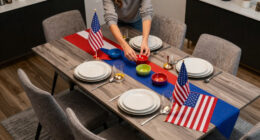
The 60 30 10 Rule is a simple yet powerful guideline for achieving balanced and visually appealing color schemes in your designs. It’s a straightforward way to apply color theory without needing to be a professional designer. When you’re working on interior coordination, this rule helps you create spaces that feel harmonious and inviting. Fundamentally, it’s about dividing your color palette into proportions: 60% of a dominant color, 30% of a secondary color, and 10% of an accent color. This breakdown guides you in choosing colors that complement each other, guaranteeing your space doesn’t feel chaotic or overwhelming.
The 60 30 10 Rule creates balanced, harmonious color schemes for inviting, visually appealing interior spaces.
You start by selecting your primary color, which should cover about 60% of your space. Think of this as the backdrop or the foundation of your design. It could be a neutral tone like beige, soft gray, or even a muted blue—colors that set the mood without overpowering. This choice is vital because it anchors the entire color scheme and influences the overall atmosphere. When you understand color theory, you realize that dominant colors set the emotional tone, so pick one that aligns with the feeling you want in the room, whether calm, energetic, or cozy.
Next, you add the secondary color, making up roughly 30%. This color should harmonize with the primary but add a bit of contrast or variation to keep things interesting. For example, if your main color is a soft gray, a richer navy or warm taupe could serve as your secondary. The key is for these colors to work well together, enhancing interior coordination. By adhering to the 30% rule, you avoid clashing or overwhelming the space. Instead, you create a layered look that feels natural and balanced. This is where understanding color relationships—such as complementary or analogous colors—becomes especially useful. Additionally, understanding color relationships can help you make more confident choices that enhance your overall design. Recognizing how different hues interact is also fundamental to creating cohesive and visually appealing color schemes.
Finally, you introduce an accent color at about 10%. This is where you can be bold, choosing a vibrant hue or a contrasting shade to add pops of interest. It could be a bright yellow pillow, a vivid piece of artwork, or decorative accessories. The small proportion ensures it draws attention without dominating the room. Using this small dose of color effectively relies on knowing how accent colors interact with the dominant and secondary hues, which ties back into your grasp of color theory.
neutral beige gray wall paint
As an affiliate, we earn on qualifying purchases.
As an affiliate, we earn on qualifying purchases.
Frequently Asked Questions
How Flexible Is the 60 30 10 Rule in Different Design Styles?
The 60 30 10 rule is quite flexible across design styles because you can adapt it with color psychology and material contrast. For example, in modern spaces, you might use bold accent colors and sleek materials, while in rustic designs, earth tones and textured surfaces work well. You can tweak the proportions slightly to suit your aesthetic, making the rule a versatile guide that balances visual interest and harmony.
Can I Adjust the Percentages for Specific Project Needs?
Yes, you can definitely make project-specific adjustments to the 60 30 10 rule. If your project calls for custom color palettes or a different balance, feel free to tweak the percentages. Flexibility is key, so consider your design goals and audience. Adjusting these ratios helps tailor the aesthetic to your needs, making your design more cohesive and impactful while still maintaining a balanced visual hierarchy.
Does the Rule Apply to Both Interior and Exterior Design?
Yes, the 60 30 10 rule applies to both interior and exterior design. Imagine 60% of your space filled with dominant colors influenced by color psychology, boosting mood and perception. You then incorporate 30% of accent materials, like textured finishes, and 10% of bold or surprising elements. This balance guides your material selection and color choices, creating harmony and visual interest whether inside or outside your home.
How Does the Rule Influence Color Harmony and Mood?
The 60 30 10 rule influences color harmony and mood by creating balanced color contrast that guides emotional impact. Using 60% of a dominant color sets the overall tone, while 30% of a secondary color adds contrast, and 10% of an accent color creates focal points. This harmony fosters a cohesive atmosphere, affecting feelings—calm, energized, or sophisticated—by thoughtfully balancing colors to evoke the desired emotional response.
Are There Common Mistakes to Avoid When Using This Rule?
You should avoid overusing one color or neglecting balance, which can disrupt color theory and harm your design consistency. Don’t rely solely on the 60 30 10 rule without considering the overall mood or message, as this can lead to unharmonious results. Also, be cautious with contrasting colors; too much contrast can create visual tension instead of harmony, so always test how colors work together within your design.

MIULEE Pillows Inserts, Pack of 4 18×18 Inch 100% Virgin Microfiber Filling Throw Pillows for Bed Couch Sofa
Premiun Material: Utilizing 100% virgin filling and 110 GSM brushed fabric, offers a perfect blend of visual appeal…
As an affiliate, we earn on qualifying purchases.
As an affiliate, we earn on qualifying purchases.
Conclusion
Think of the 60-30-10 rule as your personal compass, guiding you through a vibrant forest of colors. The dominant hues lead the way, shaping your journey, while the secondary shades add depth and intrigue. The final touches, like tiny shimmering accents, complete the scene. By balancing these elements, you craft a harmonious landscape — your unique masterpiece. Follow this rule, and you’ll navigate your creative path with confidence, turning every project into a work of art.

HYBLOM Vintage Color-Mixing Chart Metal Tin Sign – Classroom Watercolor Painting necessity Poster, Art Gallery, Home Decor, and Painting Lovers 8×12 Inches
Comprehensive Guide for Artists: This color mixing chart poster is an essential tool for both beginners and experienced…
As an affiliate, we earn on qualifying purchases.
As an affiliate, we earn on qualifying purchases.

Utopia Bedding 18×18 Pillow Inserts, Set of 2, White – Indoor Decorative Throw Pillows for Bed, Sofa & Couch – Soft, Supportive & Fluffy Cushion Inserts
18 x 18 Pillow Inserts (Set of 2) – Offers a standard fit for 18×18 pillow covers and…
As an affiliate, we earn on qualifying purchases.
As an affiliate, we earn on qualifying purchases.