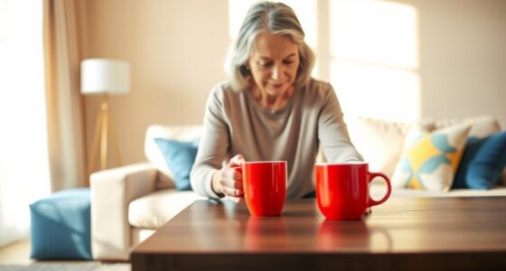
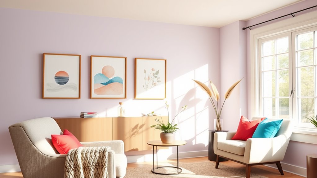
To soothe and inspire seniors at home, consider soft blues and greens for calming clarity, warm neutrals for cozy comfort, and gentle pinks or lavenders to uplift mood. Earth tones like browns and terracotta foster stability and connection, while bright accents such as yellow or turquoise stimulate creativity. Combining these colors with proper lighting and personalized touches creates an environment that nurtures emotional well-being. Keep exploring, and you’ll discover how to craft inspiring spaces that truly support your loved one’s comfort and energy.
Key Takeaways
- Soft blues and greens promote calmness, mental clarity, and reduce stress, creating soothing environments for seniors.
- Warm neutrals like beige, taupe, and warm greys foster cozy comfort and emotional security.
- Gentle pinks and lavenders uplift mood, promote positivity, and add relaxing energy to living spaces.
- Earth tones such as terracotta, soft greens, and browns evoke warmth, stability, and connection to nature.
- Bright accents like yellow or orange energize spaces, stimulate inspiration, and enhance visual interest through strategic use of color.
Soft Blues and Greens for Calm and Clarity
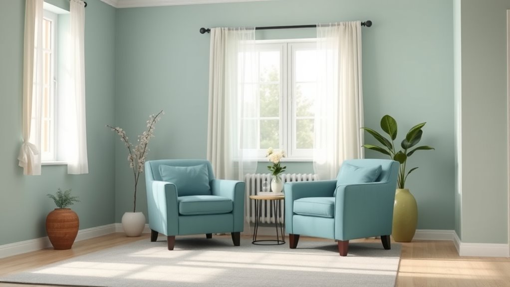
Soft blues and greens are ideal choices for creating a calming environment, especially for seniors who value peace and clarity. These colors promote mental relaxation by soothing the mind and reducing stress. When you choose soft blues, you encourage a tranquil atmosphere that helps clear mental clutter, making it easier to focus and feel at ease. Green shades foster a sense of renewal and balance, enhancing visual clarity by reducing eye strain and creating a fresh, open feel. Incorporating these colors into your home can transform your space into a sanctuary of calm, supporting mental well-being and clarity. Using color therapy techniques with soft blues and greens can further enhance the soothing effects of these hues. Additionally, understanding the impact of contrast ratio and proper lighting can optimize the calming environment you create. Being aware of regional preferences can also help tailor your space to better suit the needs of seniors in specific areas. Recognizing the influence of color psychology can help you select shades that promote relaxation and emotional well-being. With their gentle tones, soft blues and greens make everyday environments more serene and conducive to relaxation, which is especially beneficial for maintaining mental health in seniors.
Warm Neutrals to Create Cozy Comforts

Warm neutrals, such as beige, taupe, and warm greys, instantly create a sense of inviting comfort in any space. These shades serve as a perfect backdrop for your decor, making rooms feel cozy and relaxing. To maximize their calming effect, consider adding decorative wall art with soft textures or subtle patterns that complement your neutral palette. When choosing furniture color schemes, opt for pieces in warm wood tones or upholstered in beige and taupe fabrics to enhance the inviting atmosphere. Here are three ways to use warm neutrals effectively:
Warm neutrals create cozy, inviting spaces perfect for relaxing and decorating.
- Use beige or taupe walls as a neutral canvas for colorful or textured wall art.
- Combine warm greys with soft lighting for a soothing ambiance.
- Select furniture in matching warm neutrals to unify the space and promote comfort.
Additionally, incorporating glycolic acid products can help improve skin texture and radiance, contributing to overall well-being in a cozy home environment. Incorporating warm neutral tones in your decor can also subtly enhance the emotional comfort of residents, creating a truly nurturing environment. Research shows that best restaurants often feature warm, inviting color schemes to create memorable dining experiences, which can inspire similar approaches in home decor. A well-designed cozy atmosphere can significantly boost mood and provide residents with a sense of security and tranquility.
Gentle Pinks and Lavenders for Uplifting Energy
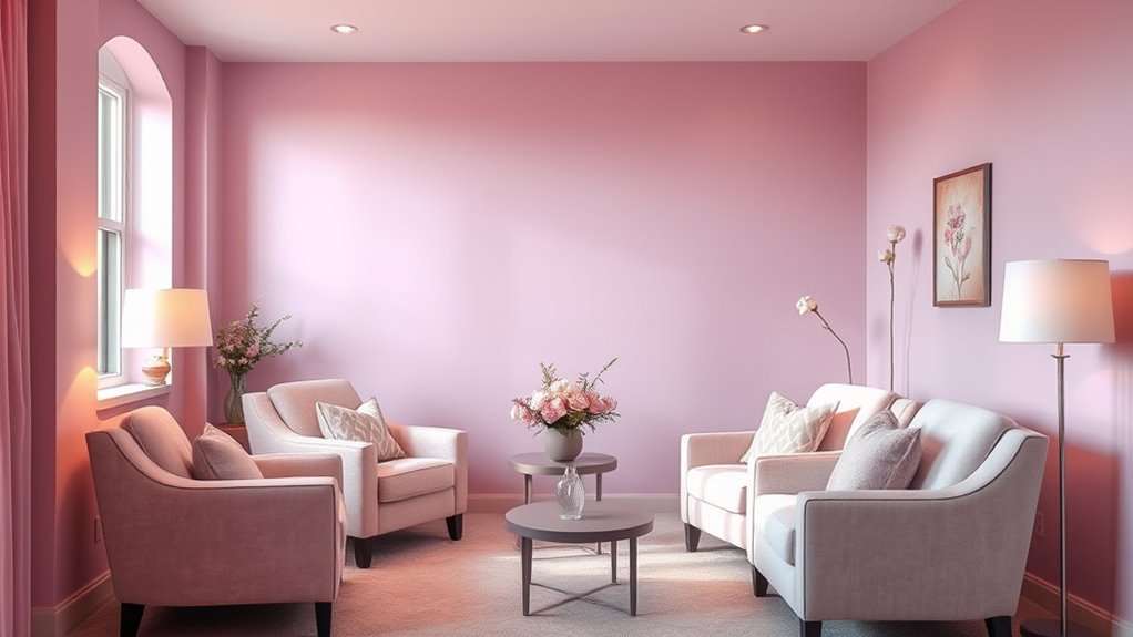
Gentle pinks and lavenders can brighten a senior’s home with uplifting energy that promotes positivity and calmness. These soft hues work well with artificial lighting, enhancing their soothing effects even during darker hours. To maximize their impact, add decorative accessories like plush cushions, vases, or artwork in matching shades. These accents reinforce the calming mood while injecting cheerful energy into the space. Keep the lighting warm and balanced to prevent the colors from feeling too dull or overwhelming. The combination of gentle pinks and lavenders creates an inviting atmosphere that lifts spirits and reduces stress. Incorporating color therapy principles can further enhance the calming and inspiring environment for seniors. By thoughtfully integrating these colors with suitable lighting and accessories, you help foster an environment that feels both inspiring and comforting for seniors. Additionally, choosing harmonious color combinations can deepen the soothing effect and create a cohesive, tranquil space. Being aware of support hours for resources or assistance can also contribute to a more relaxed and well-supported environment at home. Furthermore, understanding production quantity variance and other cost management concepts can lead to better resource allocation in home improvement projects, ensuring a balanced and efficient environment for caregiving. Incorporating multimedia tools such as calming music or guided imagery can further enhance relaxation and emotional well-being in senior living spaces.
Earth Tones to Foster Stability and Connection

Earth tones, with their natural hues and grounded presence, create a sense of stability and connection in a senior’s home. These nature-inspired palettes evoke feelings of warmth and familiarity, making spaces more comforting. You can incorporate cultural color symbolism to deepen their significance, such as using terracotta to symbolize resilience or olive green for harmony. To make your space truly soothing, consider these options:
Earth tones foster comfort and stability, symbolizing resilience and harmony in senior living spaces.
- Warm browns and beiges that mimic soil and sand, fostering security.
- Soft greens inspired by leaves, promoting calm and renewal.
- Muted terracotta or rust shades that evoke warmth and strength. Additionally, integrating water-inspired colors can enhance the tranquil atmosphere and promote relaxation, while also supporting a sense of serenity associated with natural environments. Incorporating color psychology principles can further enhance the calming and inspiring effects of these hues, especially when combined with grounding colors that help anchor the space. Using color symbolism can deepen the emotional impact of the palette and create a more meaningful environment.
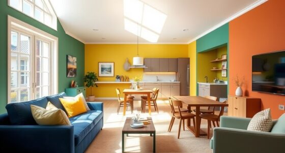
Bright Accents for Stimulating Inspiration
Adding bright accents to a senior’s home can energize the space and spark inspiration. Incorporate bold colors through wall murals or decorative accessories to create focal points that stimulate the mind. Pair these accents with strategic artificial lighting, like adjustable lamps or spotlights, to enhance their vibrancy and make the space feel lively. Bright yellows, oranges, or turquoise can evoke feelings of enthusiasm and creativity. Use wall murals featuring nature scenes or abstract designs to add visual interest without overwhelming. These accents encourage engagement and uplift the mood, helping seniors feel more inspired and motivated. Utilizing remote hackathons as a model for virtual collaboration can inspire innovative ideas for decorating and engaging seniors creatively. Incorporating color psychology principles, such as the energizing effects of warm hues, can further enhance the positive atmosphere. Additionally, understanding AI security measures can ensure that digital tools used for virtual collaboration remain protected and secure. Recognizing individual personality types can help tailor color choices to better suit seniors’ preferences and needs. Engaging in dynamic communication exercises can further foster a sense of connection and enthusiasm in a senior’s environment. By carefully balancing bold colors with proper lighting, you create a dynamic environment that invigorates the senses and fosters a positive, stimulating atmosphere.
Frequently Asked Questions
How Do Color Choices Impact Seniors’ Mental Health at Home?
Color choices substantially impact your loved one’s mental health at home by influencing emotional well-being and cognitive stimulation. Bright, calming colors like soft blues and gentle greens can create a peaceful environment, reducing stress. Meanwhile, stimulating hues like warm yellows or oranges can boost mood and alertness. Thoughtful color choices help seniors feel more relaxed, engaged, and emotionally secure, supporting their overall mental health and quality of life.
Can Color Therapy Improve Sleep Quality for Seniors?
Color symbolism can markedly improve sleep quality by creating a calming sleep environment. You might choose soft, muted hues like blues and greens, which are known for their soothing effects. These colors reduce stress and promote relaxation, making it easier for seniors to fall asleep and stay asleep longer. By thoughtfully selecting paint colors that symbolize tranquility, you enhance overall well-being and support restful nights at home.
Are There Any Colors to Avoid in Senior Living Spaces?
You should avoid harsh reds, stark whites, and overly bright yellows in senior living spaces, as they can cause overstimulation and discomfort. Color psychology shows these colors may increase stress or agitation, while paint durability guarantees they won’t fade into dullness or peel, maintaining a calming environment. Think soothing blues or gentle greens instead—colors that promote tranquility and comfort, creating a space where seniors feel safe, relaxed, and inspired.
How Do Personal Preferences Influence Effective Color Therapy?
Your personal taste and cultural influences greatly impact how effective color therapy is for you. When selecting colors, consider what makes you feel comfortable and inspired, rather than only relying on general advice. By choosing hues that resonate with your background and preferences, you create a space that promotes relaxation and positivity. Personal preferences ensure the environment feels welcoming, making color therapy more meaningful and effective in supporting your well-being.
What Lighting Considerations Enhance the Effects of Paint Colors?
Imagine you’re living in a time before electricity—natural light is your main source. Today, you can enhance paint colors with thoughtful lighting choices. Use abundant natural light to highlight soothing hues, while layered artificial lighting, like warm LEDs, creates a cozy atmosphere. Proper lighting reduces shadows and glare, allowing colors to truly shine. Adjust your lighting to complement your chosen palette, boosting mood and comfort for seniors at home.
Conclusion
By choosing the right colors, you can turn your senior’s home into a sanctuary that calms, inspires, and connects. Soft blues and greens bring clarity, while warm neutrals add cozy comfort. Gentle pinks and lavenders lift spirits, earth tones ground stability, and bright accents spark creativity. Remember, a well-chosen palette can be the secret ingredient to a happier, healthier environment—so don’t be afraid to paint your way to a brighter tomorrow. It’s all about making the space work for you.