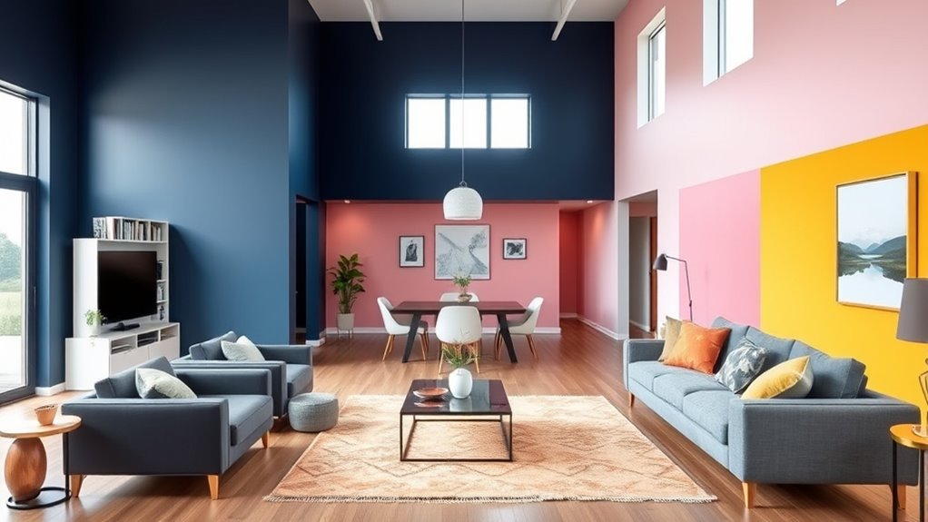
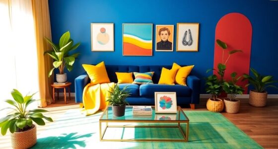
Color coding your space with paint and decor helps you create clear zones that boost organization and mood. By choosing different colors for each area, you can set visual cues that make it easier to navigate and focus. Bright shades can energize work areas, while softer tones promote relaxation in bedrooms. Using intentional colors also adds personal style, making your environment more functional and inviting. Keep exploring ways to enhance your space with mindful color choices—you’ll find it transforms your daily routines.
Key Takeaways
- Use different wall colors to clearly define and separate various functional zones within a space.
- Incorporate decor items like rugs, accessories, and furniture in matching colors to reinforce zone purposes.
- Apply color psychology by choosing hues that promote desired moods and behaviors in each area.
- Combine contrasting or harmonious colors to enhance visual interest and prevent confusion between zones.
- Personalize zones with colors that reflect your style and support organization for a cohesive, purposeful environment.

Color coding your space is a simple yet effective way to boost organization and improve your daily routine. When you assign specific colors to different zones, you create visual cues that make orienting yourself in your environment more intuitive. This approach leverages color psychology, the study of how colors influence emotions and behaviors, to help you feel more focused, relaxed, or energized depending on the area. For example, calming blues in your relaxation nook or vibrant reds in your workout zone can set the right mood. By using color intentionally, you establish clear boundaries, which enhances visual separation between spaces. This separation isn’t just about aesthetics; it’s about creating mental clarity and reducing clutter, both physical and psychological.
Color coding your space creates visual cues that enhance organization and set the right mood for each area.
When you paint walls or add decor in different colors, you’re not only defining each zone but also guiding your attention naturally. Bright, energetic hues like yellow or orange can signal activity, making them perfect for workspaces or kitchens. Softer, muted tones like lavender or mint are ideal for bedrooms or quiet corners, fostering calm and relaxation. This use of color psychology helps you subconsciously adjust your mood and behavior based on the area you’re in, making your space more functional and harmonious. Plus, the visual separation created by contrasting colors helps you avoid confusion, especially in open-plan layouts or shared spaces. It’s easier to remember where one zone ends and another begins when each has its own distinct color identity.
When you incorporate color coding into your decor, you also add a layer of personalization. You can choose colors that resonate with you personally or match your overall aesthetic. Using paint, accessories, or even rugs in different shades allows you to reinforce each zone’s purpose without cluttering your space. This method makes your environment feel more organized and intentional. Additionally, by thoughtfully applying color psychology, you can influence how you feel and behave in each area. For instance, green in your workspace can promote concentration, while soft pinks in a reading nook can evoke comfort and tranquility. These subtle cues enhance your daily routine, making your environment both beautiful and functional.
Ultimately, color coding your space is about more than just looks. It’s a strategic way to create meaningful visual separation, improve organization, and influence your mood. When done thoughtfully, it transforms your environment into a dynamic, intuitive space that supports your lifestyle and well-being. You’ll find it easier to focus, relax, and feel at home because each zone clearly communicates its purpose through color, making your daily life smoother and more satisfying.
Frequently Asked Questions
How Do I Choose the Best Color Scheme for Multiple Zones?
When choosing a color scheme for multiple zones, focus on creating color harmony and aesthetic balance. Pick a cohesive palette with complementary or analogous colors to guarantee each space flows seamlessly. Consider the mood you want to evoke in each zone, using warmer tones for energy and cooler tones for calm. Test color samples in different lighting to see how they interact, helping you select shades that unify your entire space beautifully.
Can Color Coding Help Improve Room Functionality and Organization?
Think of your space as a busy city, where visual zoning guides traffic smoothly. Yes, color coding can improve room functionality and organization by using color psychology to create clear distinctions between zones. It acts like traffic signals, helping you navigate and maintain order effortlessly. By applying different colors strategically, you enhance both the practicality and aesthetic appeal of each area, making your space more efficient and visually appealing.
What Are Some Budget-Friendly Ways to Implement Color Zones?
You can create color zones on a budget by choosing cost-effective paint options like sample sizes or leftover paints. Use DIY decor ideas such as painted furniture, colorful tapes, or wall decals to define different areas without spending much. These simple, affordable strategies help visually separate spaces, making your room more organized and functional, all while keeping costs low and adding a personal touch.
How Can I Incorporate Color Coding in Small or Open-Plan Spaces?
A picture is worth a thousand words, so use color to tell your space’s story. In small or open-plan areas, incorporate color coding with vibrant paint or decor to create visual separation. Use multi-purpose furniture to define zones without clutter. Strategically paint walls or add rugs in different hues to distinguish areas, making your space feel organized and functional while maintaining an open, airy vibe.
Are There Any Color Combinations to Avoid When Dividing Spaces?
You should avoid clashing color palettes and overwhelming color schemes when dividing spaces, as these can create visual chaos and confusion. Stick to harmonious combinations that complement each other, like soft neutrals with pops of bold color. Bright, contrasting colors can be jarring and disrupt the flow, so opt for balanced, cohesive schemes. This approach helps define zones clearly without overwhelming your space or causing visual strain.
Conclusion
Think of your space like a vibrant garden, where each color is a different flower, inviting you to explore and enjoy. By using paint and decor to define zones, you’re planting visual pathways that guide and inspire. When you blend these hues thoughtfully, your home becomes a lush landscape of purpose and personality. So, go ahead—cultivate your space with color, and watch it bloom into a beautiful, harmonious sanctuary.


