
TL;DR

Get furniture and decor delivered free — and shop member deals
- Fast, free delivery on millions of items
- Access to Prime Big Deal Days deals on October 6–7
- Prime Video, Amazon Music and more included
A forecast published by Veranda on Oct. 5 describes ten paint color directions experts expect to gain attention in 2027, from grounded roses and layered browns to mossy greens and periwinkle. The predictions draw on paint-company forecasts and color specialists’ views; they describe expected design interest, not guaranteed adoption by homeowners.
Veranda published its 2027 paint color forecast on Oct. 5, identifying ten directions that color specialists and paint companies expect to influence interiors next year. The projections favor nature-inspired, layered hues—including muted roses, nuanced browns, mossy greens and periwinkle—and suggest a move toward more personal, expressive color choices.
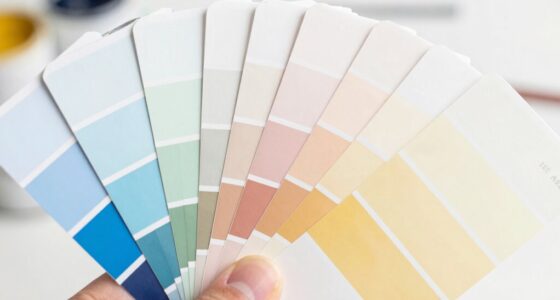
The ten forecast categories are grounded roses, neutral browns, stone-based neutrals, complex blues, warm pastels, earthen oranges, mature yellows, mossy greens, periwinkle and wine. Veranda describes the broad shift as a return to colors influenced by natural pigments, plants and minerals, with richer undertones than some recent pale or highly saturated palettes. The list combines views from color experts with named selections and forecasts from paint and interiors companies.
Several companies have announced 2027 Colors of the Year that fit these directions. Examples cited by Veranda include Dunn-Edwards’ French Press, a brown with a plum undertone; Graham & Brown’s Rose Earth, a grounded pink inspired by clay deposits in Italy; Valspar’s Cottage Door, a muted blue; and Behr’s Grounded, a rich olive. These are company selections, not evidence that consumers have adopted the shades widely.
The forecast also includes lighter and more playful options. Sherwin-Williams and HGTV Home by Sherwin-Williams selected Celery, a warm, sunlit green, while Sherwin-Williams’ trend forecast features periwinkle shades such as Agapanthus and Perfect Periwinkle. Little Greene’s new color collections include stone-based neutrals and pastels. For deeper palettes, experts point to mossy greens, golden yellows and wine reds with purple undertones.
A Broader Role for Color at Home
The forecast reflects a shift in how designers and paint companies describe color’s role in a home: hues are being presented as a way to express individual taste and memory, as well as to set a room’s mood. Emily Kantz, Sherwin-Williams’ color marketing manager, told Veranda that some people are asking whether their spaces can feel “loud and high energy” after years of favoring calm and soothing interiors.
For readers planning a refresh, the predictions offer a set of directions rather than a required palette. Balanced neutrals such as stone tones can anchor richer colors; warm pastels offer a less intense way to add color; and deeper greens, browns or wine shades can make a stronger statement. The variety also suggests that the forecast is not a single replacement color for every room, but a collection of options with different levels of saturation and warmth.
The practical consequence is modest but relevant: homeowners may see more of these shades in paint collections, design coverage and product marketing as 2027 approaches. Whether they become common in actual homes will depend on individual choices and broader market response, which the forecast does not measure.
As an affiliate, we earn on qualifying purchases.
From Calm Palettes to Personal Color
Veranda ties the forecast to two influences: nostalgia and nature. Its report says some color choices draw on personal experiences, such as a remembered vacation view, childhood home or antique textile. The article frames this as reinterpretation: familiar colors return with different undertones or combinations that can make them feel current.
That approach appears in the specific examples. C2 Paint’s Pueblo combines pink, mauve and brown undertones, while Graham & Brown’s Rose Earth is described as shifting visually from dusty rose in daylight toward light terracotta at sunset. Dunn-Edwards’ French Press moves away from the red-orange cast of some recent browns, and Little Greene’s Marle combines ochre and black undertones.
Blue remains part of the forecast, but the emphasis is on more complex blue-green tones. Kantz told Veranda that the blues in Sherwin-Williams’ 2027 forecast are “a little bit more nuanced with green undertones.” The report also notes muted and smoky blue selections from Valspar and Glidden, and a darker slate blue from California Paints. These examples connect a familiar color family to the report’s wider focus on layered shades.
““There is something distinctly human about Pueblo. It refuses to be just one thing.””
— Philippa Radon, interior designer and C2 Paint color specialist, quoted in a press release and reported by Veranda
Forecasts, Not Consumer Results
The report presents expert projections and company color selections; it does not establish that the ten categories will be widely used in 2027. Veranda does not provide consumer survey results, sales data or a common measure comparing the forecast with earlier years. The extent of any shift in homeowner preferences is therefore unclear.
Some categories also encompass a wide range of shades. “Warm pastels,” “complex blues” and “wine” describe broad directions rather than one standardized color, and a named Color of the Year is a company’s selection rather than an industry-wide designation. The forecast does not say how long any of the hues will remain popular or how adoption will vary by region, room or budget.
Paint Releases Will Test the Forecast
As companies introduce their 2027 palettes and homeowners make decorating decisions, product releases and use in interiors will show which predictions attract the most attention. The report points to already announced selections, including named Colors of the Year, but does not give a schedule for further releases or later market data.
For now, the clearest finding is the direction experts are describing: more layered, nature-linked colors, with room for both restrained neutrals and expressive shades. Whether that forecast translates into widespread use remains to be seen.
Key Questions
What are the ten color trends forecast for 2027?
Veranda lists grounded roses, neutral browns, stone-based neutrals, complex blues, warm pastels, earthen oranges, mature yellows, mossy greens, periwinkle and wine.
Which 2027 Color of the Year selections are mentioned?
Examples in the report include Dunn-Edwards’ French Press, Graham & Brown’s Rose Earth, Valspar’s Cottage Door and Behr’s Grounded. They are individual company selections within a broader forecast.
Are these colors confirmed to be popular with homeowners?
No. The article reports expert forecasts and paint-company selections, not consumer adoption or sales results. Their popularity in 2027 is still unknown.
What is driving the forecast?
Veranda cites nature and nostalgia, along with a desire for more personal and expressive interiors. Experts point to memories, natural materials and colors with layered undertones as influences.
Source: rss
Halloween Picks
halloween
As an affiliate, we earn on qualifying purchases.