
If you pick warm neutrals with muddy undertones or shades that are too muted, your room can look dull and lifeless. Avoid colors that lack contrast or have grayish, beige, or taupe tones that blend together too much. This creates a flat, muddy effect that saps energy from the space. To prevent this, focus on selecting warmer shades with depth and contrast. Keep exploring to discover how to choose the right hues for a lively, inviting room.
Key Takeaways
- Choosing overly muted or muddy warm neutrals can cause a dull, lifeless appearance in rooms.
- Lack of contrast between wall colors and furnishings may lead to a flat, muddy look.
- Using similar tones throughout the space without layering textures can diminish vibrancy.
- Insufficient lighting can make warm neutrals appear muddy and dull.
- Avoiding natural elements and contrast accents can result in a monotonous, muddy environment.
Have you ever wondered how to create a cozy, inviting space without overwhelming it with bold colors? Warm neutral colors often seem like the perfect solution—versatile, soothing, and easy to match with various decor styles. But if you’re not careful, they can turn your room into a muddy, dull space that saps the energy out of the room. That’s where understanding color psychology and interior design tips can make all the difference.
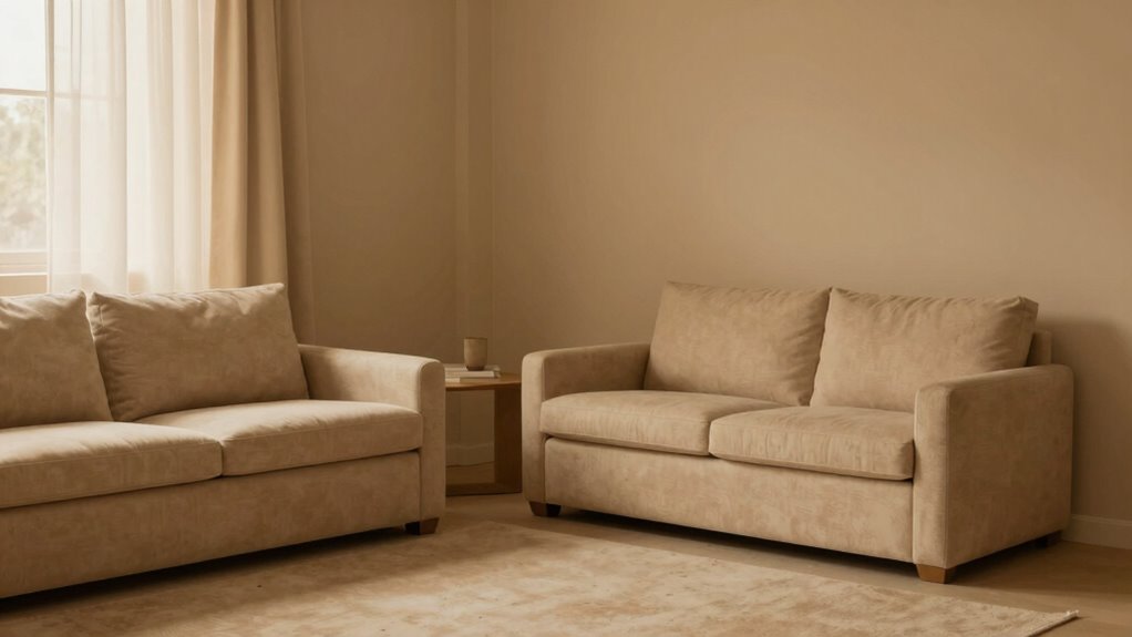
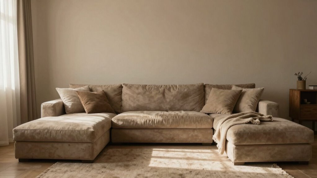
When you choose warm neutrals, you’re tapping into a palette that evokes comfort and relaxation. However, it’s easy to fall into the trap of selecting shades that are too similar or lack contrast, resulting in a muddy appearance. These colors tend to have undertones of beige, taupe, or greige, which, if not balanced properly, can blend together into a flat, uninteresting background. To avoid this, you need to pay attention to the undertones and how they interact with your lighting and furnishings.
In terms of interior design tips, layering different textures and tones within the same color family can help create visual interest and depth. For example, pairing a warm taupe wall with a slightly darker wood furniture piece or incorporating textured fabrics like linen and wool prevents the space from feeling monotonous. Also, consider the lighting in your room—warm, natural light enhances the richness of your neutral palette, but poor lighting can make everything look flat or muddy. Use layered lighting—ambient, task, and accent—to highlight the subtle differences in your colors and avoid the dull, washed-out look.
Understanding color psychology is crucial. Warm neutrals evoke feelings of calm and coziness, but if the shades are too muted or muddy, they can have a depressing or lifeless effect. Brightening the space with crisp white trim or incorporating accents in contrasting colors—like deep blues, greens, or bold metallics—can energize the room and keep it from feeling dull. Additionally, paying attention to color undertones can greatly influence the overall mood and appearance of your space. Using lighting conditions wisely can also help prevent colors from appearing muddy or washed out, ensuring the space feels lively and balanced. The key is balance: use warm neutrals as a backdrop but add pops of color and texture to keep the space lively and inviting.
Furthermore, understanding how biodiversity and natural elements can be integrated into your interior design can bring a fresh and vibrant feel, preventing the space from becoming monotonous. Incorporating indoor plants and natural materials can also add a lively touch and emphasize the connection to the outdoors. Exploring the use of natural elements not only enhances aesthetics but also improves well-being by creating a more harmonious environment. Ultimately, your goal should be to create a harmonious environment that feels both cozy and vibrant. By paying attention to the undertones, layering textures, and thoughtfully incorporating contrasting accents, you can avoid the muddy trap and craft a warm neutral space that truly feels like home.
warm neutral wall paint
As an affiliate, we earn on qualifying purchases.
As an affiliate, we earn on qualifying purchases.
Frequently Asked Questions
How Can I Prevent Warm Neutrals From Making a Room Feel Muddy?
To prevent warm neutrals from making your room look muddy, you should consider color theory principles and choose shades with subtle undertones. Opt for paint finishes like eggshell or satin, which add depth without dullness. Test your chosen colors in different lighting to see how they interact with your space. Lighten or cool down warm neutrals slightly if needed, ensuring the room feels fresh and vibrant instead of muddy.
What Are the Best Accent Colors to Complement Warm Neutrals?
To complement warm neutrals, you should consider using cool accent colors like deep blues, soft teals, or muted greens, which create a pleasing complementary color scheme. An accent wall idea could be painting one wall a rich navy or teal to add depth and contrast. These shades balance the warmth, prevent muddiness, and make your room feel lively. Incorporate these accents through accessories or artwork for a cohesive look.
Which Lighting Options Enhance Warm Neutral Tones Effectively?
You’ll want lighting that’s as warm and inviting as a sunset—think soft, golden hues that perfectly balance color. Natural lighting is your secret weapon, flooding the room with sunlight that lifts and brightens warm neutrals. Opt for warm white or soft yellow bulbs, avoiding harsh fluorescents. This combo creates a cozy, vibrant atmosphere, making your warm neutrals pop without looking muddy, and keeps your space feeling lively and balanced.
Can Warm Neutrals Work in Small or Dark Rooms?
Yes, warm neutrals can work well in small or dark rooms if you use color pairing and texture contrast effectively. Light-colored furniture or accessories brighten the space, while contrasting textures add depth and interest. Incorporate reflective surfaces like mirrors to bounce light, and choose warm neutrals with subtle undertones to prevent a muddy look. These strategies help create a cozy, inviting atmosphere without overwhelming the room.
How Do Warm Neutrals Affect Room Furniture Choices?
Warm neutrals gently influence your furniture choices by encouraging cozy, inviting pieces aligned with color psychology. They often call for softer fabrics and textured materials that enhance depth, making your space feel more balanced. When selecting furniture, opt for warm woods or upholstered pieces with tactile appeal. These choices create a harmonious environment, avoiding muddy undertones, and infuse your room with warmth and personality through thoughtful texture enhancement.

TKOWTB LED for Bedroom, Living Room, Lighting Multi-Layer Acrylic Lamp DIY Moonlight Glow Artistic Design
Artistic and Tranquil Design: Elevate your space with this Multi-Layer Acrylic Lamp, featuring a soft Moonlight glow that…
As an affiliate, we earn on qualifying purchases.
As an affiliate, we earn on qualifying purchases.
Conclusion
Think of warm neutrals as the gentle fog settling over a landscape—softening edges and obscuring the finer details, making everything appear muddier than it truly is. But just as a skilled painter chooses the right shades to highlight beauty, you can balance these tones to bring warmth without dullness. Embrace the subtle dance of light and color, and your rooms will transform into inviting havens—where serenity reigns, and muddiness becomes a distant memory.

LANANAS Neutral Couch Throw Pillow Covers 18×18 Inch Set of 4 Decorative Farmhouse Boho Throw Pillows for Living Room, Couch, Bed, Sofa Soft Corduroy Accent Home Decor (Neutral Brown, 18×18 Inch)
COVERS ONLY.
As an affiliate, we earn on qualifying purchases.
As an affiliate, we earn on qualifying purchases.
contrast accent decor
As an affiliate, we earn on qualifying purchases.
As an affiliate, we earn on qualifying purchases.