
To build a cohesive home palette without repeating colors everywhere, start by choosing a versatile core palette with neutral bases or dominant hues that reflect your style. Variations of these shades—lighter or darker—add depth while maintaining flow. Incorporate accents like bold accessories or artwork for personality, and use similar shades or subtle shifts in hallways and entryways for smooth links. Play with textures and finishes to add dimension. Keep exploring for more tips to master your entire home’s harmony.
Key Takeaways
- Use a cohesive core color palette with variations in shades for different rooms to create visual continuity.
- Introduce distinct accent colors in each space to add variety and personality without repetition.
- Vary textures and finishes to add depth and interest while maintaining harmony across rooms.
- Utilize transition spaces with subtle color shifts to smoothly connect different areas.
- Adjust colors based on lighting conditions to ensure consistent harmony throughout the home.
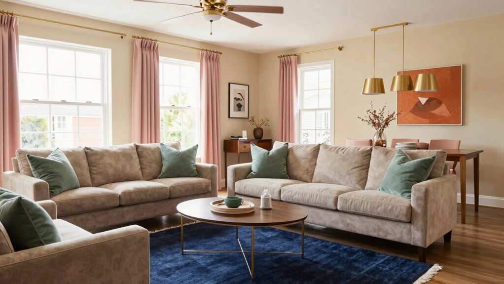
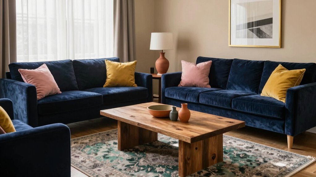
Creating a cohesive whole-home palette might seem intimidating, but with a clear plan, it becomes much easier to achieve a balanced and harmonious space. The goal is to select colors that flow seamlessly from one room to the next while avoiding the monotony of repeating the same shade everywhere. To do this effectively, you need to understand the importance of color harmony. When choosing your main colors, consider a core palette that sets the tone for your entire home. This could be a neutral base or a dominant hue that resonates with your style. From there, you can introduce variations—lighter or darker shades of the same color—to create depth and interest without breaking the visual flow. Incorporating color harmony principles helps ensure that your palette remains balanced and visually pleasing across different spaces.
Accent integration plays a crucial role in maintaining variety within your palette. Instead of sticking to one color for every room, think of accents as the tools that add personality and contrast. For example, if your primary color is a soft gray, incorporate accents in bold jewel tones or warm earthy hues in different spaces. These accents should complement your main palette, enhancing the overall color harmony. You can add them through accessories like throw pillows, artwork, rugs, or even small furniture pieces. This approach guarantees that each room feels unique yet part of a unified whole.
When building your palette, pay attention to transition spaces such as hallways and entryways. These areas act as connectors between rooms, so consider using similar colors or subtle variations to maintain the flow. A slightly darker or lighter shade of your main color can create a visual link without overwhelming the senses. Additionally, consider the natural light in each room because lighting influences how colors appear. What looks vibrant in one space might seem dull or too intense in another. Adjust your shades accordingly to keep color harmony consistent throughout.
Finally, don’t be afraid to experiment with different textures and finishes to add complexity to your palette. Matte, gloss, and satin surfaces reflect light differently, giving your colors new dimensions. By thoughtfully integrating these elements, your home will feel cohesive and lively, with a carefully curated mix of hues that avoids repetition but still reads as a unified design. Remember, the key is balance—use your core colors as anchors, then bring in accents to keep things fresh and engaging. With a strategic approach, you’ll craft a whole-home palette that’s both harmonious and visually engaging.
neutral paint color palette for home
As an affiliate, we earn on qualifying purchases.
As an affiliate, we earn on qualifying purchases.
Frequently Asked Questions
How Do I Choose Accent Colors That Complement My Main Palette?
To choose accent colors that complement your main palette, focus on color harmony by selecting hues that create a pleasing contrast or subtle blend. Incorporate pattern coordination by mixing solids with patterned pieces, ensuring the accent colors appear in different textures or designs. You want your accents to enhance your space without overpowering, so pick shades that tie back to your main colors and add visual interest through varied patterns.
Can I Incorporate Bold Patterns Without Clashing With the Colors?
Think of bold patterns as a dance partner—when you master pattern mixing, they can enhance your color harmony rather than clash. To do this, choose patterns with colors that echo your main palette, creating visual rhythm. Keep the patterns varied in scale and style to avoid overwhelming your space. With a balanced approach, bold patterns add excitement and depth, seamlessly integrating into your home’s overall color story.
What Tools Help Visualize Color Schemes Across Multiple Rooms?
You can use tools like color swatches and virtual renderings to visualize your color schemes across multiple rooms. Color swatches help you compare shades side-by-side, ensuring consistency, while virtual renderings provide a realistic preview of how your chosen palette looks in different spaces. These tools let you experiment with bold patterns and colors without committing permanently, helping you create a cohesive, stylish home that reflects your personality.
How Often Should I Update or Refresh My Home’s Color Palette?
You should consider updating your home’s color palette every few years to keep it vibrant and aligned with your evolving style. Pay attention to color psychology, as certain hues can influence mood and energy levels. Incorporate seasonal updates to reflect different times of the year, invigorating accents or accessories accordingly. Regularly reassessing your space ensures your palette stays current, inspiring positivity and comfort throughout your home.
How Do I Balance Color Consistency With Personal Style Preferences?
You can balance color consistency with personal style by focusing on color harmony, ensuring your chosen colors complement each other across rooms. Incorporate your personal expression through accents, patterns, or bold accessories that reflect your personality without disrupting the overall palette. Use a cohesive base color scheme as a foundation, then add unique touches in smaller areas, allowing your style to shine while maintaining visual harmony throughout your home.

KILZ TRIBUTE Paint & Primer, Interior, Color Sample, Bronze Mist, 8 Ounces
PAINT + PRIMER: KILZ TRIBUTE is a low VOC, 100% acrylic advanced technology paint and primer in one…
As an affiliate, we earn on qualifying purchases.
As an affiliate, we earn on qualifying purchases.
Conclusion
Creating a cohesive home palette without repetition is all about balance and subtle variation. Remember, a well-chosen color scheme can boost your mood—studies show that color impacts emotions considerably. Did you know that 85% of people feel more relaxed in rooms with harmonious color schemes? By thoughtfully selecting and combining shades, you’ll craft a space that feels connected yet dynamic, inviting comfort and personality into every corner of your home.
home interior color transition tape
As an affiliate, we earn on qualifying purchases.
As an affiliate, we earn on qualifying purchases.
texture and finish sample set
As an affiliate, we earn on qualifying purchases.
As an affiliate, we earn on qualifying purchases.