When choosing wall art by color to unify your room, consider how color impacts mood and style. Use color theory to select artwork that complements your existing palette, balancing warm and cool tones. Place pieces strategically to highlight focal points and create visual interest, whether with large statement art or gallery arrangements. Paying attention to color harmony guarantees your décor feels cohesive. Keep exploring further to discover how to perfectly tailor your wall art for a polished look.
Key Takeaways
- Select wall art colors that complement or contrast with your room’s existing palette to create visual harmony or focal points.
- Use color theory to choose artwork that evokes the desired mood, such as calming blues or energizing reds.
- Consider the size and placement of art to enhance focal points and balance with room furniture and accessories.
- Incorporate contrasting or harmonious hues in artwork to add interest and ensure seamless integration with décor.
- Plan your color scheme first to build a cohesive art display that naturally guides the eye and unifies the space.

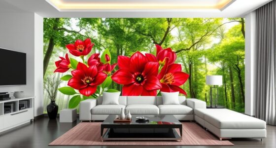
Choosing wall art by color can dramatically influence the mood and style of your space. When you select art based on color, you’re not just adding decoration—you’re shaping how the room feels and functions. To do this effectively, understanding color theory can be your best tool. Color theory explains how different hues interact and evoke emotions, guiding you in choosing artworks that enhance your room’s vibe. For example, cool colors like blues and greens tend to create calm, relaxing atmospheres, while warm colors such as reds and oranges energize and invite warmth. By applying these principles, you can craft a cohesive look that aligns with your desired ambiance.
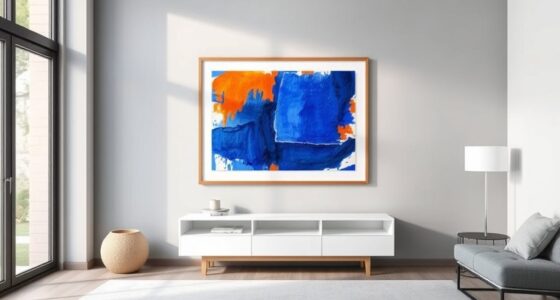
Once you grasp color theory, the next step is thoughtful art placement. Proper placement isn’t random; it’s strategic. You want your wall art to complement the room’s layout and focal points. For instance, if you’re aiming for a serene bedroom, hang calming artwork above your bed, aligning the colors with the overall palette. In living rooms, consider placing bold, vibrant pieces where they can draw attention without overwhelming the space. Remember, the goal is balance. If your walls are painted in neutral tones, a splash of contrasting color in your art can serve as a striking focal point. Conversely, if your room already features vivid hues, opt for artwork with more subdued tones to prevent visual clutter.
Strategically place art to highlight focal points and create visual harmony in your space.
Color placement also involves considering the size and placement of the art. Larger pieces can be used to anchor a wall, creating a statement piece that ties the room together. Smaller artworks arranged thoughtfully—like a gallery wall—can add visual interest and depth. When hanging art, think about how the colors in the artwork relate to other elements in the room, such as furniture, curtains, or accessories. This harmony ensures your space feels intentional and polished. If you’re unsure, start with a color scheme that resonates with you and build around it. Use color placement to guide the eye naturally across the room, encouraging a smooth visual flow that feels both intentional and inviting. Additionally, understanding how color harmony affects the overall aesthetic can help you select art that seamlessly integrates with your existing décor.
Frequently Asked Questions
How Do I Select Wall Art for a Small Room?
When selecting wall art for a small room, focus on art placement to maximize space and avoid clutter. Opt for lighter wall art materials like canvas or prints that reflect natural light, making the room feel larger. Choose pieces with colors that complement your wall color to create harmony. Keep the size proportionate to your wall, and consider minimalistic designs to prevent overwhelming the space. This approach makes your small room feel open and stylish.
Can Color-Changing Art Impact Room Ambiance?
Color-changing art can markedly impact your room ambiance by leveraging color psychology to influence your mood. As you switch colors, you create a dynamic environment that enhances mood and adapts to different activities or times of day. This versatile art form adds a sense of excitement and personalization, making your space feel more vibrant and welcoming. By aligning color shifts with your desired mood, you can effortlessly elevate your room’s atmosphere.
What Are the Best Colors for a Calming Space?
When creating a calming space, you should focus on colors that promote relaxation based on color psychology. Soft blues, gentle greens, and muted neutrals are excellent choices, as they reduce stress and foster tranquility. Use thoughtful color coordination to balance these hues with your decor, ensuring a cohesive look. By selecting these calming colors, you’ll craft a peaceful environment that’s perfect for unwinding and recharging.
How Do I Mix Multiple Colors in Wall Art?
When it comes to mixing multiple colors in wall art, you’re playing with fire if you don’t pay attention to color harmony. Start by selecting a dominant hue and complement it with accents that create visual balance. Use varying shades and tones to keep it lively without overwhelming the space. A well-balanced mix will tie your room together seamlessly, making every piece a focal point rather than a distraction.
Is It Better to Match Wall Art Color to Furniture?
Matching wall art color to your furniture isn’t always necessary for great color coordination. Instead, focus on creating artwork contrast that complements your room’s palette. If your furniture is neutral, adding art with bold or contrasting colors can make the space pop. Conversely, if your furniture has strong hues, choose artwork with subtle tones to balance the look. The key is to find harmony that enhances your room’s overall style.
Conclusion
Think of your room as a blank canvas waiting for a splash of color. Choosing wall art by hue is like planting seeds in a garden—each shade blooms into harmony, tying everything together. When you select art that speaks to your palette, you’re crafting a visual symphony where every piece plays its part. With each thoughtful choice, your space transforms into a vibrant, cohesive masterpiece—a true reflection of your personal style.