
Balancing bold and neutral colors in your decor starts with choosing one or two dominant hues and grounding them with neutral shades like white or gray. Use contrast wisely by highlighting key features with vibrant accents while maintaining harmony through textures and subtle variations. Remember, moderation is key—too much boldness can feel chaotic, so incorporate calm neutrals to keep a cohesive look. Keep exploring to discover how to create dynamic, stylish spaces that reflect your personality.
Key Takeaways
- Use dominant bold colors balanced with neutral shades to create energy without overwhelming the space.
- Incorporate textures and subtle tone variations in neutrals to add depth and visual interest.
- Achieve harmony by pairing bold hues with neutral accents, ensuring a cohesive and balanced decor.
- Use focal points and contrasting elements to highlight key features and add visual interest.
- Consider color psychology to evoke the desired mood and maintain appropriate balance in your space.
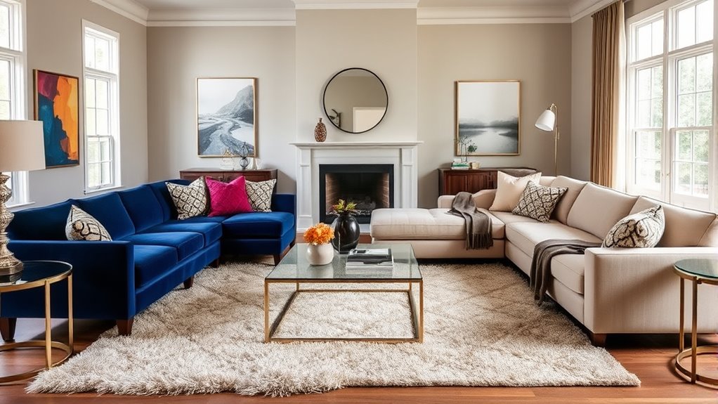
Achieving the perfect color balance in your decor can transform a space from ordinary to extraordinary. Whether you lean toward bold hues or prefer neutral tones, understanding how to create harmony and contrast is key to crafting a visually appealing environment. Color harmony ensures that the colors you select work well together, making the space feel cohesive and intentional. On the other hand, incorporating visual contrast adds interest and prevents your decor from feeling flat or monotonous. Striking the right balance between these elements is essential, especially when deciding between bold and neutral palettes.
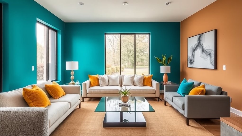
When you choose a bold color scheme, you’re making a statement. Bright, intense hues grab attention and energize a room, but they can also overwhelm if not managed carefully. To maintain harmony, pick one or two dominant bold colors and balance them with neutral shades. For instance, if you opt for a vibrant turquoise, ground it with soft whites or grays to prevent visual chaos. This approach allows the bold color to shine without overpowering the space, creating a lively yet balanced look. Incorporate contrasting elements—like a bold wall with subtle accessories—to draw the eye and add depth. Visual contrast becomes your tool to highlight key features, whether it’s a statement piece of furniture or artwork.
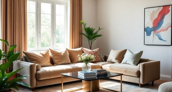
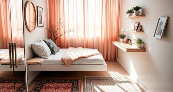
Neutral palettes, on the other hand, provide a calming foundation. They are versatile and timeless, making spaces feel open and soothing. When working with neutrals, you can play with textures and subtle variations in tone to add interest without disrupting harmony. For example, mixing different shades of beige or gray creates a layered, sophisticated look that feels intentional. To introduce visual contrast in neutral spaces, add in accents of metallics, bold artwork, or colorful textiles. These touches create focal points and prevent the room from feeling dull. The trick is to balance subtle differences in color and texture to keep the space engaging while maintaining a sense of tranquility.
Furthermore, understanding color psychology can help you select hues that evoke the desired mood and atmosphere for your space. Regardless of whether you’re leaning toward bold or neutral, mastering color balance involves intentionality. You need to consider how each element interacts with others—how color harmony guides your choices and how contrast emphasizes focal points. When you carefully select your palette and think about how each piece fits within your overall design, your decor will feel cohesive yet dynamic. Remember, bold colors can energize a room but require restraint to avoid chaos. Neutral tones provide serenity but can benefit from strategic contrast to add visual interest. By understanding these principles, you can craft a space that feels both vibrant and balanced, reflecting your personal style with confidence.

MIULEE Pack of 4 Decorative Textured Boucle Throw Pillow Covers 18×18 Inch Neutral Brown Accent Solid Pillow Cases Couch Cushion Covers for Modern Farmhouse Boho Chair Sofa Bed Room Home Decor
Timeless Boucle:Popular amongst mid-century designers of the 1940s, Bouclé is a trendy yet timeless loop detailing texture.Color palette…
As an affiliate, we earn on qualifying purchases.
As an affiliate, we earn on qualifying purchases.
Frequently Asked Questions
How Do I Choose Between Bold and Neutral Colors for Small Spaces?
When choosing between bold and neutral colors for small spaces, consider how color contrast influences visual impact. Bold colors create striking focal points and add energy, making a small room feel lively. Neutral shades, on the other hand, expand the space and promote calm. Decide what mood you want to set. For balance, incorporate accents of bold colors within a neutral palette to enhance visual interest without overwhelming the area.
Can Bold Colors Work in a Minimalist Interior Design?
Did you know that 60% of interior designers say bold colors create strong visual focal points? Yes, bold colors can work in minimalist designs if used strategically. They add personality and depth without overwhelming the space. Focus on one or two bold accents, balancing them with neutral surroundings. This approach leverages color psychology, making your minimalist interior feel lively yet calm, perfect for expressing your style while maintaining simplicity.
What Are Some Easy Ways to Incorporate Neutral Tones?
To incorporate neutral tones easily, start with monochrome palettes that create a seamless, calming look. Use natural textures like linen, wool, or wood to add depth and warmth without overwhelming the space. Consider painting walls in soft beige or taupe, and add accessories in similar shades. Mixing different textures keeps neutral decor interesting and inviting, making your space feel balanced, serene, and effortlessly stylish.
How Do Lighting Choices Affect Color Perception in Decor?
Lighting choices greatly influence how you perceive colors in your decor. The lighting ambiance you select creates different moods and highlights, while color temperature affects whether colors appear warm or cool. Using warm lighting enhances cozy tones, whereas cool lighting emphasizes neutral and bold shades. By adjusting lighting ambiance and color temperature, you can perfectly balance your space’s colors, making your decor look vibrant, soothing, or dramatic depending on your desired effect.
Are There Specific Color Combinations to Avoid With Bold or Neutral Palettes?
You should avoid clashing color schemes and inappropriate color pairings that can create visual chaos. With bold palettes, steer clear of combining overly bright or contrasting colors that clash, like reds with greens or purples with yellows. For neutrals, avoid pairing earthy tones with icy shades that can feel mismatched. Instead, focus on harmonious combinations to keep your decor balanced and visually appealing.
BOURINA Beige Throw Blanket 50×60 Inches Throw Textured Solid Soft Sofa Couch Decorative Knit Blanket
CONSTRUCTION & SIZE – Made of 100% high quality acrylic, very soft touch, cozy warm sofa throw, strong…
As an affiliate, we earn on qualifying purchases.
As an affiliate, we earn on qualifying purchases.
Conclusion
Just like a skilled painter balances bold strokes with subtle shades, you can master the art of color in your decor. Embrace the harmony of bold and neutral tones, creating a space that feels both lively and calming—your personal masterpiece. Remember, as Picasso once said, “Every act of creation is first an act of destruction.” So, don’t be afraid to experiment, find your perfect balance, and turn your home into a true work of art.

Axioglo Large Metal Wall Art Decor, 3D Abstract Stone Design, Handcrafted Metal Wall Sculpture for Living Room, Bedroom & Entryway(40")
【Elegant Abstract Stone Design】Axioglo wall art features a stunning abstract stone pattern, blending neutral, gold, and metallic accents,…
As an affiliate, we earn on qualifying purchases.
As an affiliate, we earn on qualifying purchases.

Mighty Board Minis Polystyrene Paint Color Test Panels, 12" x 9", Set of 5, White
PERFECT SAMPLES: These 12" x 9" white, styrene panels provide a smooth, warp-free surface for testing up to…
As an affiliate, we earn on qualifying purchases.
As an affiliate, we earn on qualifying purchases.