
To create senior-friendly decor that’s easy on the eyes, opt for calming, muted color palettes like pastels, neutrals, and soft tones that promote relaxation. Use high-contrast elements, such as pairing dark with light colors, to improve visibility and recognition. Keep patterns simple, bold, and minimal to reduce visual clutter and confusion. Balanced lighting, clear pathways, and non-reflective finishes also enhance safety and comfort—just continue exploring to learn how these choices can transform your space.
Key Takeaways
- Use soft pastels and neutral tones to promote relaxation and reduce visual stress for seniors.
- Incorporate high-contrast color pairings to enhance object recognition and spatial awareness.
- Choose simple, bold patterns with minimal details to improve clarity and prevent visual clutter.
- Limit decorative elements and keep surfaces tidy to create a calm, organized environment.
- Ensure adequate, even lighting with non-reflective surfaces to enhance visibility and reduce glare.

Funny Calming Corner Sign School Classroom Decor Calming Corner This Is A Safe Space Signs Classroom Decorations Classroom Calm Reading Corner Sign For Home Office Study Room Wall Decor
Funny Metal Tin Signs Size: Calming Corner Sign 8 X 12 Inches (20cmx30cm), Calming Corner Sign Hese Tin…
As an affiliate, we earn on qualifying purchases.
As an affiliate, we earn on qualifying purchases.
The Impact of Color on Senior Comfort and Well-Being

Colors profoundly influence how seniors perceive their environment, impacting their comfort and overall well-being. Understanding color symbolism helps you select shades that promote positive emotional effects. For example, warm colors like soft yellows and gentle oranges can create a welcoming, cheerful atmosphere, reducing feelings of loneliness. Conversely, cool colors such as blues and greens evoke calmness and serenity, easing anxiety and stress. Bright, overly vibrant hues may overwhelm or cause discomfort, so it’s best to prioritize soothing tones. By choosing colors thoughtfully, you help foster a space that feels safe and comforting. Recognizing the emotional effects of different hues enables you to create an environment where seniors feel relaxed, secure, and uplifted. Additionally, incorporating color psychology principles can further enhance the therapeutic benefits of your decor choices. Utilizing appropriate lighting can also amplify these calming effects and improve visibility, making the environment more accessible. Understanding the impact of contrast can help you design spaces that are easier to navigate for seniors with visual impairments, enhancing their safety. Incorporating evidence-based design strategies ensures that your decor choices are grounded in research and effective in promoting well-being. This mindful approach to color enhances their overall quality of life and emotional health.

Large Print Keyboard for Seniors,Visually Impaired-High Contrast Black Keys,White Backlit with Cover,Wired USB 104 Full Size-Easy to Read Big Letters for Macular Degeneration Low Vision (No Glare)
LIGHT UP LARGE KEY KEYBOARD: Large print backlit Keyboard features an oversized font design, clear and easy to…
As an affiliate, we earn on qualifying purchases.
As an affiliate, we earn on qualifying purchases.
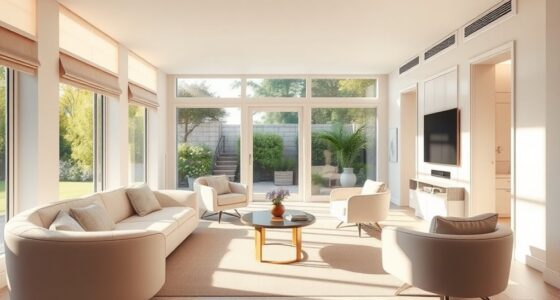
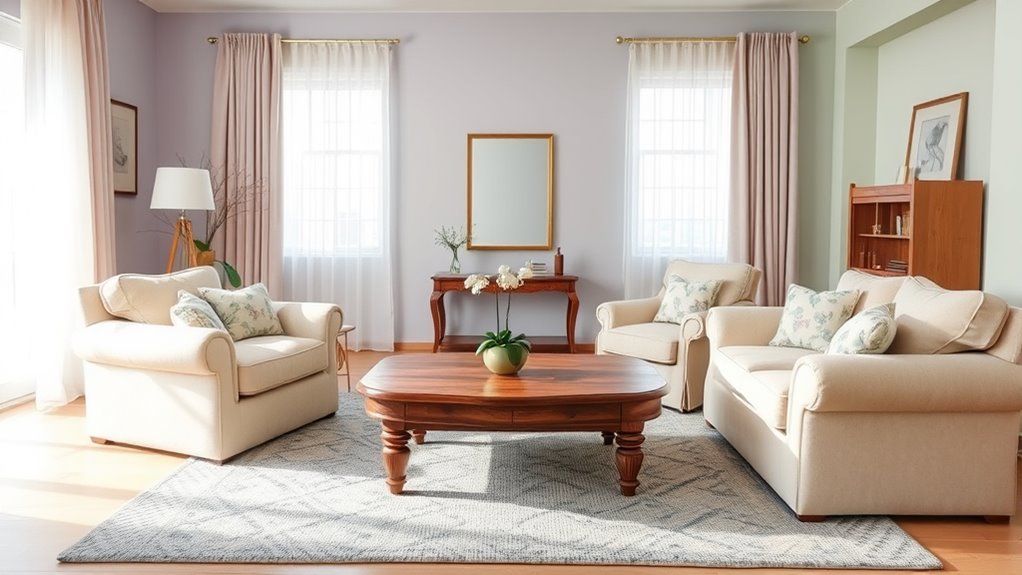
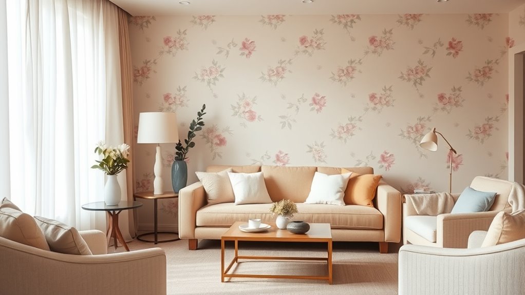
Choosing Soothing and Muted Color Palettes

When selecting a color palette for senior-friendly spaces, opting for soothing and muted tones creates a calming environment that promotes relaxation and comfort. Decorating with pastels, such as soft blues, gentle greens, and light pinks, helps reduce visual stress and fosters a tranquil atmosphere. Choosing neutral tones like beige, taupe, or light gray adds warmth without overwhelming the senses. These subdued colors are easy on the eyes and can make a room feel more spacious and inviting. Stick to a limited palette to avoid overstimulation, and consider using these calming hues on walls, furniture, or accessories. Incorporating color psychology principles can further enhance the therapeutic effects of these color choices. The goal is to create a space that feels peaceful and secure, supporting a senior’s well-being through thoughtfully chosen colors. Additionally, cultivating a creative practice around decorating can lead to innovative ways to enhance comfort and safety in senior spaces. Incorporating sound design principles, such as gentle ambient sounds, can further promote a serene environment. Exploring the benefits of color therapy can also contribute to designing spaces that support emotional health and relaxation. As research on AI in healthcare advances, there are new opportunities to personalize and optimize color and sensory environments for individual well-being.

SXCKANG Sage Green Checkered Desk mat, Retro Boho Extra Large Mouse Pad, Abstract Wavy Desk Protector Pad, Minimal Pattern Aesthetic Writing Mat for Computer & Laptop Home Office, 31.5 X 11.8 in
【31.5 x 11.8 inches】 The desk mouse mat measures 31.5x 11.8 inches ( 800x300mm) and features 3mm thickness.It…
As an affiliate, we earn on qualifying purchases.
As an affiliate, we earn on qualifying purchases.
Patterns That Promote Clarity and Ease of Recognition
Using high contrast helps you easily distinguish shapes and objects, reducing confusion. Simplified patterns make recognition quicker and prevent visual clutter. By choosing clear, distinct designs, you create a space that’s safer and more comfortable to navigate.
Contrast for Distinct Shapes
Contrast plays a essential role in creating distinct shapes that are easy to recognize and interpret. By using strong contrast for distinct shapes, you enhance visual perception, making objects stand out clearly against their backgrounds. This helps your brain quickly identify and differentiate items, reducing confusion. High-contrast patterns improve spatial awareness, allowing you to judge distances and positions more accurately. When selecting decor, focus on pairing light and dark colors or bold patterns that clearly define edges. Avoid subtle shades that blend together, as they can cause visual clutter. Clear contrast not only makes patterns easier to distinguish but also reduces eye strain, supporting comfortable and confident navigation through your space. Effective contrast can also help individuals with visual impairments better perceive their environment, promoting independence. Incorporating visual clarity strategies ensures that your decor remains accessible and easy to interpret for everyone. Additionally, visual perception can be enhanced by understanding how contrast influences the recognition of shapes and patterns. Understanding how material choices impact heat retention can guide you in selecting the right decor materials to create a cozy and functional environment. Prioritize contrast to create a visually accessible environment that promotes independence and safety. Additionally, incorporating emotional support strategies can help individuals feel more comfortable and confident in navigating their environment.
Simplified Patterns Enhance Recognition
Simplified patterns are key to making decor more recognizable and easier to interpret. When you choose designs with clear, straightforward decorative motifs, you reduce visual confusion. Avoid overly intricate textures that can distract or overwhelm the eye. Instead, opt for bold, simple shapes that stand out. Imagine a rug with broad stripes, a wall with large geometric patterns, or furniture with clean lines. These patterns help your brain quickly recognize and process visual information. You’ll find that minimalistic designs with limited detail make navigation and interaction more comfortable. By focusing on clarity and simplicity, you create a space that feels welcoming and easy to understand. Remember, less is often more when it comes to patterns that promote clarity and ease of recognition. Incorporating effective composition techniques and considering visual hierarchy can further enhance the visual harmony and ensure your decor remains accessible and pleasing to all. Additionally, choosing patterns aligned with cognitive perception abilities can help accommodate diverse visual needs and improve overall visual processing. Being mindful of visual contrast can further improve pattern recognition for individuals with varying eyesight.

Polyvine Wax Finish Varnish Dead Flat 500ml
WAX FINISH VARNISH: A unique traditional wax-like, brush-on, protective varnish, for a high-performance satin or non-reflective finish. It…
As an affiliate, we earn on qualifying purchases.
As an affiliate, we earn on qualifying purchases.
Avoiding Visual Overload: Tips for Balanced Decor
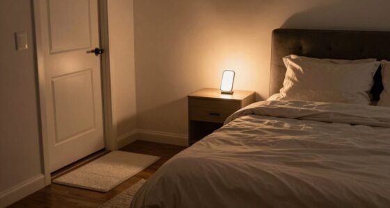
To create a comfortable, senior-friendly space, it is essential to prevent visual overload that can cause confusion or stress. Use soft, evenly distributed artificial lighting to avoid harsh shadows and glare, which can be overwhelming. Keep lighting simple and avoid overly bright or flickering sources. Thoughtful furniture placement also plays a key role; position larger pieces to create clear pathways and avoid cluttered areas. Limit the number of decorative items and keep surfaces tidy to reduce visual noise. Stick to a neutral or subdued color palette with minimal patterns to help the eyes relax. Additionally, optimizing lighting efficiency can further reduce glare and improve overall comfort. Incorporating local design trends can also help create a welcoming environment that feels both familiar and soothing. Being mindful of gold IRA investment strategies can inspire a sense of security and stability in the decor, subtly emphasizing calm and reassurance. Understanding the importance of attention to detail in selecting decor ensures that each element contributes to a balanced and harmonious space. Paying attention to lighting placement and choosing fixtures that diffuse light evenly further enhances visual comfort. By balancing lighting and furniture arrangement, you create a calm environment that’s easy to navigate and reduces visual confusion.
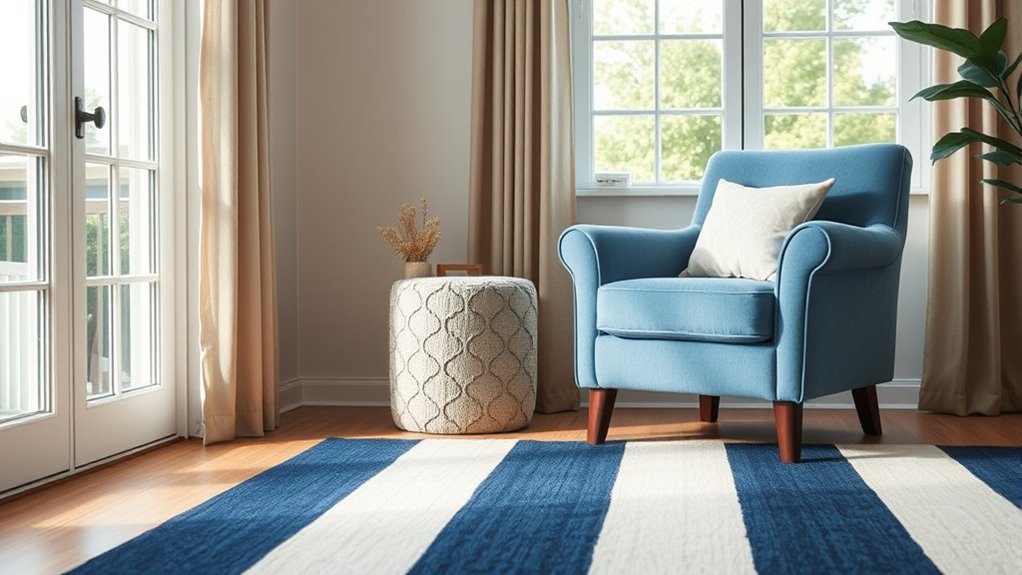
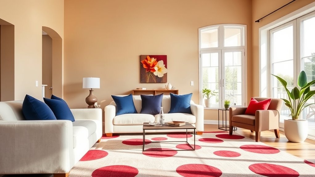
Incorporating High-Contrast Elements Safely
Using bright color pairings can help with visibility, but it’s important to choose combinations that don’t overwhelm the senses. You should also avoid visual clutter and keep pathways clear to prevent tripping hazards. Together, these strategies create a safer, more navigable space for seniors.
Bright Color Pairings
Bright color pairings can make a room feel lively and inviting, but it’s essential to choose high-contrast elements carefully to guarantee safety. When selecting colors, consider color psychology to evoke calmness and clarity. Using contrasting hues helps with pattern recognition, making objects easier to identify. For example, pairing deep blues with bright yellows creates a vibrant yet safe environment. To enhance visual clarity, think about:
- Bold red accents against soft white walls
- Dark furniture contrasting with light flooring
- Brightly colored handles on cabinets
- Contrasting borders around rugs or artwork
- Well-defined, high-contrast window coverings
These choices support safe navigation and reduce confusion. Remember, high-contrast doesn’t mean overwhelming; it’s about balancing vivid color pairings that are stimulating yet easy on the eyes. Incorporating product authenticity checks can ensure that your decor choices are both safe and genuine.
Avoiding Visual Clutter
While incorporating high-contrast elements can enhance safety and visual clarity, cluttered spaces can quickly become confusing and overwhelming, especially for seniors. To avoid visual overload, limit decorative accessories and decorative lighting to a few impactful pieces. Keep surfaces clear and organized, prioritizing essential items. Use bold, contrasting colors thoughtfully to highlight important areas without creating chaos. Here’s a simple guide:
| Tip | Example |
|---|---|
| Limit decorative accessories | One or two statement pieces |
| Use high-contrast lighting | Bright task lighting |
| Keep surfaces uncluttered | Clear tables and countertops |
| Highlight key features | Contrasting frames on doors |
| Minimize visual noise | Avoid excessive patterns |
This approach keeps your space safe, visually appealing, and easy to navigate.
Clear Pathways
Creating clear pathways through your home is essential for safety and independence, especially for seniors. High-contrast elements help distinguish walkways from surrounding areas and prevent accidents. Use bold, contrasting colors for flooring and walls to create visual boundaries. Incorporate decorative accessories and wall art with distinct patterns or bright frames to guide the eye. Keep pathways unobstructed and well-lit. To enhance visibility, consider adding tactile markers or textured rugs along key routes.
- Brightly colored rugs defining hallways
- Contrasting wall art framing doorways
- Bold-colored furniture against neutral floors
- Reflective or matte finishes on decorative accessories
- Clear, unobstructed walkways free of clutter
Practical Guidance for Selecting Senior-Friendly Fabrics and Finishes

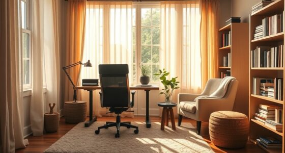
Choosing the right fabrics and finishes is essential for making a space comfortable and safe for seniors. When selecting fabrics, focus on soft textures that reduce the risk of irritation and are easy to clean. Avoid rough or coarse materials that can cause discomfort or snag easily. For upholstery, opt for fabrics with high finish durability; they resist wear and stains, maintaining their appearance over time. Consider finishes that are low-glare and non-slip to prevent accidents. Smooth, non-reflective surfaces help reduce visual confusion, while durable finishes ensure longevity in high-traffic areas. Prioritize practicality without sacrificing comfort, making sure fabrics and finishes support both safety and ease of maintenance in your senior-friendly space.
Creating a Harmonious and Accessible Living Environment

A harmonious and accessible living environment relies on thoughtful design that balances aesthetic appeal with practical functionality. You can achieve this by incorporating vivid color schemes that energize the space without overwhelming, and decorative accents that add personality. Use soft, contrasting tones to highlight pathways and key areas, making navigation easier. Incorporate decorative accents like textured pillows or artwork to create visual interest while maintaining clarity. Keep clutter minimal to promote safety and ease of movement. Here are some ideas to inspire you:
Creating a safe, inviting space with vibrant colors, tactile accents, and minimal clutter enhances both beauty and accessibility.
- Bright, easy-to-see signage for essential areas
- Bold-colored rugs to define zones
- Clear, simple lighting fixtures
- Decorative accents with tactile appeal
- Consistent color patterns for visual continuity
This combination fosters a welcoming, safe, and visually engaging environment.
Frequently Asked Questions
How Can I Incorporate Personal Style Into Senior-Friendly Decor?
You can incorporate your personal style by selecting decorative accessories that reflect your personality, like favorite artwork or meaningful keepsakes. Choose simple, easy-to-clean items that add color and texture without overwhelming the space. Mix in soft textiles, cozy throws, or decorative pillows that match your taste. By thoughtfully adding these touches, you create a space that feels uniquely yours while remaining safe and comfortable for senior living.
Are There Specific Color Combinations to Avoid for Seniors?
Think of your home as a stage; certain color combinations can be like blinding spotlights. For seniors, avoid high contrast and harsh color contrasts, as they can hinder visual acuity and cause confusion. Stick to gentle, harmonious color combinations like soft blues and warm neutrals. These create a calming environment that’s easy on the eyes, reducing the risk of falls and making everyday tasks more comfortable.
How Does Lighting Affect Color Perception in Senior Spaces?
Lighting plays a vital role in how you perceive color in senior spaces. You want balanced lighting contrast to avoid shadows that can distort colors, making it harder for seniors to distinguish objects. Proper lighting enhances color vibrancy without overwhelming the eyes. By ensuring even, bright, and natural light, you help seniors see true colors clearly, improving safety and comfort in their environment.
Can Decorations Be Both Functional and Aesthetically Pleasing?
Did you know that 78% of seniors prefer decor that’s both functional and attractive? You can choose decorative accessories that serve multiple purposes, like stylish storage baskets, or opt for multifunctional furniture, such as ottomans with hidden compartments. These pieces add visual interest while providing practicality. By blending form and function, you create a space that’s inviting and useful, making everyday living easier and more enjoyable for you.
What Are Cost-Effective Ways to Update Home Decor for Seniors?
To update your home decor affordably for seniors, focus on simple, cost-effective ideas. You can try DIY painting to refresh walls with calming, easy-on-the-eyes colors that brighten the space. Replace outdated accessories with budget-friendly options or rearrange furniture for a more functional layout. Adding soft lighting and removing clutter also makes the environment more comfortable and accessible, creating a safer, more inviting home without breaking the bank.
Conclusion
By choosing calming colors, simple patterns, and high-contrast elements, you create a safer, more comfortable space for seniors. Did you know that nearly 80% of seniors experience vision changes that make visual clarity essential? With thoughtful decor choices, you can enhance their independence and well-being. Keep these tips in mind to design an environment that’s both beautiful and accessible, ensuring your loved ones feel secure and at ease every day.