
To create a calming room, choose soft, harmonious color pairings like gentle blue with warm cream, pale green with beige, or lavender with gray. Avoid high-contrast combos that feel energetic. Instead, opt for monochromatic or analogous schemes that promote relaxation. Light reflection and surface choices also influence the mood, making your space feel more peaceful. Keep these tips in mind, and you’ll discover how subtle color pairings make your room truly soothing.
Key Takeaways
- Opt for subtle, harmonious color pairings like soft blue with warm cream or pale green with beige.
- Avoid high-contrast combinations such as bright red and white that create visual energy.
- Use monochromatic or analogous color schemes to maintain a calm, cohesive atmosphere.
- Incorporate muted, earthy tones like soft taupe or muted sage to promote serenity.
- Consider natural light conditions to select colors that enhance relaxation throughout the day.
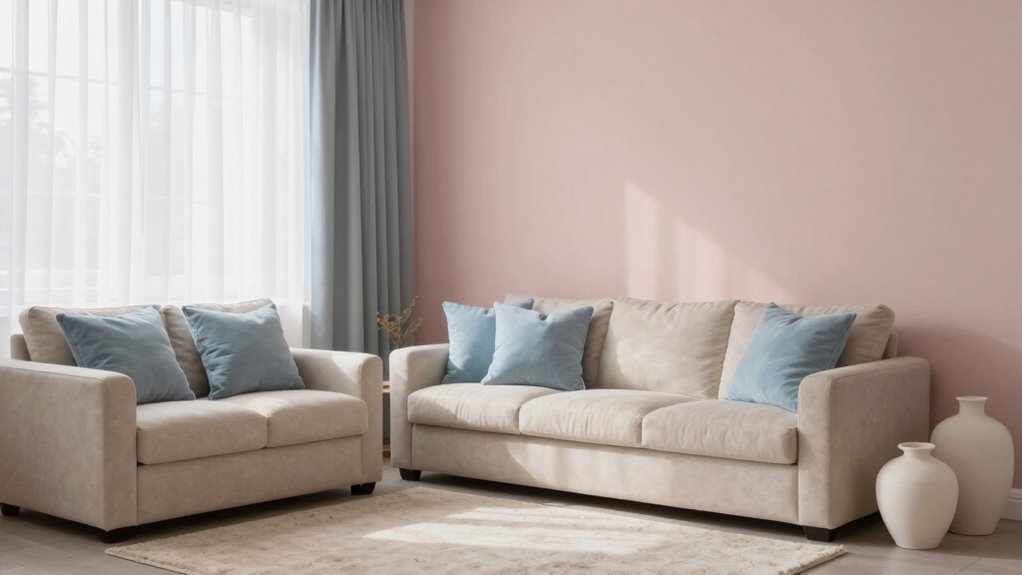
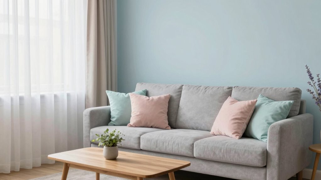
Creating a calm and soothing atmosphere in your home often starts with the right color pairings. When choosing colors, understanding how color psychology influences mood can help you select shades that promote relaxation rather than excitement. Soft, muted tones like gentle blues, warm beiges, and pale greens can create a peaceful vibe, making your space feel welcoming and tranquil. These colors have a calming effect because they’re linked to serenity and balance, helping you unwind after a busy day. Incorporating natural light influence into your color choices can significantly enhance these calming effects. Natural light influence plays a significant role in how these colors appear and how effective they are at creating calm. When your rooms receive ample sunlight, light hues tend to brighten the space and enhance their soothing qualities. For example, a pale blue wall can look even more calming when bathed in natural light, reflecting a sense of openness. Conversely, in rooms with less natural light, deeper shades like soft taupe or muted sage can add warmth without overwhelming the space. These darker yet calming tones absorb some light, preventing the room from feeling stark or cold, and instead foster a cozy, peaceful environment. Additionally, light reflection can further intensify or soften these effects depending on the surfaces and furnishings in your space. Choosing color pairings that lean toward subtle contrasts enhances serenity. For instance, pairing a soft blue with a warm cream creates a gentle balance that feels both inviting and restful. Avoid high-contrast combinations like bright red and white, which tend to energize rather than relax. Instead, stick with monochromatic or analogous color schemes—colors next to each other on the color wheel—like lavender and gray or pale green and beige. These combinations keep visual interest without disrupting the calming atmosphere. You should also consider how the natural light in your space influences your color choices during different times of the day. Morning light tends to be cooler, making blues and grays more prominent, while afternoon sunlight warms up the room, emphasizing earth tones and warmer neutrals. By selecting colors that complement these shifts, you ensure your room remains tranquil at all times. For example, pairing light gray with soft blush or warm taupe can keep your space feeling consistent and soothing regardless of the time. Paying attention to lighting conditions and how they interact with your chosen colors can help you create a truly harmonious environment, especially when considering color temperature to optimize the mood throughout the day. Additionally, understanding color harmony principles can guide you in creating cohesive and balanced color schemes that enhance your room’s calming effect.

Glidden Interior Paint + Primer: Blue/Sleep Baby Sleep, One Coat, Semi-Gloss, 1-Quart
One Coat Coverage – Glidden One Coat Interior Paint & Primer has exceptional hide and stain block which…
As an affiliate, we earn on qualifying purchases.
As an affiliate, we earn on qualifying purchases.
Frequently Asked Questions
How Do Lighting Choices Affect Calming Color Pairings?
Lighting choices substantially influence calming color pairings by enhancing their soothing effects. You should maximize natural light to brighten the space gently, making colors appear softer and more inviting. Incorporate ambient lighting, like warm-toned lamps, to create a cozy atmosphere, preventing bold hues from feeling overwhelming. The right balance of natural and ambient light helps maintain a tranquil environment, ensuring your calming color pairings truly promote relaxation.
Can Bold Patterns Complement Calm Color Schemes Effectively?
Think of bold patterns as the spice that awakens a gentle dish; they can indeed complement calm color schemes when you strike the right balance. Use complementary palettes to anchor the patterns, ensuring they don’t overpower the tranquility of the room. By balancing patterns carefully, you create visual harmony—bold accents add interest without chaos, making your space lively yet serene, like a peaceful garden with vibrant blooms.
What Role Does Furniture Color Play in Creating Tranquility?
Your furniture color plays a vital role in creating tranquility. Opt for furniture with soft, muted tones that blend seamlessly with your color harmony, avoiding loud or contrasting shades. Incorporate varied textures to add depth and comfort without overwhelming the senses. Smooth, natural finishes or matte surfaces work best, as they promote a calming atmosphere. When furniture complements your color scheme, it helps foster a serene, balanced environment in your room.
Are There Specific Color Pairings for Small Spaces to Feel Calmer?
You’d think tiny spaces need bold colors to make a statement, but ironically, they thrive on muted color palettes and soft accent tones. These gentle hues create an illusion of openness and calm, making your room feel larger and more peaceful. Pair light grays with blush pinks or soft blues with creamy whites, and you’ll find your small space transforms into a tranquil retreat—no loud colors required to get that calming vibe.
How Long Does It Take to Notice the Calming Effects of Color Changes?
You’ll usually notice the psychological impact and emotional response to color changes within a few days to a week. When you choose calming hues, your mind starts to adapt, creating a more peaceful atmosphere. Subtle shifts in mood and stress levels can become evident quickly, especially if you spend consistent time in the space. Consistent exposure helps your brain associate the colors with relaxation, enhancing the calming effect over time.
3D Floral Green Wall Art (Set of 3) Lightweight, Wooden Ready-to-Hang Boho Framed Wall Art for Bathroom, Master Bedroom, Living Room or Office – Premium Sage Green Farmhouse Decor – Gift-Boxed
Unique 3D Floral Cutout Design – This elegant 3 piece set features raised wooden floral cutouts that add…
As an affiliate, we earn on qualifying purchases.
As an affiliate, we earn on qualifying purchases.
Conclusion
By choosing the right color pairings, you can create a calming and inviting space that soothes your senses. Remember, soft blues with warm neutrals or gentle greens with cool grays can considerably reduce stress. Did you know that studies show rooms painted in calming colors can lower blood pressure and heart rates? So, next time you’re redecorating, opt for these peaceful palettes—you’ll enjoy a more relaxed atmosphere every day.

Emvency Purple Throw Pillow Cover Rustic Follow Your Dreams Light Purple Decorative Pillow Case Monogram Home Decor Rectangle Queen Size 20×30 Inch Cushion Pillowcase
Super Soft: A Grade Velvet, fine texture, soft handle and comfortable. It has elasticity, no pilling and no…
As an affiliate, we earn on qualifying purchases.
As an affiliate, we earn on qualifying purchases.

AMETHEUS Wall Mounted Lights, 2 Pack Rechargeable RGB Color Changing Light, 3 Color Temps & Remote and Touch, 360°Rotation Dimmable Cordless for Study Bedroom Reading Bedside (Black)
RGB Mood Lighting for Any Space: Choose from 80 RGB colors, DIY mode, and dynamic lighting effects to…
As an affiliate, we earn on qualifying purchases.
As an affiliate, we earn on qualifying purchases.