To achieve high contrast without harshness for aging eyes, focus on pairing soft, muted colors with gentle vibrancy. Use warm neutrals like beige or taupe alongside pastel or desaturated hues that create clear separation without overwhelming your eyes. Avoid overly bright or saturated shades, opting instead for subtle contrasts in lightness and darkness. Incorporating textures and patterns can further improve clarity. Keep exploring these techniques to make your visual environment both comfortable and vibrant.
Key Takeaways
- Use muted, soft neutral colors combined with gentle contrasts to enhance visibility without causing eye strain.
- Prioritize subtle differences in lightness and saturation rather than harsh color contrasts.
- Incorporate textures and patterns to improve differentiation while maintaining a calm, balanced look.
- Avoid overly saturated, bright hues; opt for desaturated or pastel tones for softer, more comfortable visuals.
- Utilize design tools to calibrate contrast and preview color combinations for optimal accessibility and comfort.
Why Good Contrast Is Essential for Your Aging Eyes

As you age, your eyes naturally become less efficient at distinguishing between similar shades, making good contrast more essential than ever. Proper contrast helps you navigate daily tasks and reduces eye strain. Color psychology can guide your choices, as high-contrast pairings can evoke specific feelings or reactions. For example, bold, contrasting colors like black and white are universally recognized for clarity, but cultural perceptions influence color preferences and meanings. In some cultures, certain color combinations symbolize safety and trust, increasing their effectiveness. Understanding how contrast and color perception evolve can help you select visual cues that optimize visibility, comfort, and emotional impact. Additionally, the field of view in visual environments influences how contrast is perceived and can be optimized to enhance clarity. Recognizing how visual perception changes with age allows for more effective design choices that support accessibility and comfort. Being aware of visual processing changes can further inform how to create environments that are easier to interpret for aging eyes. By prioritizing good contrast, you ensure your visual environment remains accessible and engaging, regardless of age.
How Aging Affects Your Color Vision and Contrast Sensitivity

Aging doesn’t just affect how you see but also how well your eyes distinguish colors and contrast. As you get older, your color perception declines, making it harder to differentiate subtle shades, especially in low light. Contrast sensitivity also diminishes, meaning you need more distinct differences between colors and shades to tell objects apart. This is why media literacy and informal language awareness can be useful for clear communication in various contexts. Additionally, understanding visual processing changes can help you adapt your environment to maintain clarity and comfort. These age-related changes can make everyday tasks, like reading labels or maneuvering stairs, more challenging. You might find that vibrant colors lose their brightness, and soft hues become harder to perceive. These shifts happen gradually, often unnoticed, but they impact how you experience visual details. Understanding this helps you choose color pairings that compensate for these changes, ensuring clearer, more comfortable vision as you age.
Choosing Soft, Vibrant Colors That Are Easy on the Eyes

When selecting colors, opt for soft foundations that provide a calm background without causing strain. Incorporate vibrant hues that are lively but gentle enough to be easy on your eyes. By balancing these elements, you can create a palette that’s both appealing and comfortable to view. Additionally, choosing visual ergonomics elements can further reduce visual fatigue and enhance overall comfort. Implementing color contrast principles can help ensure that your chosen palette remains accessible and reduces eye strain, especially for aging eyes. Emphasizing visual ergonomics can help optimize color choices for better eye health and prolonged usability. Incorporating adaptive lighting can further tailor the environment to your visual needs, reducing glare and providing consistent illumination. Utilizing color harmony techniques can also help create a more cohesive and soothing visual experience.
Soft Color Foundations
Choosing soft, vibrant colors creates a gentle foundation that’s easy on aging eyes. Pastel palettes offer subtle variations of color that reduce strain while maintaining visual interest. These muted tones provide enough contrast without being harsh, making them ideal for everyday wear or reading environments. Monochrome schemes, using different shades of a single color, create harmony and simplicity, helping your eyes focus without distraction. When selecting soft color foundations, prioritize shades that are lively yet muted, avoiding overly bright or dark hues. This careful selection ensures your vision stays comfortable while keeping your look fresh and appealing. Establishing a visual balance through gentle, vibrant colors can also help reduce eye fatigue over time. Incorporating color psychology into your choices can further enhance your well-being by promoting calmness and focus. Additionally, understanding color contrast principles helps you create a harmonious space that minimizes eye strain. Using a variety of color harmonies can help you achieve a balanced and pleasing aesthetic that supports your eye health. By establishing a base of gentle, vibrant colors, you set the stage for pairing with more nuanced accents later on, all while supporting your eye health.
Vibrant Yet Gentle Hues
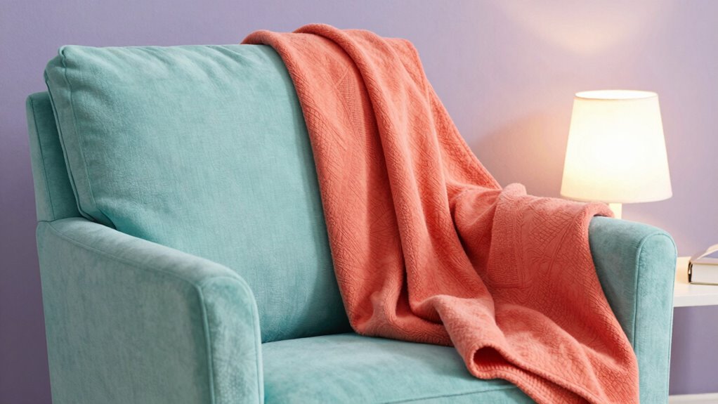
To keep your look lively without overwhelming your eyes, opt for soft, vibrant hues that balance energy with gentleness. Color psychology shows that certain colors evoke positive feelings without being harsh, making them ideal for aging eyes. Incorporate contrast principles by choosing shades that stand out subtly against your background, enhancing visibility without strain. For example, try muted coral or gentle teal—these colors offer vibrancy while remaining easy on the eyes. Focus on hues that provide enough contrast to define your features without creating harsh lines or glare. Color contrast plays a crucial role in achieving this delicate balance, helping you create an engaging look that promotes comfort and confidence, all while respecting the natural sensitivity of aging eyes. Paying attention to indoor lighting can further improve how your colors appear and reduce eye strain. Additionally, understanding visual contrast can help you choose combinations that are both attractive and safe for sensitive eyes, especially when considering color saturation levels and brightness. Properly selecting and balancing these elements can help prevent eye strain and support clearer vision.
How to Pair Colors for High Contrast Without Harshness

To create high contrast looks that aren’t harsh, consider pairing muted brights with soft neutrals. Balancing color saturation helps your eyes guarantee differences without strain. Incorporating these elements ensures your outfits stay vibrant yet gentle on aging eyes. Additionally, choosing reliable color combinations can help prevent visual fatigue and improve overall comfort.
Choosing Muted Brights
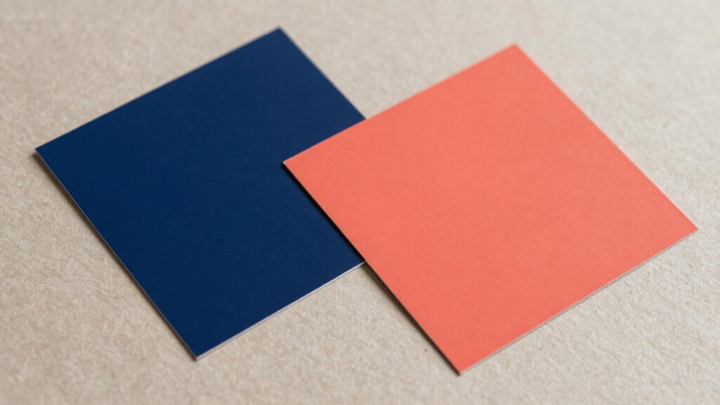
Opting for muted brights can create vibrant looks that are easier on aging eyes, as they offer high contrast without the harshness of pure, saturated hues. These muted brights maintain the energy of bold colors while softening their intensity, making them more comfortable to view. When pairing colors, focus on achieving color harmony by selecting shades that complement each other without clashing. Look for hues with slight desaturation or softened tones, which provide contrast without overwhelming the eyes. Muted brights can be used as statement colors or accents, adding visual interest without straining your vision. By choosing these tones thoughtfully, you’ll create balanced, lively looks that are both eye-friendly and stylish.
Balancing Color Saturation
Balancing color saturation is key to creating high-contrast looks that remain gentle on aging eyes. Instead of bold, overly saturated hues, opt for monochrome palettes or pastel combinations that offer contrast without harshness. Monochrome palettes, using varying shades of the same color, provide subtle depth while maintaining softness. Pastel combinations blend muted tones that contrast enough to be visible but avoid the eye strain caused by vivid colors. To achieve the right balance, choose colors with similar saturation levels, and introduce contrast through lightness or darkness rather than intensity. This approach guarantees your look is vibrant yet easy on your eyes, making high contrast feel natural and comfortable. Remember, less is more—soft, balanced colors elevate your style without overwhelming your vision.
Incorporating Soft Neutrals
Incorporating soft neutrals allows you to create high-contrast looks that are gentle on aging eyes. Neutral tones, like soft beiges, warm greys, and gentle taupes, serve as versatile bases that balance bold colors without overwhelming. Using subtle hues as accents adds depth and dimension, making your overall look more harmonious and less harsh. These shades help enhance contrast while maintaining a delicate, refined appearance. Pair a muted neutral with brighter, yet muted, colors to draw attention without startling. Soft neutrals also make progressions smoother, reducing visual strain. By thoughtfully integrating these gentle shades into your wardrobe or makeup palette, you can achieve striking contrasts that are both vibrant and comfortable for aging eyes.
Enhancing Visual Clarity With Textures and Patterns

Textures and patterns can considerably improve visual clarity for aging eyes by providing additional cues that help distinguish text from the background. Using texture contrast creates a tactile difference, making text stand out more clearly. Pattern pairing involves combining simple, repetitive designs that guide the eye without overwhelming it. For example, pairing a subtle dotted background with bold, solid text enhances readability. To illustrate, consider this table:
| Background Pattern | Text Style |
|---|---|
| Fine diagonal lines | Bold, sans-serif font |
| Light checkerboard | High contrast colors |
| Subtle grid | Clear, large lettering |
Applying Contrast Guidelines Using Design Software

To effectively apply contrast guidelines in design software, you need to understand how different tools and features can enhance readability for aging eyes. Start with color calibration to ensure your colors are accurate and consistent across devices, preventing unintended low contrast issues. Use gradient overlays thoughtfully to create smooth transitions between colors, avoiding harsh edges that can strain eyes. Adjust contrast settings within the software to meet accessibility standards, paying attention to luminance differences. Many design programs offer real-time previews or contrast analyzers, helping you fine-tune your color choices. By leveraging these tools, you can craft designs that provide sufficient contrast without harshness, making content more comfortable and accessible for viewers with aging eyes.
Common Mistakes That Make High Contrast Uncomfortable

High contrast can improve readability, but when overdone, it quickly becomes uncomfortable for viewers with aging eyes. Common mistakes include choosing colors that clash on the color wheel or creating excessive brightness differences, which heighten visual strain. For example, pairing bright red with bright green may seem vibrant but can cause eye fatigue. Similarly, ignoring emotional impact can make contrast feel harsh rather than helpful. To avoid discomfort, focus on subtle contrast using hues close on the color wheel and moderate luminance differences. Here’s a quick guide:
| Mistake | Impact | Better Approach |
|---|---|---|
| Using stark complementary | Harsh visual effect | Soft complementary tones |
| Overly bright color pairing | Eye strain, discomfort | Muted, balanced contrasts |
| Ignoring emotional tone | Creates uninviting feel | Harmonize colors for warmth |
Balancing contrast with color harmony creates comfortable, engaging visuals.
Testing Your Color Choices With Accessibility Tools

Testing your color choices with accessibility tools is an essential step to guarantee your visuals are comfortable for aging eyes. These tools help you assess how your color palette performs across different conditions, including for those with color blindness and other visual impairments. Using digital accessibility checkers, you can verify if your contrast ratios meet standards and ensure readability.
Here are key steps to follow:
- Use online contrast analyzers to compare text and background color contrast
- Simulate color blindness to see how your palette appears to affected viewers
- Test on various devices to check consistency
- Adjust shades for better visibility if needed
- Seek feedback from users with aging eyes or visual impairments
This process ensures your design is inclusive, clear, and comfortable for all users.
Practical Tips to Balance Brightness and Softness

After verifying your color choices with accessibility tools, the next step is to fine-tune the balance between brightness and softness in your design. Focus on achieving ideal color contrast to enhance readability without overwhelming the eyes. High contrast improves visual acuity, making text and important elements stand out clearly. However, avoid overly harsh combinations that can cause eye strain. Instead, incorporate softer tones alongside brighter shades to create a gentle yet effective contrast. Use muted backgrounds with vibrant accents or vice versa, ensuring enough distinction without harshness. Pay attention to the overall harmony and keep the contrast level comfortable for aging eyes. This balance helps maintain clarity while reducing fatigue, making your design more accessible and visually pleasing.
Frequently Asked Questions
How Can I Test Color Contrast for Aging Eyes Effectively?
To test color contrast effectively for aging eyes, start by adjusting your monitor’s color temperature to a warmer setting, reducing glare and harshness. Then, use contrast calibration tools or software to make certain text and background colors have sufficient differentiation without being too stark. Test with real-world examples, like menus or signage, and get feedback from others with similar vision needs to confirm the setup is comfortable and accessible.
Are There Specific Color Combinations Recommended for Older Adults?
Think of color harmony as your guiding star—soft, yet clear. For older adults, stick to high-contrast combinations like deep blue and white or dark green and cream to improve visual accessibility. Avoid overly bright or harsh colors, which can strain aging eyes. Opt for muted tones with sufficient contrast to make reading and recognizing objects easier, creating an environment that’s both functional and visually comfortable.
What Tools Help Evaluate Visual Comfort in Design?
You can use tools like contrast checkers and color accessibility analyzers to evaluate visual comfort. These tools help you assess color harmony and guarantee sufficient contrast for visual accessibility, especially for aging eyes. By testing your design with these resources, you ensure that color combinations are both aesthetically pleasing and easy to see, reducing eye strain and improving overall readability for older adults.
How Does Lighting Influence Color Perception for Aging Eyes?
Lighting impact considerably influences how you perceive colors as you age. Bright, well-balanced lighting can enhance perception changes, making colors appear clearer and more vibrant. Poor lighting, on the other hand, causes glare and shadows, which can distort color perception and cause discomfort. By adjusting lighting to reduce harsh shadows and increase contrast, you help aging eyes see colors more accurately, improving visual comfort and overall perception.
Can I Adjust Contrast Settings on Digital Screens for Better Comfort?
A stitch in time saves nine, so yes, you can adjust contrast settings on your digital screens for better comfort. Lowering contrast and tweaking color temperature to warmer tones helps reduce glare and eye strain. Also, consider optimizing ambient lighting to complement screen settings; soft, diffuse light minimizes harsh shadows. These adjustments create a balanced environment, making it easier for aging eyes to see clearly without discomfort.
Conclusion
Finding the right balance between contrast and softness is like walking a tightrope—you want stability without harshness. By choosing gentle, vibrant colors and testing your designs with accessibility tools, you can create visuals that are clear and comfortable for aging eyes. Remember, it’s about making your space both lively and soothing, like a sunrise that brightens your day without blinding you. With these tips, you’ll craft designs that are both eye-catching and easy on the eyes.


