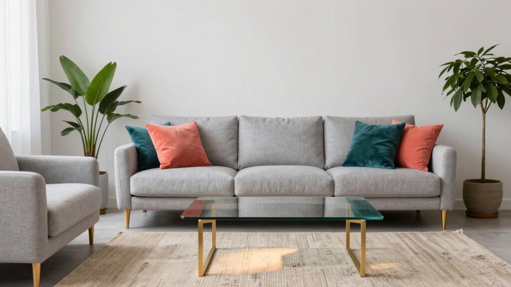

To use accent colors without making a room feel busy, focus on just 1-2 key areas like a single wall or decorative accessories. Choose shades that complement your furniture and keep accessories sparing and deliberate. Incorporate textures and materials to enhance visual interest without clutter. Balance is key—make sure accents highlight, not overpower, the space. Want to discover more tips for creating a harmonious and inviting room? Keep exploring for expert guidance.
Key Takeaways
- Limit accent colors to 1-2 areas to prevent visual overload.
- Use softer or muted shades for accents to maintain a calm, balanced look.
- Position accents strategically on single walls, accessories, or artwork to highlight without clutter.
- Coordinate furniture with neutral tones to let accent colors stand out subtly.
- Incorporate textures and materials thoughtfully to add interest without overwhelming the space.
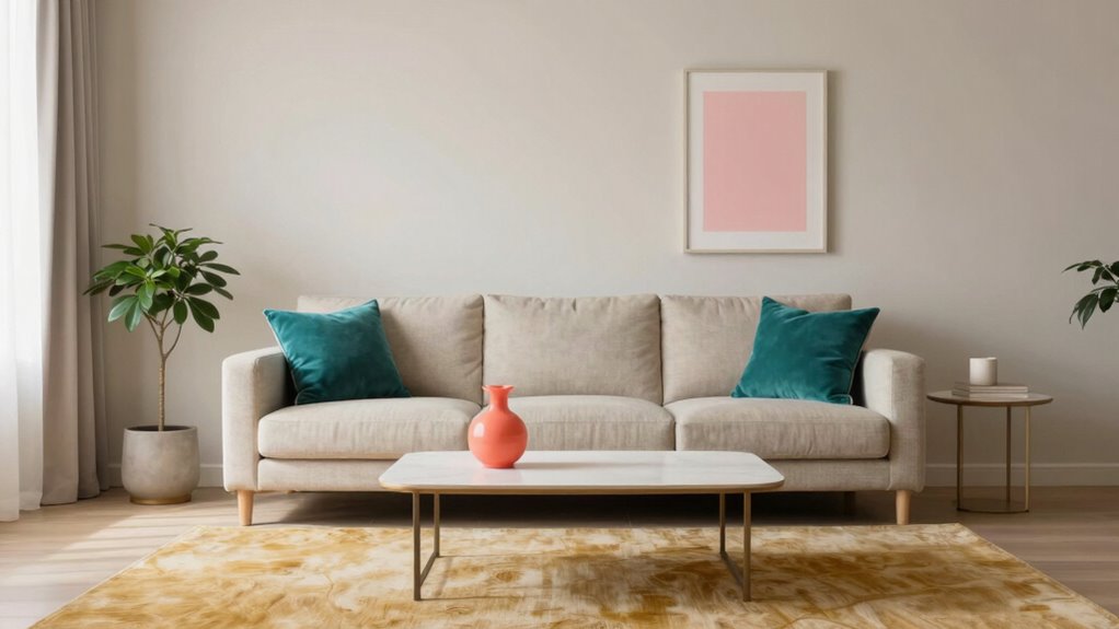
Have you ever wondered how to make your designs pop without overwhelming them? Using accent colors is a fantastic way to add personality and depth to your space without making it feel chaotic. The key is understanding how color psychology influences mood and how furniture coordination can create harmony. When choosing your accent hues, consider the emotional impact of different colors. For example, blues and greens tend to be calming, while reds and yellows energize a room. Knowing this helps you select shades that enhance the atmosphere you want to create, rather than clutter it.
To avoid a busy look, keep your accent colors limited to one or two key areas. Think of them as spotlight features rather than the main event. Use these pops of color on a single wall, a piece of artwork, or decorative accessories. This way, your eye is drawn to the accent, but it doesn’t compete with everything else in the room. When it comes to furniture coordination, choose pieces with neutral tones or complementary colors that act as a balanced backdrop for your accent shades. For instance, if your accent color is a vibrant coral, opt for furniture in soft greys or beige to keep the space feeling cohesive and calm.
Another way to use accent colors effectively is through small, intentional bursts of color in accessories like pillows, vases, or rugs. These small touches can make a big impact without overwhelming the overall design. Remember, less is often more when it comes to accent colors. Use them sparingly and intentionally, and always keep in mind how they relate to the larger color scheme. Incorporating color psychology can help guide your choices to evoke specific moods and feelings in your space. Additionally, paying attention to visual harmony and how different elements work together ensures that your accents enhance rather than disrupt the overall aesthetic. Understanding color coordination can further refine how you select and place your accents for a seamless look.
Mixing textures can also help your accent colors stand out without feeling busy. For example, a velvet pillow in a bold hue or a matte-finish vase can add visual interest without cluttering the space. Exploring different material contrasts can amplify this effect and create a richer, layered look. Incorporating varied textures and finishes can also help draw attention to your accents while maintaining a balanced appearance. Ultimately, the goal is to strike a balance: let your accent colors enhance your design without stealing the show. When you pay attention to color psychology and coordinate your furniture thoughtfully, you’ll create a space that’s lively yet harmonious—inviting, vibrant, and perfectly styled.
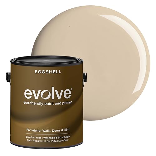
EVOLVE Interior Paint & Primer, Eggshell (Natural Beige), 1 Gallon – One-Coat Coverage, Excellent Hide, Low VOC, Low Odor, Washable Paint for Walls, Doors & Trim
- Paint and Primer in One: Provides coverage and surface sealing
- Multiple Sheens and Colors: Available in various finishes and shades
- Eggshell Sheen: Soft, velvety glow with durability
As an affiliate, we earn on qualifying purchases.
As an affiliate, we earn on qualifying purchases.
Frequently Asked Questions
Can Accent Colors Be Changed Seasonally?
Yes, you can change accent colors seasonally. Using seasonal color palettes makes it easy to update your space with temporary accent updates that reflect the time of year. You might swap out pillows, throws, or decorative accessories to incorporate warm tones in fall or cool hues in winter. This approach keeps your room fresh and festive without overwhelming the overall design, giving your space a timely, stylish touch.
What Are the Best Tools for Choosing Accent Colors?
You’re in luck—top tools like color palette generators and apps are your best bet for choosing accent colors. Studies show color psychology can boost mood and influence emotions, so selecting the right shades is key. Use digital tools like Canva or Adobe Color to experiment with colors and see how they enhance your space’s mood. These tools help you make confident choices without feeling overwhelmed, ensuring your accent colors complement your room perfectly.
How Many Accent Colors Should I Use in a Room?
You should use two to three accent colors in a room to achieve balanced color harmony. Too many can create visual chaos, while just one might seem dull. Focus on strategic accent placement—such as pillows, artwork, or accessories—to highlight your chosen hues. This approach maintains visual interest without overwhelming the space. Keep your accent colors cohesive and complementary for a harmonious, inviting room that feels lively yet balanced.
Do Accent Colors Work Better in Small or Large Spaces?
Accent colors shine brighter in large spaces, like stars in a clear night sky, giving you room for playful experimentation. In small rooms, they can overwhelm unless used with careful design consistency. Color psychology guides you to choose hues that evoke desired feelings, preventing chaos. Whether big or small, your goal is harmony, letting your accents complement the space without overpowering it, creating a balanced, inviting atmosphere.
How Do I Balance Multiple Accent Colors Effectively?
To balance multiple accent colors effectively, focus on color harmony by choosing hues that complement each other. Use a dominant accent color and add others sparingly to maintain visual balance. Incorporate these shades through accessories or small decor pieces, avoiding overwhelming the space. This approach helps create a cohesive look, where each color enhances the room without making it feel busy. Stick to a consistent palette for a harmonious, inviting environment.
Conclusion
Now that you know how to incorporate accent colors thoughtfully, imagine the stunning transformation your space can undergo. But beware—there’s a secret to balancing those vibrant pops without overwhelming your room. Are you ready to discover the one trick that guarantees your accent colors will elevate rather than clutter? Stay tuned, because mastering this final step will reveal the true potential of your decor. Don’t miss out—your perfectly balanced room is just one decision away.