
A colorful environment can brighten your spirits and boost memory by triggering positive emotions and familiar associations. Warm tones like yellow and orange encourage happiness, while softer shades promote calmness and reassurance. Using vibrant accents or meaningful artwork acts as visual cues, helping you navigate spaces and recall memories more easily. Thoughtful color choices can create a supportive, uplifting atmosphere that fosters emotional well-being. Keep exploring to discover how color can transform your environment and enhance your experience.
Key Takeaways
- Bright, warm colors like yellow and orange can evoke happiness and stimulate positive memories in seniors.
- Colorful cues such as artwork and textiles act as prompts to enhance reminiscence and emotional connection.
- Using strategic colors in the environment supports mood elevation and boosts confidence among seniors.
- Incorporating gentle pastel shades fosters calmness, reducing anxiety and promoting emotional well-being.
- Thoughtful color placement helps seniors reconnect with personal history, uplifting their spirits and encouraging social engagement.

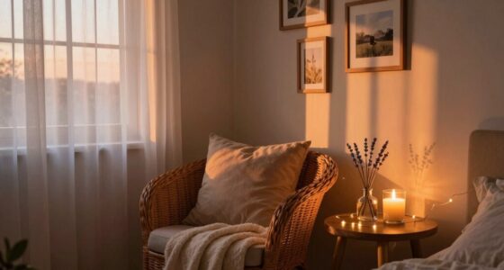
Color plays a powerful role in shaping our memories, often acting as a vivid trigger for recall. When you surround yourself with specific hues, you tap into a deep well of associations that can evoke feelings of comfort, happiness, or nostalgia. For seniors, this connection between color and memory becomes especially meaningful. As you age, your brain relies more on visual cues to access past experiences, and colors serve as effective cues that can spark vivid recollections. This is where color therapy comes into play—using carefully chosen shades to enhance mood and stimulate memory. By incorporating certain colors into daily environments, you can create a more engaging and uplifting atmosphere for your loved ones or yourself. Bright, warm tones like yellow and orange often evoke feelings of happiness and energy, while softer shades like pastel pinks and blues promote calmness and serenity. These colors serve as visual cues that help seniors navigate their surroundings more confidently and recall positive memories associated with those hues.
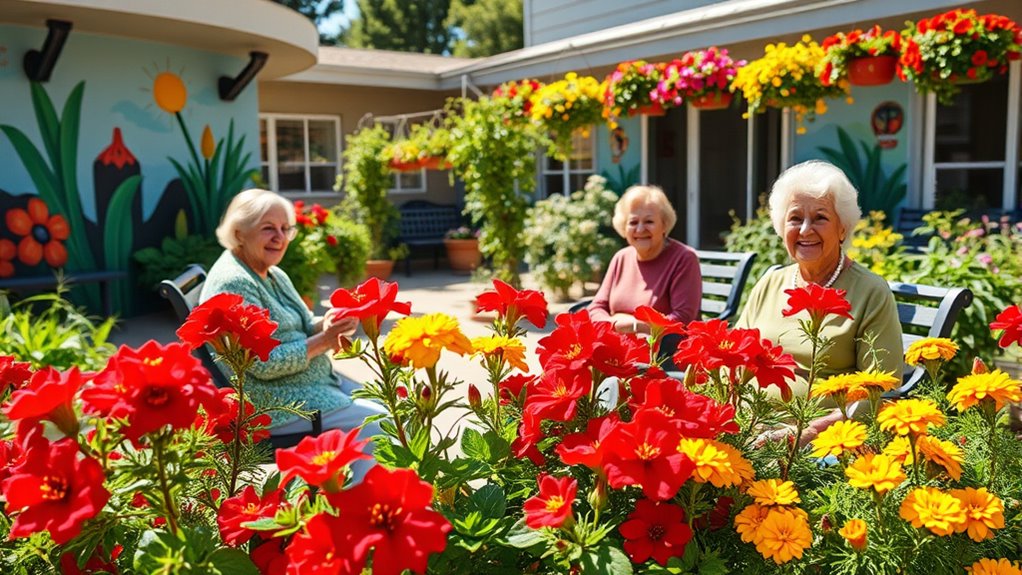
Imagine walking into a room painted in cheerful yellows or decorated with vibrant red accents. These colors immediately catch your eye and can spark memories of joyful moments—perhaps a sunny day at the park or a favorite childhood toy. When you use color therapy intentionally, you’re not just decorating; you’re creating a psychological environment that encourages engagement and emotional well-being. Visual cues like colorful artwork, patterned textiles, or even colorful plants can serve as prompts for conversation, reminiscence, or simply elevating mood. For seniors experiencing cognitive decline, these cues can be especially beneficial, helping them reconnect with their sense of self and their past. Strategically incorporating colors into spaces where they spend time can make a significant difference in their overall emotional health. Additionally, understanding the quality assessment of colors and materials can help in choosing the most effective cues for stimulation.
You don’t need elaborate designs to make a difference; simple, deliberate use of color can transform an ordinary space into a vibrant, memory-rich environment. By understanding the power of color therapy and how visual cues influence recall, you can foster a more positive, stimulating atmosphere for seniors. Whether it’s a splash of red on a cushion, a wall painted in calming blue, or colorful artwork on a shelf, each detail can serve as a trigger that lifts spirits and rekindles cherished memories. In this way, your mindful use of color becomes a subtle but impactful tool for enhancing well-being and creating a more joyful, connected environment.

Large Print Easy Color & Frame – Stress Free: Adult Coloring Book with 31 Designs | Flowers, Mandalas & Nature | Perforated Pages, Spiral Bound | Gift for All Ages, Seniors & Beginners
As an affiliate, we earn on qualifying purchases.
As an affiliate, we earn on qualifying purchases.
Frequently Asked Questions
How Do Color Preferences Vary Among Different Senior Individuals?
You might notice that your color preferences vary among seniors due to individual aging perception and personal experiences. Some may favor calming shades like blues and greens, while others prefer warm colors like reds and yellows. Color therapy can influence mood and memory, making it helpful to tailor environments to their unique tastes. By understanding these preferences, you can create spaces that uplift spirits and support positive aging.
Can Specific Colors Trigger Long-Term Memories in Seniors?
Imagine walking through a garden where every color whispers stories from the past. You might find that certain hues act as gentle memory triggers, stirring long-buried moments. In color therapy, specific colors can evoke emotional responses and possibly release cherished memories in seniors. While not guaranteed, these visual cues often serve as subtle gateways, helping seniors reconnect with their history through the power of color’s calming and evocative influence.
What Role Does Contrast Play in Seniors’ Color Perception?
Contrast plays a crucial role in seniors’ color perception by enhancing visual acuity and aiding color differentiation. When you increase contrast, you make objects stand out more clearly, which helps seniors see details better and reduces confusion. This is especially important for those with declining eyesight, as high contrast improves overall visibility and makes environments safer and more comfortable for them.
Are There Any Colors That Should Be Avoided in Senior Environments?
Think of color psychology as a guiding light, much like a lighthouse guiding ships. You should avoid harsh, overly bright or fluorescent colors that may cause discomfort or overstimulate seniors, disrupting their emotional responses. Pastel or muted tones often foster calmness and comfort. By choosing gentle hues, you create a warm environment that supports emotional well-being, helping seniors feel safe, relaxed, and uplifted.
How Do Cultural Differences Influence Color Choices for Seniors?
You should consider how cultural differences influence color choices for seniors. Cultural symbolism and traditional color meanings vary widely, affecting how seniors perceive colors. For example, certain hues may symbolize luck or mourning in different cultures. By understanding these cultural nuances, you can select colors that resonate positively, making environments more welcoming and comforting, ultimately supporting seniors’ emotional well-being and respecting their cultural backgrounds.

Neck Pillow for Travel,Geometric Tribal Colorful Artwork Memory Foam U Shaped Pillows,Portable Headrest Abstract Ethnic Pattern Art Neck Head Support Cushion for Home Office Car Airplane Sleeping
Comfortable Neck Protection: Our neck pillow is made with a high-density memory foam core and high-elastic polyester cover,…
As an affiliate, we earn on qualifying purchases.
As an affiliate, we earn on qualifying purchases.
Conclusion
Imagine your mind as a vibrant garden, where colors bloom to bring joy and clarity. By surrounding seniors with lively hues, you help nurture their memories and lift their spirits. Just as sunlight brightens a dull day, a splash of color can awaken forgotten moments and spark happiness. Embracing this simple change transforms their environment into a vivid tapestry of life, reminding us that sometimes, a splash of color is all it takes to brighten a soul.
pastel textiles for calming senior spaces
As an affiliate, we earn on qualifying purchases.
As an affiliate, we earn on qualifying purchases.
vibrant accent decor for dementia care
As an affiliate, we earn on qualifying purchases.
As an affiliate, we earn on qualifying purchases.