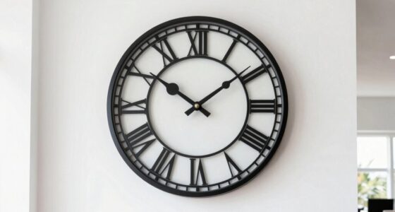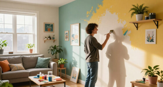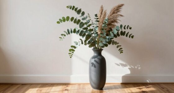
You need negative space around statement decor because it helps those pieces stand out and become focal points. By giving them room to breathe, you prevent the space from feeling cluttered or chaotic, making the overall look more balanced and intentional. Proper negative space highlights contrasting colors and textures, amplifying their impact. When you create these visual pauses, your decor feels more sophisticated and cohesive. Want to discover how to master this design trick? Keep exploring for more tips.

Get furniture and decor delivered free with Prime
- Fast, free delivery on millions of items
- Prime Video, Amazon Music and more included
- Member-only deals all year
Key Takeaways
- Negative space creates a visual pause, highlighting the statement decor and making it more attention-grabbing.
- It prevents clutter, ensuring the statement piece remains the focal point without feeling overwhelming.
- Adequate space around decor emphasizes contrast, color, and texture for a stronger visual impact.
- Negative space establishes balance, guiding the viewer’s eye and enhancing overall room harmony.
- It adds sophistication and clarity, turning simple statement pieces into compelling, eye-catching features.
Have you ever wondered how to make your decor truly stand out? It’s not just about choosing bold statement pieces; it’s about how you give those pieces room to breathe. Negative space plays a vital role in highlighting statement decor, and understanding its importance can transform your interior design from cluttered to captivating. When you incorporate negative space around a bold art piece or decorative element, you create a visual pause that draws the eye directly to the statement piece. This space acts as a buffer, allowing the color contrast of your decor to really pop without competing with other elements in the room. By giving your statement decor room to breathe, you prevent the design from feeling overwhelming or chaotic. Strategically managing visual weight helps balance the overall aesthetic and emphasizes each element’s significance. Frame selection also ties into this concept. When you choose a frame for your artwork or decorative piece, it’s essential to consider the space around it. A well-chosen frame can act as a boundary that sets your statement piece apart from the surrounding decor. But even the best frame can’t do its job if it’s crammed into a crowded wall. Adequate negative space around the frame enhances its impact, guiding your eye toward the focal point. This deliberate use of space amplifies the effect of contrasting colors and textures, making your statement decor stand out even more vividly. Conversely, a cluttered or busy background diminishes the power of your statement piece, no matter how striking it is. Negative space isn’t about leaving gaps for the sake of emptiness; it’s a strategic choice to create balance and focus. It also echoes the importance of interior balance in creating a harmonious environment. Incorporating Negative space is a key principle in effective interior design because it helps to establish a sense of order and clarity. An understanding of design principles can further enhance how you arrange and highlight your statement decor. When selecting what to display, think about the visual weight of your decor and how much space it needs to be appreciated. This approach can help you craft a harmonious look where each element has room to be appreciated, rather than competing for attention. Remember, a well-placed negative space can turn a simple statement piece into an eye-catching centerpiece, giving your room a sense of sophistication and intentionality. It’s the secret ingredient that ties your decor together and makes every bold element truly stand out.
As an affiliate, we earn on qualifying purchases.
Frequently Asked Questions
How Does Negative Space Affect the Readability of Statement Decor?
Negative space enhances the readability of statement decor by creating visual balance and emphasizing focal points. When you give your decor enough space, the words or designs stand out clearly, preventing clutter. It guides the eye naturally and makes the message easier to understand. Without enough negative space, your decor can feel overwhelming or confusing, reducing its impact. So, always leave room around your statement pieces to guarantee they catch attention effectively.
Can Negative Space Be Used to Highlight Multiple Decor Pieces?
Like a conductor guiding an orchestra, you can use negative space to highlight multiple decor pieces. By balancing clutter and spacing each item thoughtfully, you create a visual rhythm that guides the eye smoothly from one focal point to another. Think of negative space as the silence between musical notes—essential for emphasizing each piece and ensuring your decor feels harmonious rather than chaotic.
What Are Common Mistakes When Incorporating Negative Space?
A common mistake is neglecting color contrast, which can make negative space look dull or confusing. You also might choose frames that clash or overwhelm the decor, detracting from the overall balance. To avoid these errors, select frames that complement your decor and guarantee the negative space allows your statement piece to breathe. Proper color contrast enhances visual interest, making your decor stand out beautifully without feeling cluttered.
How Do Room Size and Shape Influence Negative Space Choices?
A small, square room might need more negative space around statement decor to prevent clutter, ensuring furnishings balance with wall proportions. For instance, in a narrow hallway, leaving ample space around a bold art piece makes it stand out without overwhelming the space. Room size and shape directly influence your negative space choices, helping you create a harmonious balance between furnishings and wall art that feels inviting and well-proportioned.
Is Negative Space More Important in Modern or Traditional Decor Styles?
Negative space is more important in modern decor styles. You’ll notice that modern designs emphasize clean lines, open spaces, and minimal clutter. This creates a striking contrast through color contrast and highlights texture balance without overwhelming the eye. By leaving negative space around statement decor, you allow each piece to stand out, making your space feel balanced, sophisticated, and visually appealing.
Conclusion
Remember, statement decor isn’t just about what you put on the wall; it’s about what you leave out. Embrace negative space to highlight your piece, to breathe life into your design, and to create a visual balance that draws the eye. Let your statement stand tall, stand out, and stand proud by giving it room to breathe. Because in the art of decor, sometimes less truly means more—more impact, more clarity, more style.
Halloween Picks
halloween
As an affiliate, we earn on qualifying purchases.