
Color zoning allows you to define individual spaces in an open plan by using paint creatively. You can choose vibrant hues for lively social zones or softer tones for calming areas, making each space feel purposeful. Proper lighting enhances these zones, highlighting boundaries without physical walls. Coordinating colors and lighting helps create a harmonious flow. To discover how to master this technique and transform your space, keep exploring the impactful ways paint and light can work together.
Key Takeaways
- Use paint to create visual boundaries within open spaces, defining zones without physical walls.
- Choose contrasting or harmonious colors to differentiate areas like living, dining, and workspaces.
- Incorporate layered lighting to highlight color zones and enhance spatial boundaries.
- Select colors and lighting that match each zone’s function for a balanced, functional layout.
- Consider psychological effects of colors and natural light to promote mood and visual harmony.
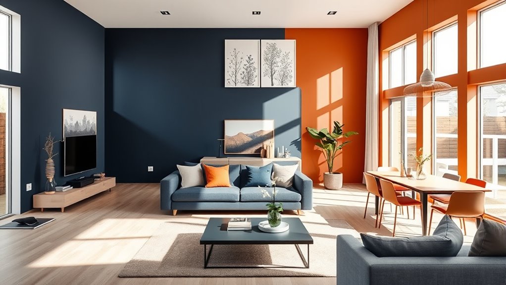
Have you ever wondered how to define different areas within an open-plan space without building walls? One effective way is through color zoning, where you use paint to create visual boundaries. Instead of relying on physical partitions, you can play with creative color palettes to distinguish zones, making each area feel intentional and functional. Bright, vibrant hues can energize a dining or social area, while softer, muted tones might calm a workspace or reading nook. By carefully selecting colors, you guide the eye naturally from one zone to another, giving each space its own identity without sacrificing the open feel.
Color alone isn’t enough to create distinct zones; lighting integration is equally essential. Proper lighting can emphasize color zones, making them pop or fade into the background as needed. For example, installing warm, focused lighting over a designated work area with a different wall color can draw attention and create a sense of separation. Conversely, layered lighting—combining ambient, task, and accent lights—helps you subtly delineate spaces while maintaining harmony across the entire open plan. When you coordinate lighting with your color choices, you reinforce the boundaries you want to establish, making the transition from one zone to another seamless and visually appealing.
To make your color zoning effective, think about how each space functions and how lighting can enhance that function. If you want a cozy conversation nook, choose warm tones like terracotta or deep amber and add soft, dimmable lighting. For a lively entertainment zone, opt for bold colors like navy or emerald and incorporate brighter, more direct lighting to energize the area. Remember, the key is balance. Using contrasting colors can define boundaries sharply, but too many stark differences might make your space feel disjointed. Instead, consider a cohesive color palette with variations in tone and intensity to maintain flow and harmony.
Additionally, you can use lighting fixtures as design features—pendant lights, wall sconces, or track lighting—to highlight certain color zones. This not only emphasizes the boundaries but also adds a layer of visual interest and sophistication. Be mindful of natural light as well; large windows can wash out colors or change their appearance throughout the day. Incorporate lighting that complements the natural light, ensuring your color zoning remains consistent and appealing from morning to night.
A well-planned approach to color zoning can also consider the psychological effects of colors, enhancing both the aesthetic and mood of each zone while maintaining overall harmony.

Mighty Board Minis Polystyrene Paint Color Test Panels, 12" x 9", Set of 5, White
PERFECT SAMPLES: These 12" x 9" white, styrene panels provide a smooth, warp-free surface for testing up to…
As an affiliate, we earn on qualifying purchases.
As an affiliate, we earn on qualifying purchases.
Frequently Asked Questions
How Do I Choose Colors That Complement Each Other?
To choose colors that complement each other, start with the color wheel to identify harmonious pairs. Opt for complementary hues, which sit opposite each other on the wheel, for vibrant contrast. Consider the mood you want to create and test small swatches together before committing. By understanding color relationships, you’ll create a cohesive, balanced space that feels intentional and visually appealing.
Can Color Zoning Make a Small Space Feel Larger?
Think of your small space like a puzzle; color zoning acts as the guiding pattern, making it feel bigger. You can create visual harmony by using lighter shades in larger areas and strategic color contrast to define zones. This tricks your eye into perceiving more space, much like a well-designed puzzle appears seamless. Proper color zoning enhances openness and makes your small room feel more expansive and inviting.
What Are the Best Paint Finishes for Zoning?
You should opt for matte or eggshell finishes when using paint techniques for zoning, as they create subtle contrasts without glare. Textured wall finishes, like faux finishes or wall paneling, add depth and define spaces effectively. These paint finishes help distinguish zones while maintaining a cohesive look, making your open plan feel organized and inviting. Combining smooth and textured surfaces is a smart way to enhance visual separation without overwhelming the space.
How Do I Maintain Color Zones Over Time?
To maintain your color zones over time, you should regularly inspect the zone boundaries for any touch-ups needed. Use a fine brush to fix any paint chips or fading along the color shift areas. Consider applying a clear protective topcoat to preserve the integrity of your zones. Consistent cleaning and avoiding harsh scrubbing help keep your color transition smooth and your zone boundaries sharp, ensuring your open plan stays visually defined.
Should Color Zoning Be Consistent Throughout the Entire Home?
No, your color zoning shouldn’t be entirely consistent throughout your home. Instead, tailor zones to each space’s function by considering color psychology and furniture coordination. Use calming hues for relaxing areas and energizing shades for social zones, creating visual flow without uniformity. This approach enhances your home’s personality, making every space feel intentional and inviting while maintaining a cohesive look.

Shine LUEST Modern LED Ceiling Light Fixture Black Kitchen Lighting Fixtures Ceiling for Bedroom 31.5" Dimmable 6 Ring Square Ceiling Light for Kitchen with Remote Control for Living Room,Dining Room
🌈Dimmable LED Ceiling Light: Light memory function is easy to operate,Modern 6 ring LED chandelier with stepless 5%-100%…
As an affiliate, we earn on qualifying purchases.
As an affiliate, we earn on qualifying purchases.
Conclusion
Color zoning transforms open plans like a painter’s brush, turning a blank canvas into distinct, inviting spaces. By choosing different shades, you create a visual flow that guides your eye and defines each area effortlessly. It’s like setting boundaries with a whisper rather than a shout, making your home feel both spacious and cozy. Embrace color zoning, and watch your open plan come alive with personality and purpose. It’s the secret to a beautifully unified yet uniquely individual space.

FOLKSMATE Modern LED Wall Sconces, 3000K Warm White Hardwired Wall Lights Set of 2, 10W Up and Down Wall Mount Light, Matte Black Indoor Sconces Wall Lighting
Modern Design & Minimalist Style: The LED wall sconce encapsulates modern sophistication with its cutting-edge design and minimalist…
As an affiliate, we earn on qualifying purchases.
As an affiliate, we earn on qualifying purchases.

AUQUEE 8 Light Track Lighting Fixtures Ceiling, Matte Black Kichen Track Lighting Fixtures, Rotatable Light Heads, Adjustable Modern LED Track Lights for Kitchen/Hallway, No GU10 Bulb
Black 8 Light track lighting fixures ceiling with Long Size: The 55.3'' length allows this kitchen track lighting…
As an affiliate, we earn on qualifying purchases.
As an affiliate, we earn on qualifying purchases.