TL;DR

Get furniture and decor delivered free with Prime
- Fast, free delivery on millions of items
- Prime Video, Amazon Music and more included
- Member-only deals all year
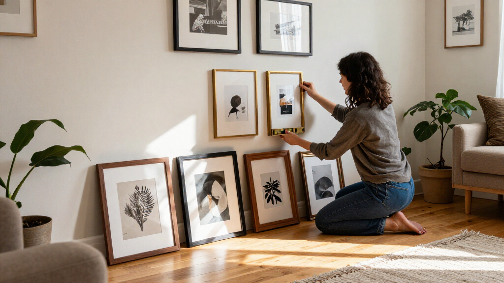
Toronto framing expert Tara Gavin says a gallery wall works best when it follows a clear design direction. Her approach uses unexpected mat and frame colors, varied photo placement and, in some projects, black-and-white prints to bring a collection together.
Toronto framing expert Tara Gavin says a gallery wall should have a clear design direction, rather than relying on a standard mix of white mats and wood frames. In an interview with House Beautiful, the founder of On the Wall Framing described how she uses color, spacing and photo placement to make collections feel connected while still allowing individual pieces to stand out.
One example came from a project commissioned by Toronto design studio Kessler Levitan for a local family of five. Gavin had just 31 inches of wall width to work with, making gallery wall frames a practical consideration. She treated the limited space as a design feature, combining familiar oak and black frames with burgundy-colored mats and frames.
Gavin said the burgundy added warmth, the oak kept the arrangement from feeling too formal, and the black frames provided contrast. She suggested that homeowners could borrow the palette or choose a mat color that picks up a shade already present in the room. In her view, white is not the only practical backdrop: burgundy, soft blue, olive green and warm neutrals can also change how a photograph reads.
Gavin also described using negative space—the mat area around an image—as a way to give photographs more presence. Her team sometimes places more than one photo in a frame or sets an image off-center instead of automatically centering a single picture. For the featured project, the photographs were printed in black and white, a choice Gavin recommended for collections made up of family pictures taken at different times, in varied lighting and with different color palettes.
A Plan for Personal Photo Collections
Gavin’s advice addresses a common design challenge: family photographs may be personally meaningful but visually inconsistent when displayed together. Her suggested methods offer ways to create a more unified arrangement without requiring every image to match or buying an expensive art collection.
The project also shows how a gallery wall can be adapted to a narrow area. Color choices and matting can help a limited stretch of wall feel intentional, while black-and-white printing can reduce differences among photographs. These are design recommendations, not rules that guarantee a particular result; the source does not report measurements of viewer response or compare the approach with other methods.
Products Worth Considering

Blueair Blue Pure 211i Max Air Purifier

Ring Battery Doorbell Plus (2nd Gen) and Indoor Cam Plus Bundle, Nickel Silver and White

Philips Hue Secure Wired Video Doorbell, 2K, Black
As an affiliate, we earn on qualifying purchases.
How Gavin Builds a Composition
House Beautiful presents Gavin’s approach as a combination of scale, frame finishes, mat color and image positioning. Rather than making every frame identical, she varies details while using a consistent plan to connect the pieces. Her examples focus on a family gallery wall and on the choices made for that specific commission.
Gavin said she and her team work with different frame finishes and mat colors to keep displays feeling fresh. For family photographs, she also recommends thinking about the images themselves—not only the frames—and deciding whether converting them to black and white would make the collection more cohesive. The source does not provide a full installation guide, such as exact spacing, hanging measurements or hardware recommendations.
“My team and I love playing with scale, unexpected mat colors, different frame finishes, and the way photographs are positioned within a frame in order to keep them fresh.”
— Tara Gavin, founder of On the Wall Framing, quoted by House Beautiful
Details Beyond the Design Advice
The supplied report does not state when the article or Toronto project was published, give the wall’s full dimensions beyond its 31-inch width, or identify the number and sizes of frames used. It also does not include a complete materials list, installation instructions or a budget for the project.
Gavin’s recommendations are based on her professional experience and the examples described in the report. The source does not establish that black-and-white printing, colored mats or off-center placement will suit every room or photograph, and it does not compare their effects with other design approaches.
Applying the Ideas at Home
The report does not announce a follow-up project or a new service from Gavin. For readers planning a gallery wall, the advice points to a practical next step: decide on a visual direction, review the images together, and test frame and mat combinations before hanging them. A limited wall area can be measured and planned as part of the composition, rather than treated as a reason to abandon the idea.
Whether to use color, black-and-white printing, multiple openings or off-center placement remains a matter of the photographs and room. The source offers no fixed formula for spacing or layout, so those details remain for each homeowner or framing professional to determine.
Key Questions
What does Tara Gavin say is the key to a gallery wall?
Gavin says it should have a clear design direction. She uses choices such as frame finishes, mat colors, scale and photo placement to connect the display.
Does a gallery wall have to use white mats and wood frames?
No. Gavin’s Toronto project combined oak and black frames with burgundy mats and frames. She also named soft blue, olive green and warm neutrals as possible alternatives to white.
Why print family photos in black and white?
Gavin says black-and-white printing can bring consistency to photos taken at different times, in different lighting and with different color palettes. She presents it as an option, not a requirement.
How can matting make a gallery wall more interesting?
Gavin’s team uses negative space around images and sometimes puts multiple photos in one frame or positions a photo off-center. She says these choices can make the arrangement feel less predictable.
Source: rss