To create different atmospheres in each room, choose colors that evoke specific moods. For relaxing spaces like bedrooms, opt for cool tones like blues or greens that promote calmness. Energize social or work areas with warmer shades like yellows or reds. Use accents and layering to balance bold hues and add depth. Consider natural light and materials to enhance the effect. If you explore further, you’ll discover how to craft personalized, emotionally resonant environments through color choice.
Key Takeaways
- Choose colors that evoke the desired emotion, such as calming blues for bedrooms or energizing reds for activity areas.
- Use accent colors and layered textures to add depth and prevent overwhelming the space with bold hues.
- Incorporate natural materials and lighting to enhance color effects and create a harmonious atmosphere.
- Match color schemes with room functions to support the intended mood and purpose.
- Personalize color choices based on individual preferences to craft emotionally resonant and inviting environments.

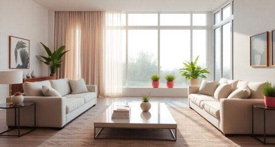
Color plays an essential role in shaping the mood and vibe of each room in your home. When you choose the right hues, you can influence how a space feels, making it more calming, energizing, or inviting. This is where understanding color psychology becomes fundamental. Different colors evoke specific emotions and reactions, which directly impact the room ambiance. For example, soft blues and greens tend to create a tranquil, peaceful environment, ideal for bedrooms or relaxation areas. On the other hand, vibrant reds and oranges can energize a space, making them perfect for kitchens or activity zones. Knowing how colors influence mood allows you to craft an atmosphere that aligns with your intentions for each room.
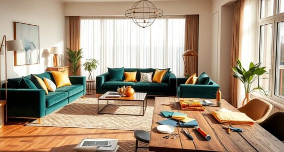
When selecting colors for a room, think about the emotional response you want to encourage. If you aim for a serene, restful ambiance, opt for cool tones like pastel blues or gentle lavenders. These shades promote relaxation and help reduce stress, making them perfect for bedrooms and bathrooms. Conversely, if your goal is to boost activity and concentration, warmer tones like yellows or earthy tones can stimulate mental alertness. Bright, bold hues like scarlet or lime green can energize a space, making it lively and dynamic, suitable for social areas or home offices. By aligning your color choices with intended room functions, you set the tone for how you and others will feel when spending time there.
The key to effective color use lies in balancing hues to achieve the desired room ambiance. Don’t feel pressured to go all-in on bright colors if you prefer a calmer environment. Instead, incorporate them as accents—think throw pillows, artwork, or small accessories—so they add energy without overwhelming the space. Similarly, layering different shades can add depth and complexity to a room, enhancing its mood. Remember, lighting also plays a role; natural light can soften or intensify colors, so consider how sunlight interacts with your chosen palette throughout the day. Additionally, incorporating natural materials such as wood and linen can amplify the calming or inviting atmosphere you wish to create.
Ultimately, your color choices should reflect your personality and the vibe you want each room to exude. Whether you prefer soothing, neutral tones or bold, energetic hues, understanding how color psychology influences room ambiance helps you design spaces that are both beautiful and emotionally resonant. Each color you select becomes a tool to craft an atmosphere tailored to your lifestyle, making your home a true reflection of your mood and personality.

THE ONE All-In-One Paint & Primer – Light Blue Matte, 8.5 Fl Oz/250ml | 1 Coat Formula | Easy Indoor & Outdoor Decorating for Home & Garden Walls, Floors & Furniture | Water-Based & Low VOC
ALL-IN-1 PAINT & PRIMER: A hardy multi-purpose and multi-surface one-coat paint and primer in one for almost any…
As an affiliate, we earn on qualifying purchases.
As an affiliate, we earn on qualifying purchases.
Frequently Asked Questions
How Do I Choose the Right Color for a Multipurpose Room?
When choosing the right color for a multipurpose room, focus on color coordination to guarantee the space feels cohesive. Opt for neutral tones or muted shades that promote visual harmony, making it easy to switch between activities. Incorporate accent colors through accessories or furniture to add personality without overwhelming the room. This approach helps you create a versatile, balanced environment perfect for work, relaxation, or entertainment.
Can Color Psychology Influence Productivity in a Home Office?
They say, “The eyes are the windows to the soul,” and color psychology proves it’s true. Your home office’s color choices can markedly influence your productivity through color associations and emotional impacts. Bright blues boost focus, while soft greens reduce stress. By choosing colors that evoke positive emotional responses, you can create an environment that encourages concentration and efficiency, turning your workspace into a productivity hub.
What Are the Best Colors for Reducing Stress in Bedrooms?
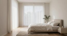
If you want to reduce stress in your bedroom, consider color therapy techniques that focus on calming shades. Soft blues and gentle greens have a soothing emotional impact, helping you relax and unwind. These colors promote tranquility and reduce anxiety, making your space more restful. By choosing these calming hues, you create an environment that supports peaceful sleep and emotional balance, turning your bedroom into a true sanctuary.
How Do Lighting Conditions Affect Color Perception in Different Rooms?
Lighting impact greatly influences how you perceive colors in each room. Natural light enhances color accuracy, making hues appear more true-to-life, while dim or artificial lighting can distort perception, making colors seem warmer or cooler than they are. You should consider the lighting conditions when choosing paint and decor, as they directly affect the atmosphere and mood you want to create, ensuring your colors look their best at all times.
Are There Any Color Combinations to Avoid in Small Spaces?
Color clashes can cause chaos in small spaces, so steer clear of bold combinations that create confusion or claustrophobia. You should avoid pairing intense reds with vibrant greens or bright yellows with bold blues, as these clash and can make a room feel cramped. Instead, opt for harmonious hues or subtle shades, ensuring your tiny rooms feel open and inviting without overwhelming the senses or creating visual chaos.

LANANAS Neutral Couch Throw Pillow Covers 18×18 Inch Set of 4 Decorative Farmhouse Boho Throw Pillows for Living Room, Couch, Bed, Sofa Soft Corduroy Accent Home Decor (Neutral Brown, 18×18 Inch)
COVERS ONLY.
As an affiliate, we earn on qualifying purchases.
As an affiliate, we earn on qualifying purchases.
Conclusion
Think of your home as a canvas, where each color you choose paints a different mood. I once visited a friend’s living room painted in calming blues, instantly feeling more relaxed—like sinking into a peaceful lake. Just as a painter selects shades to evoke feelings, you can use color to craft atmospheres that suit each space. Remember, the right hues don’t just decorate—they transform your home into a sanctuary tailored to your mood.
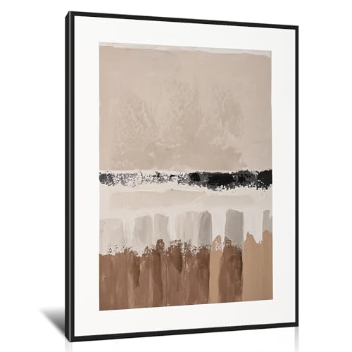
Poemwish Minimalist Canvas Wall Art, Earth Tone Bathroom Wall Decor, Textured Geometric Wall Decor for Bedroom, Abstract Layered Painting in Neutral Tones
【Elegant Minimalist Design】Create a serene atmosphere with this sophisticated abstract piece. Featuring layered earth tones and soft geometric…
As an affiliate, we earn on qualifying purchases.
As an affiliate, we earn on qualifying purchases.
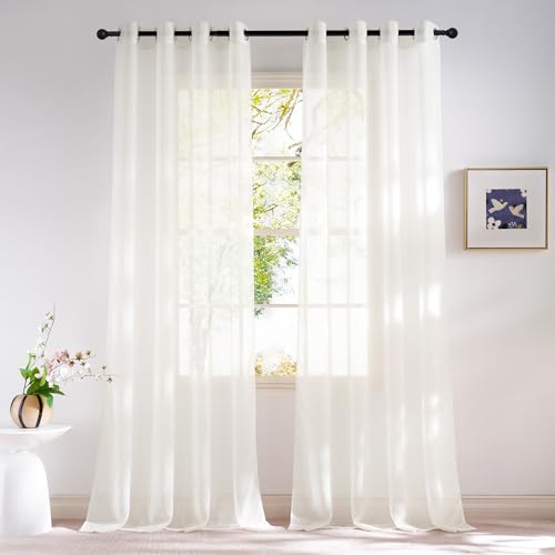
NICETOWN Natural Voile Sheer Bedroom Curtains 84 Inches Long, Grommet Airy & Lightweight Window Treatments Light Filtering for Living Room/Bedroom,W54 x L84, Set of 2
READY MADE: 2 panels sheer curtains per package. Each panel is 54" wide and 84" long when hanging…
As an affiliate, we earn on qualifying purchases.
As an affiliate, we earn on qualifying purchases.